
Posted on September 1, 2017 by KylieMawdsley
Are you tired of seeing the same gray-on-greige paint palettes on Pinterest? I’M NOT! I still break into a Richard Simmons style sweat everytime I see a well-coordinated neutral palette. HOWEVER, there is something to be said for some well-placed colours that not only work WITH gray, but ENHANCE it. That’s right o’ Great World of Pinterest, I said the ‘c’ word – COLOUR!
This post may contain affiliate links. If you make a purchase through links on our site, we may earn a commission.
And that’s why I want to show you this next project – which happens to be my BFF Kim’s home (I captured her via a tranquilizer dart and forced the Kool-Aid down her throat – lucky girl).
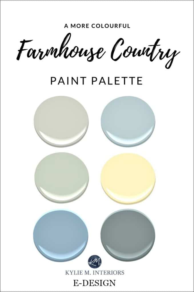
Kim loved country style with a nod to farmhouse, but didn’t want to go full-steam ahead with trends such as shiplap, tons of distressed/painted furniture and the usual ‘white on gray on greige on beige on taupe on mushroom on cream’, type of paint palette (all in one breath too!). So, we decided to use some ‘thoughtful colour placement,’ to work with the homes existing colours/features and to capture the mood that Kim wanted to create in her home.
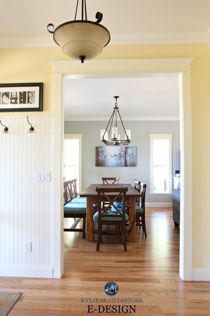
Living Room and Dining Room
The entire left side of the house is pretty much living room and dining room, with the kitchen and entryway branching off on either end. It was VITAL that this colour set the right foundation to support the more ‘colourful’ sides of the adjoining rooms.
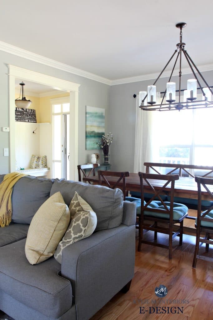
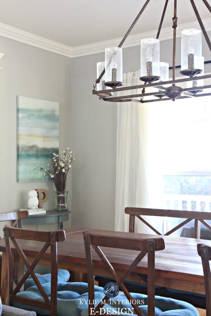
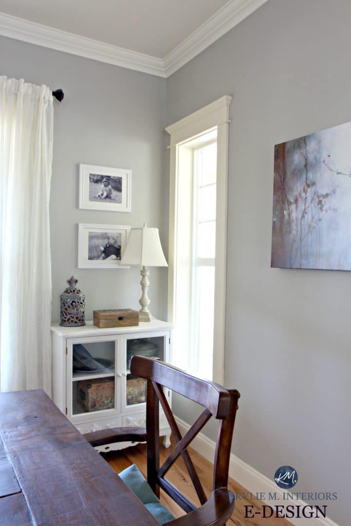
And the paint colour is NONE other than Benjamin Moore Revere Pewter (read ALL about it here). And this is one of those RARE times when rather than going a muddy green, Revere Pewter picks up a faint stony blue undertone. This can happen when you have the ‘perfect storm’ of exposure, trim colour, interior lighting and a bottle of wine.
See the entryway in the upper left corner? We tied the colour of the entryway (and kitchen) into the living and dining room via yellow accents – this helped to create flow from space to space.
Country Kitchen and Eating Nook
Painted a beautiful sunshiny yellow, this room is radiant and inviting! Because all of the main floor windows are underneath a deck, the natural light is slightly diffused coming in and could make some paint colours feel a bit flat and dull. The golden warmth of Benjamin Moore Suntan Yellow radiates out of this room and invites everyone in (or maybe it’s just the beer fridge).
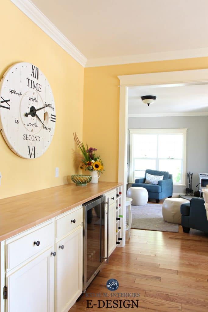
In the photo above, you can see how Revere Pewter makes a GREAT back-drop to the warm yellow kitchen.
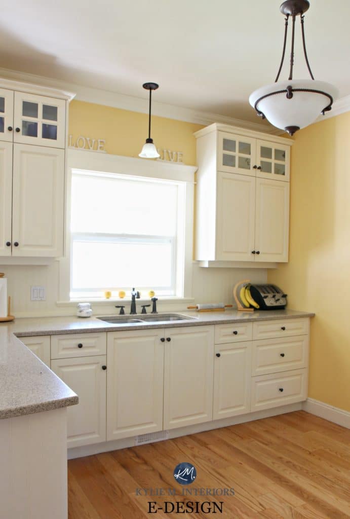
The cabinets are a colour very close to Benjamin Moore Navajo White with quartz countertops and a golden oak floor.

We spend a lot of time at this table! With French doors leading out to the pool (everyone needs a friend with a pool, now we’re waiting for them to get us a boat…wink wink Clint), the kitchen is definitely the hub and heart of this home. And for my friends in the USA, I know a pool is a common feature down there, however up here on the West Coast of Canada, a pool is a novelty and bathing suits are optional!
Read more: 3 Neutral Farmhouse Country Paint Palettes
Entryway and Hallway
Attached to the kitchen is the entryway. With creamy wainscoting and a built-in bench, it’s not just a simple transition area, it really sets the stage for the rest of the home with its colour, warm wood tones and accents.
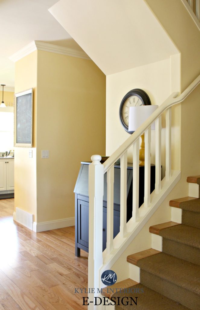
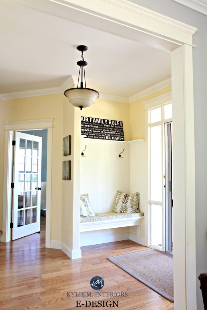
And you can see a sneak-peek of Kim’s home office to the left – one of my FAVE colours…
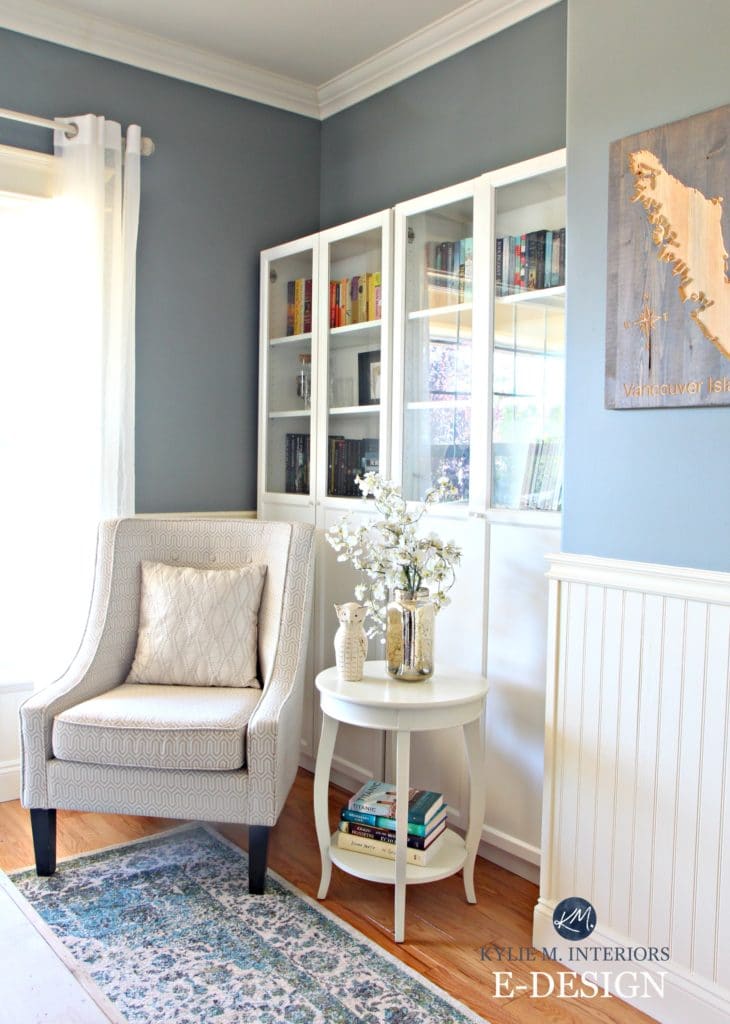
Kim’s Home Office
For her home office, Kim wanted something a bit ‘West Coast’ inspired, which was an easy look to get with Benjamin Moore Stonybrook. Stonybrook is a super fabulous blend of blue and gray with some green in it which stops it from falling too cold or shadowed looking.
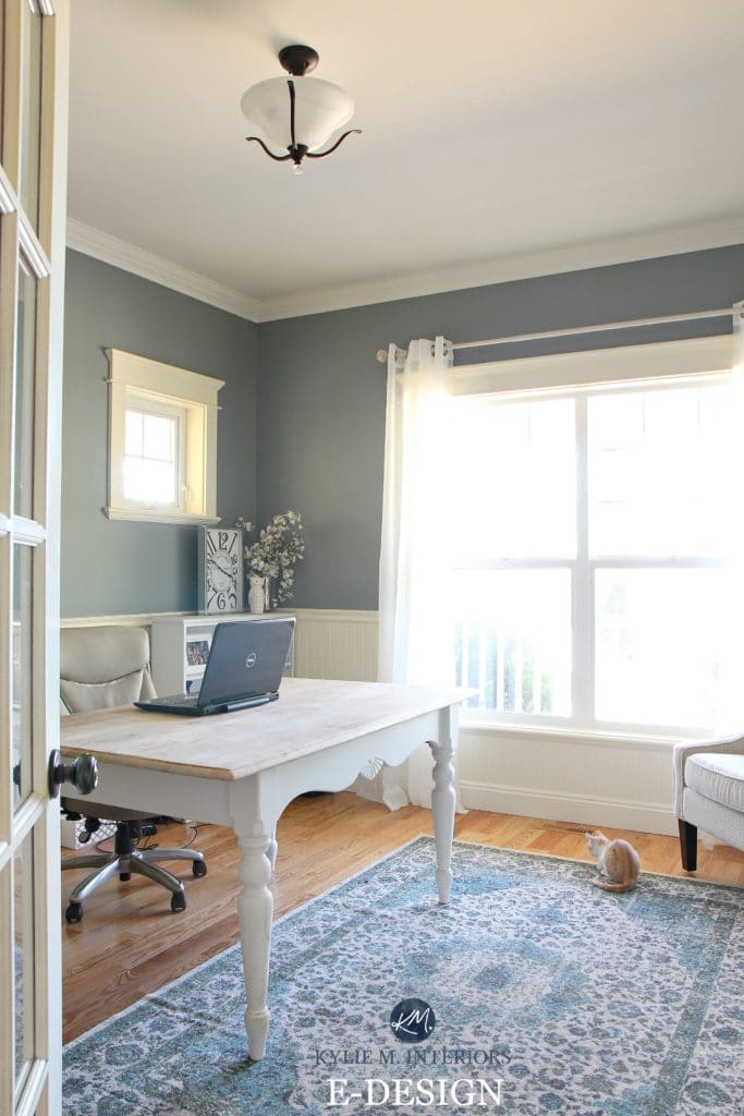
This is where Kim works on her website, Vancouver Island View. An AWESOME resource for those of us living on Vancouver Island and for all of the tourists that come to visit our beautiful island (passive aggressive travel suggestion…). And if you look closely you can see a lovely little ginger in the photo (because all gingers are lovely and if you disagree we’ll steal your soul).
Now let’s go upstairs and take a pee(k) in the guest bathroom.
The Guest Bathroom
With it’s cool blue vibe, the guest bathroom is a fresh retreat for company (or when I don’t want them to hear me peeing in the powder room downstairs).
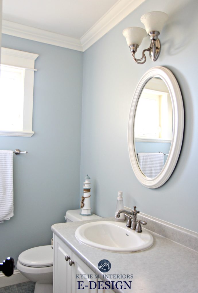
Benjamin Moore Smoke, is the perfect complement to the blue vinyl flooring and countertops – giving it a fresh, beachy vibe!

The Guest Bedroom
The guest bedroom is also a soft blue paint colour – Benjamin Moore Glace Bay.
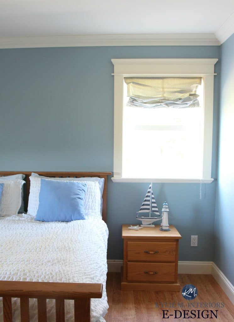
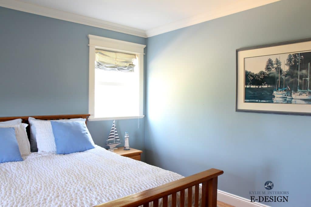
Glace Bay is a soft, fresh blue that is relatively neutral in that it doesn’t lean strongly purple or green toned (which blue just LOVES to do).
Read more: The Best Blue and Blue/Green Paint Colours
The Love Shack
And finally – where the magic happens. Well, that’s what her hubby Clint likes to think anyway.

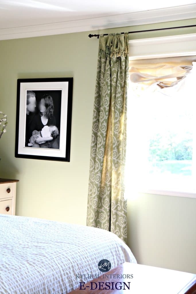
You’re looking at Benjamin Moore Fernwood Green, a soft muted green with a subtle earth-toned base that calms things down, giving this green a farmhouse country vibe. And I blurred out their faces in the photos because Clint is just so DARNED good-lookin’ that I didn’t want Kim to get jealous of the fan mail he’d get.
So there you have it – a colourful country home! Feeling inspired to add some colour to your home?
Check out my affordable Online Color Consulting and E-Design packages!

Chat soon,

Comments
Leave a Reply
More Posts

The 5 Best Creamy White or Off-White Paint Colors
THE ELUSIVE ‘CREAMY WHITE NEUTRAL’ When it comes to light, warm neutrals, it’s all in the undertones. And other than pink and green, yellow is the undertone many of my
Read More

The 8 Best Warm Neutral Paint Colors With NO Yellow Undertones!
The Top Light Depth, Warm Colors That Aren’t Cream! When choosing the best warm neutral paint color for your home, whether creamy white, beige, taupe, or greige, your choices are
Read More

The 12 Best Farmhouse Sinks of 2024
FIND YOUR DREAM SINK HERE… While traditional farmhouse design was all the rage in previous years, the embers have definitely cooled. As for MODERN farmhouse, it’s still kickin’ its cowgirl
Read More


What a lovely job. What a lovely home. Magazine ready.
Author
Thank you Toni, it really is a lovely home!
What a lovely home! The colors are just beautiful and work so well together. My favorite is the yellow!
Author
Oh you would like it Deedra, being a farmhouse country gal yourself! I know, the yellow is so warm and welcoming!
I enjoy your posts!!
Oh how you make me laugh ! Great post. Beautiful home. Su-pear job. Revere Pewter shines as always. My fav color. Can do so much with it. Vancouver is on my bucket list for sure!
Beautiful rooms. Can you tell us what colour is all the trim? Thanks
Author
Hi Tina! It is very similar to Navajo White, just a bit lighter. It’s the original trim colour so that’s as close as I could get to it 🙂
Love the colors and the vibe. Trendy, but not too, and comfortable. My favorites are the living and dining rooms. I’d love a regular feature titled “Real Homes, Real People”.
Author
Oooo Linda, you’re a genius! I love it! I’m going to think more on that. The only challenge I have is getting clients with enough ‘finished rooms’ and quality enough photos. So many of my clients are e-design, so I can’t pop over and get photos myself (or even a glass of wine!!!!). Hmmm. I’m going to see what I can do though…Maybe YOUR home should be in it!!!
~Kylie
BM’s Fernwood Green in the Master Bedroom is a colour that will linger with me. I’m sure I will opt for that in my bedroom. Its just what I have been looking for. All the other colors are wonderful as well. I’m tired of grays!
Author
I know, isn’t it GORGEOUS. I spend a lot of time consulting in the gray/griege world, and it’s just SO nice to explore colour – and Fernwood is just a beauty!
What color did you use for the trim? In some rooms it looks white, in others it looks creamy.
Author
Wellll, we’re busted. So, like with most homes, things evolve over time. So, the crown molding was a newer addition and hasn’t been painted the creamy colour that the rest of the trim is (yet). So, most of the window/door/baseboards are a colour similar to BM Navajo White, while the crown molding is more white! (but don’t tell anyone…) Eventually, it will all be painted the same colour 🙂
In my own home, we added crown molding in several rooms and painted it the same color as the rest of the trim and it looks so much whiter,brighter!!! (The color is Behr “Decorator White” which is a neutral (doesn’t lean noticeably cool or warm–pretty close to BM’s Chantilly Lace, maybe a hair’s breadth warmer, perhaps. ) This is true in all the the rooms where we installed the crown molding, even though the rooms are different sizes and have different exposures! Is this some phenomenon of lighting? Have you ever experienced this before?
By the way, the home is gorgeous and the color palette is too! You are a great bff to have! I love the post and your humor, as always.
Author
Thank you Phyllis! That’s the great thing about choosing ‘just the right white’ is that it can accommodate different exposures/lighting situations – you picked good girl! Basically, the less ‘colourant’ that is in it, the more flexible it will be for warm/colour colours and exposures…
And yes, she IS fabulous!
~Kylie
Beautiful! I love that Fernwood Green. I had just decided my next bedroom needs more green!
Author
I know, isn’t it beautiful! I’m not even a green fan yet I LOVE that colour!
I love your design style and reading your blogs. They are awesome and so much fun =)
Did you lighten the Revere pewter in the dining room ? It looks lighter than 55lrv. Or perhaps all the natural lighting from the windows.
Author
Hi Eileen, thank you! Nope, that was REvere Pewter as-is!
Is the yellow in the entry the same suntan yellow as the kitchen? Looks maybe a shade softer/lighter? Is that just the light?
Gorgeous! This is the look I’m going for now. I love soft happy colors.
Author
Hi Sarah! Nope, it’s different – the entryway is much softer 🙂
What Yellow is the entryway colour?
Other than the Suntan Yellow?
Author
Hiya! I believe it’s BM Buttermilk 🙂
Thank you! I was looking for a yellow and was deciding either to use BM Buttermilk or BM French Toast. Maybe I will use both! 😊
Author
You’re most welcome!
Hey Kylie!
I’m scratching my head here, no matter what way I put it I can’t figure out how you made Revere Pewter look that bluey gray.
Do you lighten it or darken it?
Or is it just the other finishings in the dinning room that make it look bluey?
Thanks!
Author
TELL ME ABOUT IT! This is my bff’s house and every time I go there, I MARVEL at it. I think it’s a wicked combination of considerably warm trim and 3 exposures!