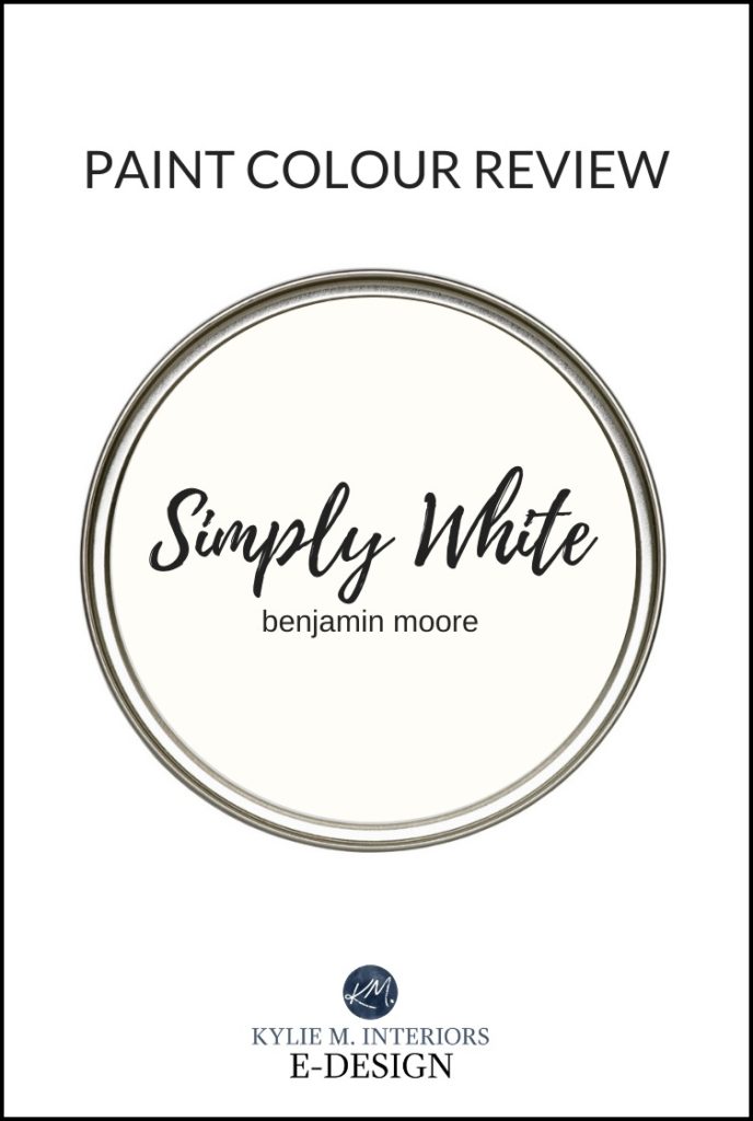
The Best Warm White Paint Color: Benjamin Moore Simply White
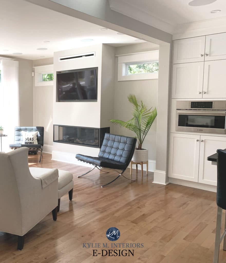
Simply White is definitely one of the more popular warm white paint colors these days and it’s no wonder. Whether it’s on walls, trims, exteriors, cabinets, doors or ceilings – you name it, Simply White’s got it covered.
In fact, I’ve had a lot of E-Design clients HOPING to use Simply White on their cabinets, walls or trim. And while it’s a beauty, it’s not as simple as it seems and there’s a LOT to consider if you’re thinking of using it in your own home…
What type of paint color is Benjamin Moore Simply White? Is it a warm or a cool white?
Simply White is a warm white paint color with subtle, but VERY IMPORTANT undertones which we’ll get into shortly.
If you have south-facing or afternoon western sunshine, you may find Simply White leaning that bit warmer and more yellow-toned. If you have north-facing or flat dull light, Simply White can have more passive warmth and the undertones usually shine through, but you HAVE to have decent interior lighting to bring it to life.
Read more: North, East, South, West – Which Paint Color is the Best?
What’s the LRV of Simply White?
Simply White has an LRV of 91.7. If you don’t know what LRV is, I highly recommend you read this – it could make your paint pickin’ a WHOLE lot easier! This high LRV puts Simply White WELLLL into the white range, but it isn’t one of the WHITEST whites.
Simply White with Benjamin Moore Collingwood
What are the undertones of Simply White? Will it look yellow?
This is where you need to be careful. Simply White might look pretty damn white, but it has a yellow undertone and a relatively clean one at that (not too much black/gray in it). This means that yellow can show up JUST when you least expect it – like when you partner it with a cool-toned marble or white subway tile backsplash.
Read more: How to Choose the Best White Paint Color for Your Project
Let’s take a quick break to talk about paint samples…
Undoubtedly, you’ll be heading out in the near future to grab paint samples – stop right there! I want you to check out SAMPLIZE. Samplize offers peel and stick paint samples that are more AFFORDABLE, EASIER and more ENVIRONMENTALLY FRIENDLY than traditional paint pots. Here are just a FEW reasons why I recommend Samplize to my clients…
- Samples arrive ON YOUR DOORSTEP in 1-3 business days, depending on location
- At $6.99, they’re more affordable than the samples pots/rollers/foam boards that are needing for traditional paint sampling
- If you keep the samples on their white paper, you can move them around the room
Visit the SAMPLIZE website HERE
Is Simply White a good paint color for kitchen cabinets?
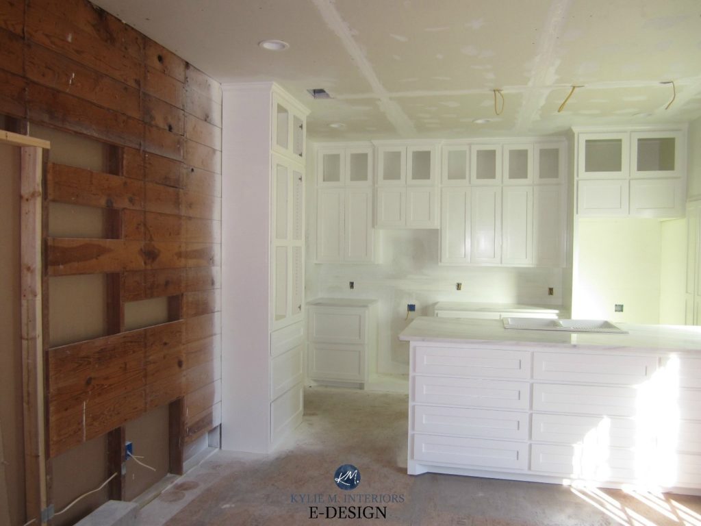
Simply White is a gorgeous white for kitchen cabinets. It’s fresh, but not stark white appearance is the perfect choice for a welcoming and bright kitchen! HOWEVER, if you’re a STICKLER for matchy-matchy whites, you might find it too warm for a traditional white/gray marble (countertop or backsplash) or white appliances. It’s also too warm for most white-base quartz countertops.
Simply White on trims, ceilings and doors
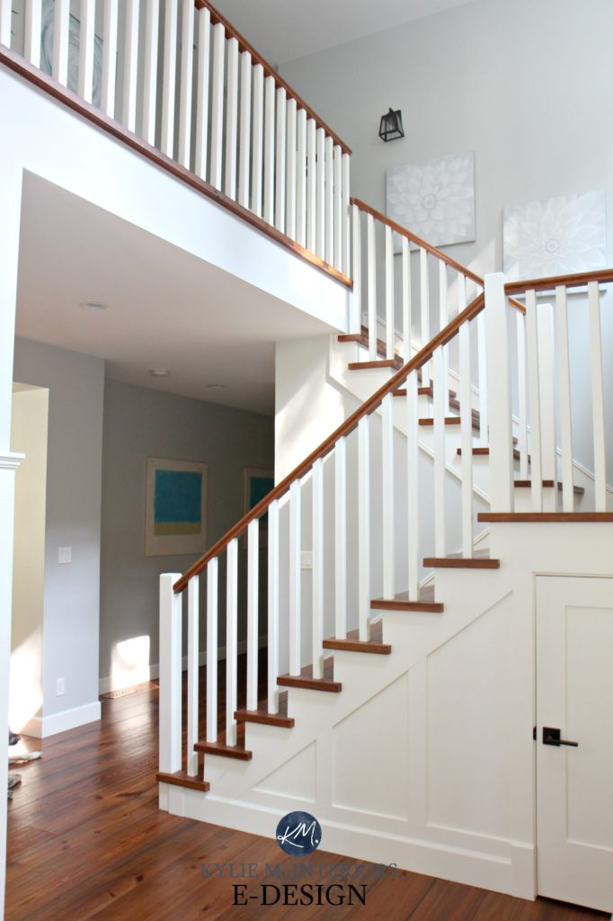
When choosing the right white for trims and ceilings it can hard to figure out which one will be best for BOTH. Well, stop that smoke from coming out of yer’ ears and take a close look at Simply White as in the absence of a TRUE white, it acts like white – without looking stark or cold. I’m also a FIRM believer in doing the same white on trims, ceilings and doors to keep those undertones consistent.
BTW, if you have Simply White on your trim and are wondering which white paint color to use on your walls, I HIGHLY recommend…Simply White. When it comes to whites, I prefer repetition, so you don’t have to worry about a mix n’ match look.
Is Simply White a good color for the exterior of a home?
It can be, but if you have white windows, you will notice that touch of yellow in Simply White when the two are up against each other. Simply White would sit better with black windows or I would choose a different white paint color.
What Sherwin Williams paint color is the same as or similar to Simply White?
When it comes to matching paint colors, you’ll never get the same look – there will always be shifts in undertone, depth and temperature. Most of the time I can find colors that have a LOT in common, however, there isn’t anything in Sherwin Williams that really compares…
- Sherwin Williams Alabaster – has a warmth to it, but more depth than Simply White
- Sherwin Williams High Reflective White – is bright, but doesn’t have that yellow
Want to see Simply White in action? Check out my video explaining MORE about this great white paint color!
Not sure which white is best for you and your home? I’ve got more!
THE 8 BEST WHITE PAINT COLORS
Read more: The 8 Best Benjamin Moore White Paint Colors
BENJAMIN MOORE CLOUD WHITE
Read more: Paint Color Review of Benjamin Moore Cloud White
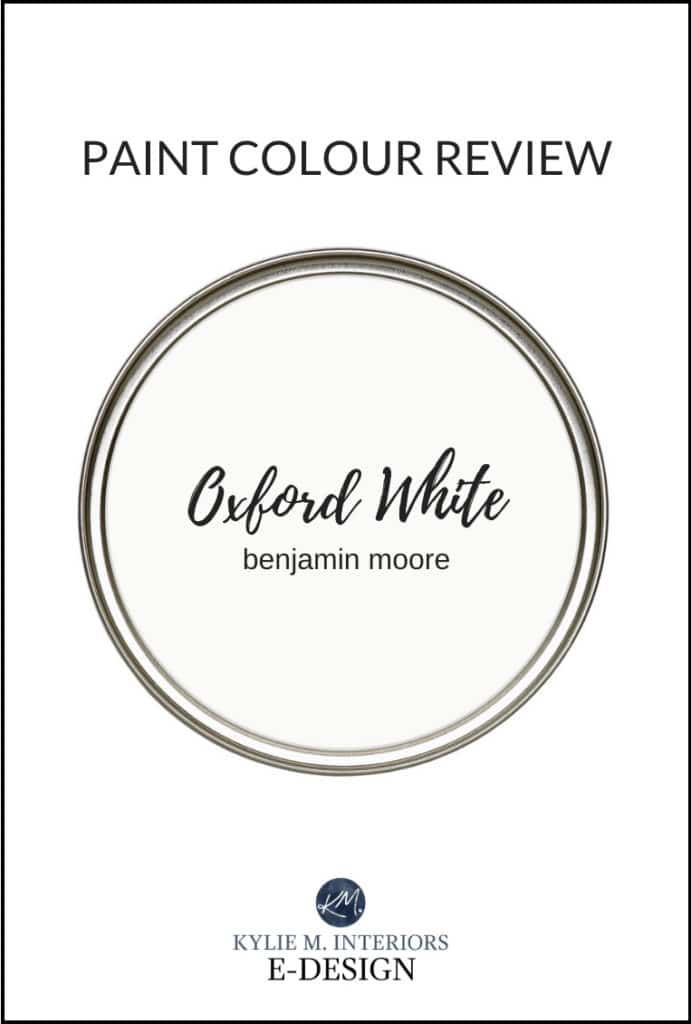
BENJAMIN MOORE OXFORD WHITE
Read more: Paint Color Review of Benjamin Moore Oxford White
Need help picking YOUR best white paint color?
Check out my affordable E-Design and Color Consulting Services
Chat soon!
READ MORE
The 3 Best Warm White Paint Colors
Should You Paint Your Oak or Wood Cabinets? A Questionnaire
The 8 Best White Paint Colors from Benjamin Moore
4 Tips on How to Pick Your Room’s Best White Paint Color
Originally written in 2017, awesomely updated in 2019
Comments
Leave a Reply
More Posts
The 12 Best Farmhouse Sinks of 2024

Trendy & Popular Paint Colors for Your Kitchen Island (Mixed Bag!)






The color is great………the problem is It takes too many coats to cover evenly. I have been painting for many years and this was by far the worst paint I’ve ever purchased in terms of how many coats it took to look good. Had to do 3 coats in both the bathrooms and bedroom so I am now fed up with this color. It’s the paint and primer in one and even after 2 coats you can still see the beige previous paint color. I have never had to paint 3 coats before with any previous paint. The color is great……..just too much work.
Author
Oh heck ya, I hear ya on that one! And don’t feel bad about your 3 coats, I had to do 6 in my daughters room – I was about to LOSE MY MIND (and even then, it’s questionable coverage)! The paint store (after the fact) said that adding 4 ounces of white to the can and doing 2 coats of quality primer prior to painting would have helped a lot. In general, whites can be tricky with regard to coverage. I had it colour matched into SW paint in the Opulence line. Next time I’m going to try it in BM Regal and see if I have better luck.
~Kylie
Hi Kylie! I’m thinking of painting my NW-facing loft in Simply White….its current gross yellowy-beige makes me want to curl in a ball and cry! In terms of darkness (tho not prettiness), the current color is somewhere along the same lines as Benjamin Moore Shaker Beige . Do you think the Benjamin Moore High Hiding Primer in white would cut out the beige so I could get away with just 2 coats of paint? I know it’s impossible to give a concrete answer, this is just my first time painting with “good” paint (aka not the cheapest thing at Canadian Tire) and I’m not sure if that’s a good primer to use — do you have any thoughts on it? Thanks!!
Author
Hi Charlotte! If there’s ONE thing I know about white paint, it’s that it doesn’t cover well…at all. I did Simply White in my daughters room over a lighter blue/gray colour and 6 coats later I was losing my mind. My BEST advice is this…
#1 – ask them to add 4 ounces of white to the gallon. This white won’t affect the ‘colour’ but will give your paint more of a backbone so that it covers better
#2 – do a coat of primer
If I’d done that I’m SURE I would’ve saved myself a lot of grief – you live you learn!
~Kylie
Hi Kylie!
Hope you had a fantastic holiday! I wanted to give you an update since I ended up going with Simply White based on this post. Using two coats on BM primer did make a big difference, it looks great after two coats of paint. Gorgeous color, my place looks 1000000000x brighter and happier (and that’s before I’ve got my art up!)!! Of course, now my white trim stands out and needs to be painted, but whatever — I’m just happy the pinky beige of sadness is gone. Thanks for your awesome advice, I’ll definitely be checking in for e-consulting for some of the other rooms in my home!
Hi Kylie! I’ve really enjoyed your interesting tip and ideas columns. Great information! We’re building so impossible to test drive colors. I’m running blind! I’ve decided on Simply White for the cabinets, (kitchen, bath, laundry rooms) and of course that would include trims and moulding through out the house… However, I just re-watched your video on Simply White and caught that it will gray out in a North facing room. Now I’m second guessing my decision and wondering if a warmer white like Cloud White or SW Alabaster would be a better choice. The room is large, approximately 24 by 30. There is a large 12′ window on the North wall plus 2 small narrow west windows. All windows are in the dinning and seating area, not the kitchen area. The kitchen island is 16′ from all the windows. So it might be considered a windowless kitchen. So my concern is that Simply White might seem dingy. Would it be better to switching to a warmer white, like Cloud White or SW Alabaster? I’m perplexed… Any comments will be really appreciated! Thanks!!!
Author
Hi Sheryl! You know, it will gray out a bit in the day via your northern exposure, but that same grayish will be thrown onto any lighter colour. I can’t say that Cloud White or Alabaster will be THAT much better. You’d almost have to add some considerable warmth, like SW Creamy. It still gets grayed out, but perhaps not as much. I have Simply White and Creamy in north facing spaces in my own home and while Simply White is a bit brighter looking, Creamy holds its warmth just a bit better….
Hi Kylie, Thank you! And thanks for the speedy reply too! I will check out SW Creamy! Maybe you can clear up a bit about Simply White for me… Would a North Facing kitchen like I’ve described, be considered a low light/low energy room (?) where Simply White can fall flat? It is because of the kitchen’s distance from the windows? Is that what the graying out refers to, falling flat? If so, why is Simply White considered a good choice for a North Room? And since all light colors will fall flat in northern exposures, would stained kitchen cabinets be a better choice? Thanks again.! And wishing you a “Happy New Year”! Sheryl
This was so helpful! I have tons of experiences just picking a color I like, putting it on the wall, and then spending the next two years hating it because of all the things you talk about in your posts- weird lighting, the sheen, how it changes in different conditions… all the things.
So. I have now decided that my strategy is to research the crap out of stuff online before I narrow down and choose. Which led me to you. You think about all the things I never do. Thank you for that.
I am painting a very large basement space with low natural light (two really small windows) and crappy artificial lighting (hoping to add pots but not just yet) and considering Simply White (along with White Dove, Steam, Decorators White so far… just got some samples). Given what you said about low light/low energy rooms, is this a bad choice? I’m also getting a little worried about whites because our drywall and texture isn’t the best and it might highlight that. Wanting a clean bright look. Thanks for thinking about all the things so I don’t have to!
Author
Hi Courtney! Simply White could work well OR the softer look of White Dove, as long as your lighting is ‘half-decent’. As for textured walls, generally darker colours are better for camouflaging damage/texture, but that would kill the vibe you’re going for, so YOU’ll want to focus on SHEEN! The more sheen there is the more flaws you will see in the wall, so I’d recommend a high quality matte finish. 🙂
Finally figured out the colors for our new build: BM’s Shoreline, Pale Oak, Silver Mist, and SW Sea Salt.
Would the ceilings in Simply White work well? My only concern is the hallway area which can be a bit dark.
(Shoreline).
All of our trimwork is to be stained wood, medium color in tone. I do love this white!
Thanks for helping me decide on my paint colors….big moment.
Kylie – Would you please comment on Ben Moore Chantilly Lace, how does it compare to Simply White? Looking at the formulas, it seems Chantilly Lace should be more “white” then the warmer white of Simply White, but do yo have any experience with it? Any input would be appreciated as I am trying to determine which white to use in a summer home, both on walls and trim, and I am going for a clean white look, yet not stark. Thank you.
Author
Hi Bridgette! Chantilly Lace is a popular one! It is a fresh white that is often see as the most ‘white looking white’, even though it can have a slightly cool cast to it. The difference is that Simply White has a slightly WARM cast to it. I actually just wrote a blog post that you might find helpful re: whites… https://www.kylieminteriors.ca/4-steps-pick-the-right-white-for-your-trim-cabinets-or-walls/
Hi Kylie!
My entire house is painted in “Agreeable Gray” and I’ve been wanting to paint our Master Bedroom and Guest Room in a soft white color- would you recommend Simply White or White Dove for this? I’ve been scared to do it b/c I didn’t want to accidentally choose a white that was too stark or coo and/or wouldn’t compliment the Agreeable Gray…
Thanks so much!!
Annie
Author
Hi Annie, White Dove could be pretty! I do have several articles on the Best White Paint Colours for both SW and BM. If those don’t help, I have an affordable and fun E-design service that I created for questions like yours! https://www.kylieminteriors.ca/online-decorating-design-services/
~Kylie
Hi. I have painted my new build Simply White. Some of the cabinets and doors look very yellow. I know the oil based will yellow over time, but I haven’t even moved into the house yet. Do you have any advice about that? I tried to attach pictures. I love the color on the walls. Thank you.
Author
Well, there is a difference in sheen, which could account for that difference. Walls are usually flat/matte/eggshell, whereas cabinets are often a satin or semi-gloss. Sheen can lighten/brighten AND enhance a colour, so it sounds to me like the undertones might have come up a bit more. The only other reason is if you had it matched into another brand…they match MIGHT not be bang-on?
Hi Kylie,
Thank you so much for your fabulous blog! OMG, I have learned so much and laughed a long the way. After 30 years we are finally redoing our kitchen and have decided to go with Simply White for our cabinet color, we live in Mukilteo WA and I didn’t want any grey undertones or a stark cold white since it is cold and grey here most of the year. I’m looking at Cambrian Black granite for our countertops, love the black/white contrast. Do you think the Simply White is a good choice with this granite?
Thank you so much!!
Mari
Author
Hi Mari-Ann! Due to the number of emails I get every day, I have to pick ‘n choose which questions to answer, focusing first on the ones that have mass appeal! I do try to give as much complimentary info as I can on my blog and if that doesn’t help, it might be time for a closer look with my E-design. Otherwise, I’m just guessing as to the lighting in the room, exposure, flooring and all of the other things that matter when choosing a colour! https://www.kylieminteriors.ca/online-decorating-design-services/
I hope to hear from you!
~Kylie
I love the simply white color!
I’m going to use it on my cabinets, and i was also going to use the same color on my walls.
Good idea, bad idea?
Author
That’s a great idea Emily! This way you’ll see a wee subtle shift in the sheens – totally a good idea!
Hi Kylie, you’re site has been so helpful in a long and maddening process :-). After 14 colors on the walls, we’ve decided on Coventry Gray. Would you suggest Simply White or Dove Gray for woodwork? We’ve got a ton of natural light from West windows facing water, High South windows and a few North windows, so Coventry looks fairly mid to light. We have a lot of white woodwork to be repainted. The living area has mid/light laminate and new soft mineral blue/green velvet sofas. The new paint spans an open floor plan that includes a very big kitchen with cinnamon maple cabinets and gray/black granite with small splotches of Burgundy. For the trim/woodwork, would you suggest Simply White or White Dove? We like a fresh transitional feel, but welcoming and not stark or cold. Thanks so much!
Painting oak kitchen cabinets going to have them sprayed
Torn between white dove and simply white as I was advised to go with a white when painting oak cabinets
I don’t want a yellow at all but both colors look good on painted cabinets in pictures
??
Author
Hi Kris! I would lean more into White Dove over Simply White just because the BOTH have warmth (yellow) in them, but White Dove is grounded with a neutral base. It can depend a lot on your countertop/backsplash/lighting as well, but of the 2, I’d hit White Dove AND I’d ask them to add 4-6 drops of white to each gallon, which just cleans it up a stitch AND improves coverage (and btw, you can paint oak cabinets any colour, but DARK colours can highlight the grain a bit more).
Hi Kylie,
You’re so amazing with understanding paint colors. I have a little more knowledgeable about paints now. I have a small single wide manufactured home. I’ve decided to go with ‘Simply White” on the walls. Since my house is so small, would you recommend I paint the cupboards and trim the same through the entire place or perhaps a different white for contrast. Would having contrast make my home appear smaller? Thanks so much.
Author
Hi Diane, I’m SO glad you asked – YES! I wouldn’t switch up whites as you’ll find the undertones can react in weird ways. You’ll get a wee shift just from the change in sheens from ceiling (flat), walls (matte or eggshell), trim (satin) and cabinets (satin). 🙂
Hello Kylie, . I have a question please if you have the time….I am painting a guest room with Farrow and Ball Pink Ground. I have two whites for ceiling and trim to consider: Simply white by BM or Wimborne White by Farrow and Ball. It seems to me the Wimborne White goes better and its a little creamier and less pure white. The room faces north. I think one of your posts said pink is not great with Simply White…. can you tell me your opinion of the Wimborne White with the Pink Ground of course knowing that its only a guess and you are not in the room and so forth. It is more vanilla toned and it seems a bit better. Thank you so much. I am going for a calm and restful mood. Margaret
Author
Hi Margaret! Ooo, I’m not as well-versed in F&B colours, but ‘generally speaking’ yellow and pink don’t love each other. I mean, there can be exceptions if it’s gone about in a gentle way, but it makes me darned nervous. I would say that if it’s less ‘yellow’ than Simply White – then that is a good thing, although the word Vanilla doesn’t leave me feeling hopeful on that…Looking at them both online, I DO like that they both seem that bit more muted and soft…
Hi Kylie,
I’m thinking of painting my oak kitchen cabinets BM Simply white, I have a Baltic brown granite countertop , terracotta floor tile and stainless steel appliances. Or would Chantilly Lace look better ? Thank you!
Author
Hi Kerri, you should read the blog post that I JUST PUT OUT as I talk about Baltic Brown right in it! https://www.kylieminteriors.ca/how-to-update-your-older-granite-countertops/
Hello!
I am trying to choose the prefect white for my home. I would like to keep it consistent throughout (walls,ceiling,trim) .
The colors in my home are dark browns (chocolate and darker browns ) black and gold.
I’m Not sure which white I should go with. What do you suggest?
Author
Hi Alicia, I would definitely stick with warmer whites, along the lines of BM Simply White for a brighter look and BM White Dove or Cloud White for a softer look 🙂
I have read so many of your articles!! I have a question. Our cabinet makers use Benjamin Moore paint and we chose simply white for the cabinets. I’m we have to use sherwin Williams paint for our walls,trim, etc. I want to paint my walls, trim, and ceiling the same white. I was thinking sherwin Williams pure white. Would these two pair well together?
Author
Ooooo, I would be careful. Simply White is a brighter and CLEANER white than Pure White. This could make Pure White look a bit dingy in comparison and Simply White look more YELLOW in comparison.
I have chosen chantilly lace for all my doors and trim and I’m trying to decide on a white to go on the walls. I’m thinking of simply white. Do you think that would be a good choice to add contrast?
Author
Hi Katrina, it depends on what you want! If you want to see the warmth of your walls, then yes, as Chantilly can help show that wink of yellow in Simply White.
I am going to paint my entire house Simply White, including trim. I’d like the kitchen cabinets to a pale grey or off-white. Do you have any ideas on what would go with Simply White?