
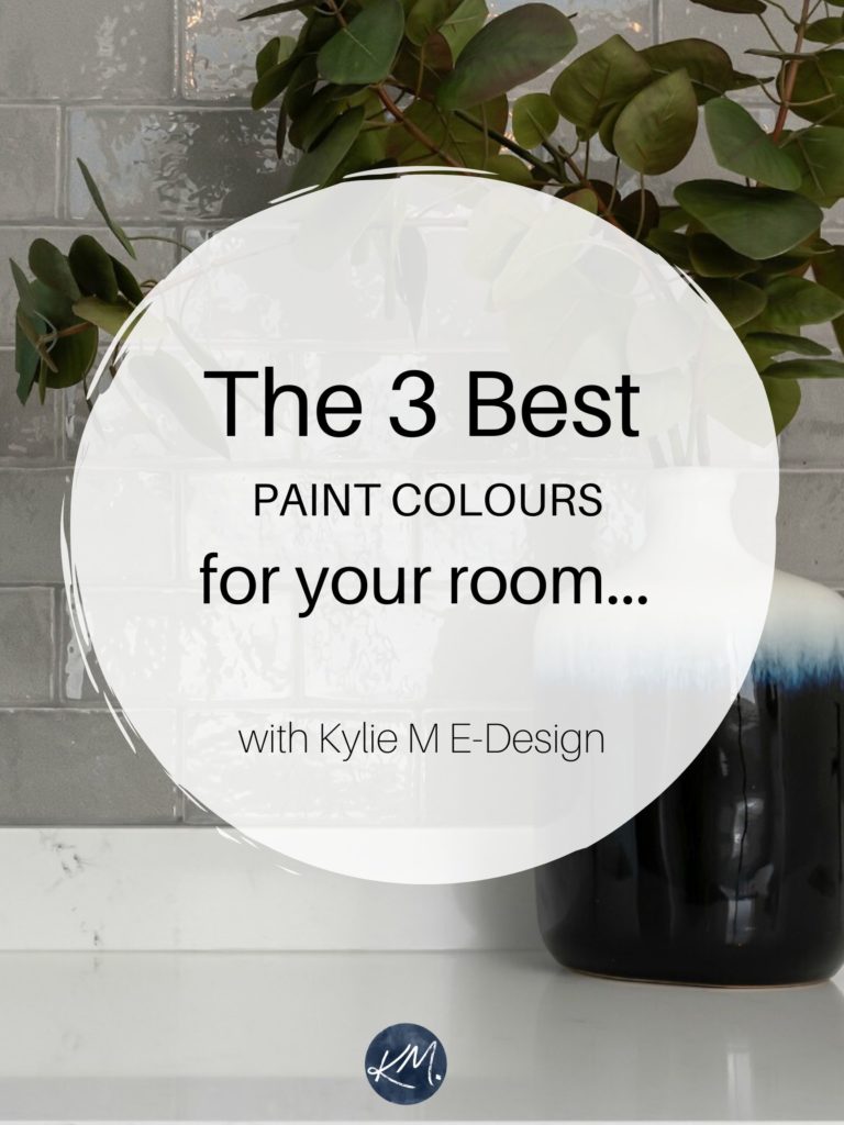
Posted on June 5, 2023 by KylieMawdsley
The Most Popular Dark Paint Colors – Benjamin & Sherwin
Are you looking for a color with more meat on its bones? Perhaps a dark wall color with some depth, drama, and personality? You’ve come to the right blog as I LOVE DARK COLORS! While I have many light rooms in my home, I have several SUPER dark rooms, as I feel quite comfortable in deep, moody hues.
But what MAKES a color dark? It’s not just what you see; it’s its LRV – light reflectance value.
This post may contain affiliate links. If you make a purchase through links on our site, we may earn a commission.
Every paint color has an LRV between 0 and 100. 0 is black, 100 is white. Now, in the residential paint world, this scale runs from 2 to 95, as we don’t have BLACK blacks or SUPER whites (just darn close).
Dark paint colors have LRVs between 2 and 10 (approx).
However, how dark a paint color is can also be open to PERCEPTION. What you see as a dark paint color, I might see as only moderately dark. So, we’re going to look at some wicked dark colors, as well as some medium-dark colors.
Medium-dark colors have LRVs between 11-20 (approx).
If you want to learn more about LRV, I’ve included a link at the end of this blog post. Now let’s talk about the TYPE of room you want to paint dark…
THE EVERYDAY ROOM
Do you have a relatively normal, everyday room that needs its butt kicked with some serious COLOR? Maybe it’s boring and has no defining features, or maybe its features are BEGGING for a darker accent color to pull them together. Or maybe it’s just little ole you wanting something fantastically moody on your walls.
These rooms are most often bedrooms, dens, and family rooms. However, I’ve had clients who’ve wanted something dark and dreamy in their living rooms and dining rooms – especially in older homes.
A DARK ROOM THAT NEEDS PERSONALITY
Do you have a dark basement family room or a kitchen or bathroom with no windows? Are you struggling to find a paint color that makes these rooms feel like an inviting part of your home rather than dismal dungeons of doom? COME TO THE DARK SIDE!
You might think that your dark room needs to be a light color to offset the lack of natural light. While this can work – and I have a blog post dedicated to this exact topic – you might be missing out on adding some personality and interest with a more deep and saturated paint color.
Why would you paint a dark room a dark color?
Dark rooms tend to have a lot of shadows and heavy corners, and many light colors look dingy and dirty in these low-light spaces. On the other hand, DARK colors LOVE shadows; they ABSORB shadows and tend to look even more stunning than they do on that weeee little paint chip.
‘But won’t this make my room feel dark and scary?’
If you have adequate INTERIOR lighting, no. The key to solving a dark room doesn’t just lie in choosing the right paint color; it’s in the lighting as well. With adequate lighting and the right decor, even a room with no windows and dark walls can feel inviting and unique in the day and cozy and intimate in the evening.
How to Fix a Dark Room – And it Ain’t With Paint!
If you DON’T have adequate lighting, no paint color will save you
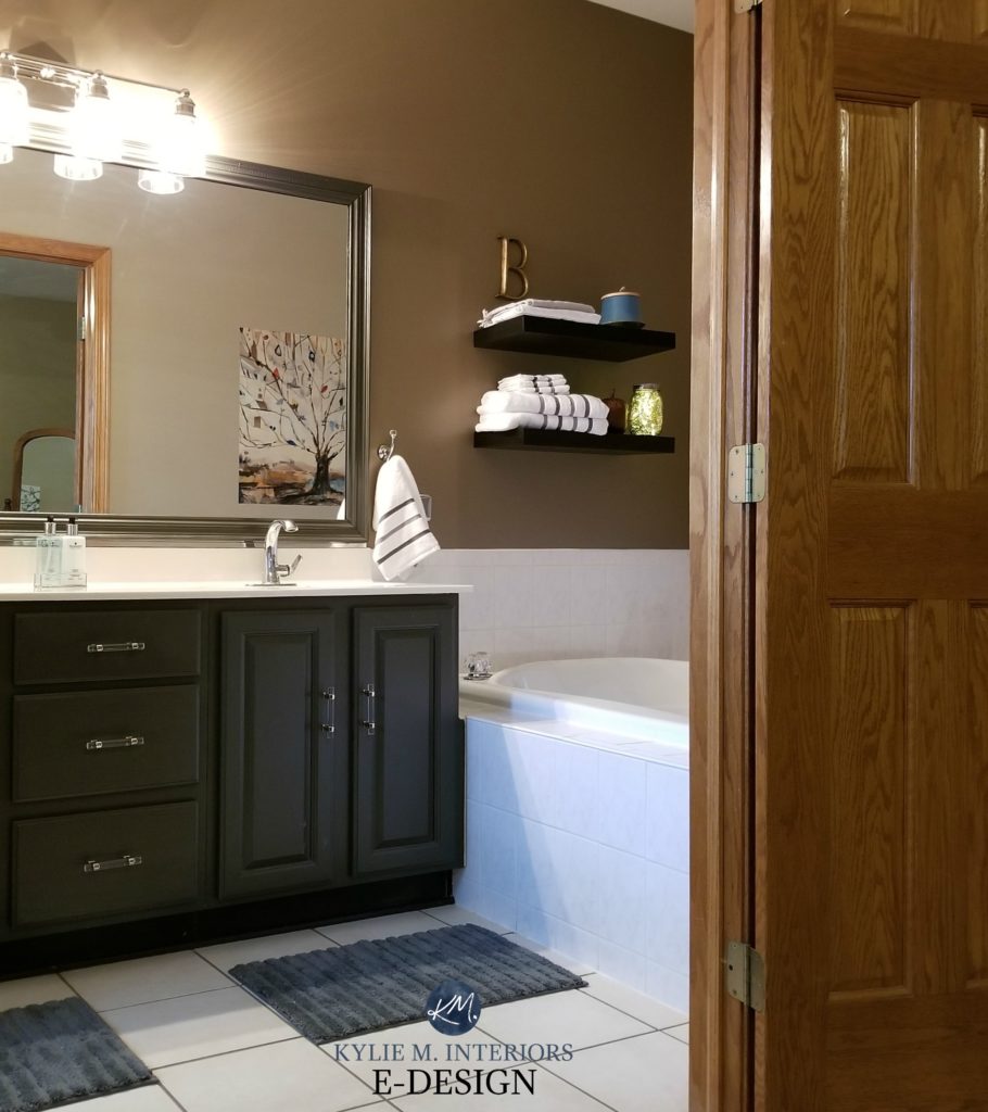
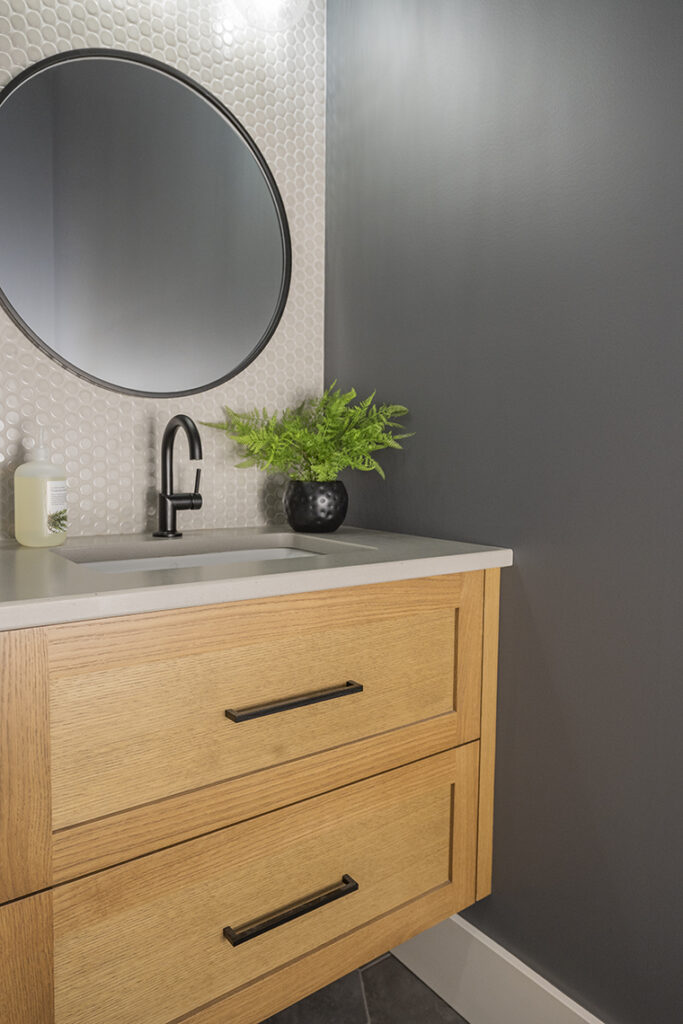
This dark bathroom looks gorgeous BECAUSE of the dark vanity and wall color!
At the end of the day, it doesn’t matter if your room is big, small, bright or dark, if you want dark walls, I’M HERE TO GIVE THEM TO YOU!
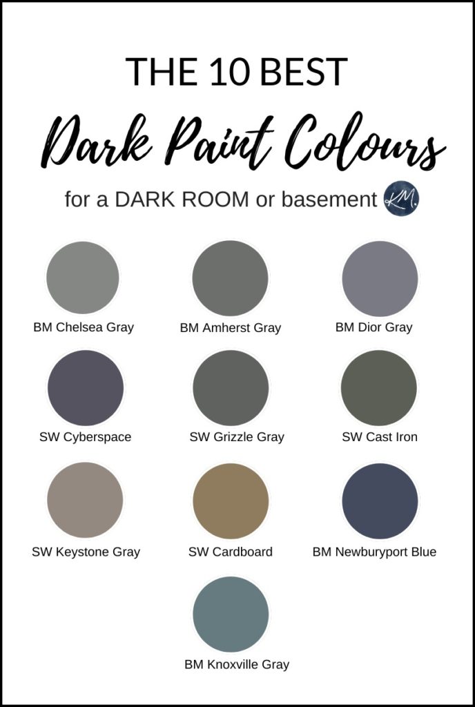
1. BENJAMIN MOORE CHELSEA GRAY HC 168
Hands down, Chelsea Gray wins the grand prize as the best medium-dark paint color, not just for normal rooms but dark rooms like basements and windowless spaces. It’s just the right depth and sits a smidge on the warm side of neutral compared to more cool-blue-toned charcoal grays.
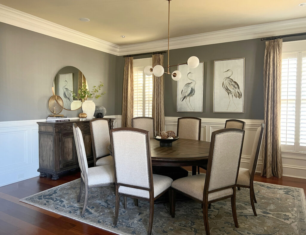
The above photo shows you how Chelsea Gray might act in a room with some but not TONS of natural lighting – particularly the right side of the wall.
Please note, to be authentic and have MASS appeal for the everyday homeowner, I only use images on my site from my Online Color Consulting clients (or my own home). I do the best I can with what I have so that you can get inspiration for your own home!
As shown in the photos above and below, white trim is a great way to amp up the visuals, as the CONTRAST will add a clearer definition of the walls.

- Chelsea Gray is like a ‘heavy medium-toned’ warm gray
- Chelsea Gray has soft undertones that are susceptible to picking up environmental cues. In some lights, Chelsea Gray can pick up just a barely-there green undertone, while in other lights, it falls into a slightly softer, warmer zone while STILL looking totally charcoal
- Chelsea Gray has an LRV of 23.5
How to Choose a Paint Color with LRV
2. BENJAMIN MOORE CHEATING HEART 1617
Cheating Heart is NOT for the faint of heart, so if you’re looking for a KILLER dark color, this is it. Cheating Heart is a mix of gray, black, and navy blue. It has an LRV of 8.97, so it ain’t messin’ around in the dark department. This dark shade of blue adds drama and interest to ANY space, but it also adds EMOTION to rooms that currently don’t give any feels.
Here’s Cheating Heart in a small powder room (one small window). One BIG improvement would be light fixtures that cast light out, not just down, with slightly higher Kelvins in the bulbs to remove the golden hue. Still, it’s pretty badass…
FULL Paint Color Review of Benjamin Moore Cheating Heart
If you happen to have built-ins or cabinets in your family room or bar area or a bathroom vanity that needs a little TLC, Cheating Heart is a great choice…
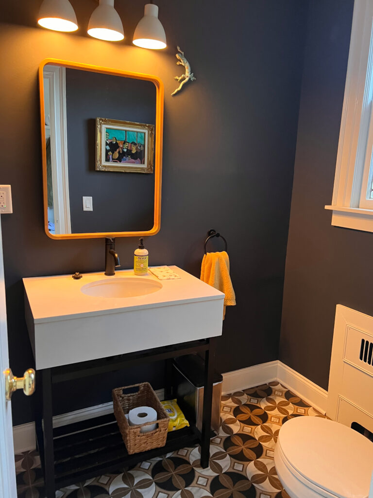
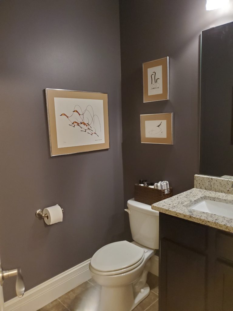
3. BENJAMIN MOORE STORMY SKY 1616
Stormy Sky is a seductively dark shade of gray (charcoal) with STUNNING violet-blue undertones. Many people fall for the wicked depth of Cheating Heart (myself included) but find it a touch too blackish in some conditions. Shifting to the lighter but still dark look of Stormy Sky provides visual interest without tipping the scales.
This next small bathroom (powder room) is in our home. It’s 30″wide x 84″ long, so there’s no room to spare. It also has NO windows, so it’s like a glorified closet that happens to have a loo in it. So, rather than painting it a light shade to make it look bigger (it would still look small, it would just look BRIGHTER), I decided to give it PERSONALITY instead!
With no natural light, to get a photo this good, we had to bring a professional photographer in.
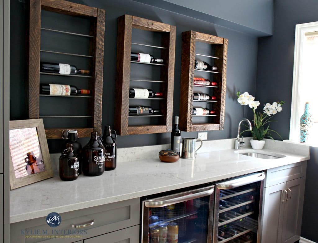
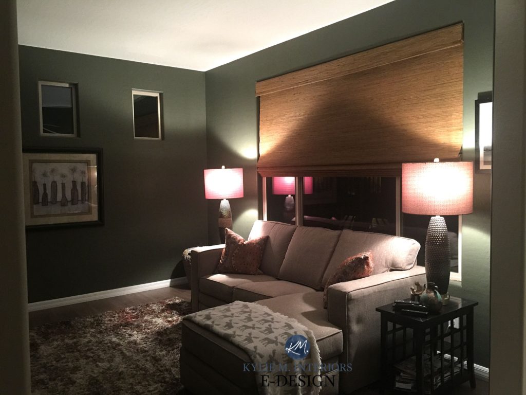
4. SHERWIN WILLIAMS CYBERSPACE SW 7076
Cyberspace is a color I used in my OWN home, so I had to touch on it for you! Cyberspace is a navy blue hue, but that blue is buried in a deep, calming bed of gray. The gray doesn’t take over, don’t worry, but Cyberspace is a more muted approach to this darker shade.
- Cyberspace has an LRV of 6 – BOOM, that’s dark!
- Cyberspace can look dark charcoal/blackish with super reduced light – just a warning
- If you want MORE blue to rise, then Hale Navy might be a better choice for you. Cyberspace is a wink more subtle with a stronger charcoal base
- In the above home bar, Cyberspace is partnered with Sherwin Williams Dovetail and Caesarstone Bianco Drift
- See other popular navy blue paint colors
FULL Paint Color Review of Sherwin Williams Cyberspace
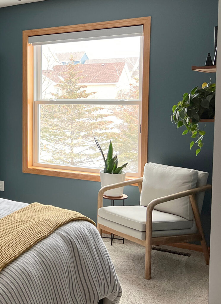
5. BENJAMIN MOORE KNOXVILLE GRAY HC-160
Knoxville Gray is a wicked cool, medium-dark, blue-green-gray blend. It has an earth-toned appeal without leaning into the warm, olive-colored greens.
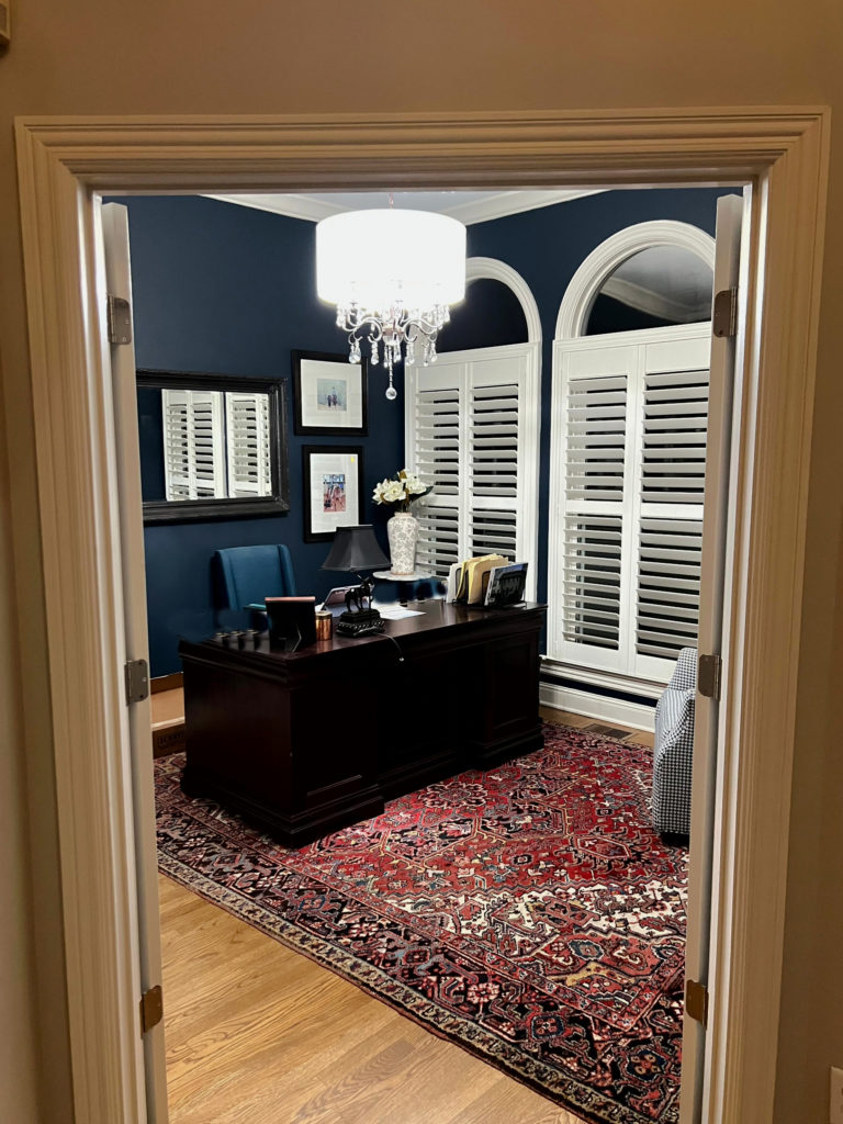
The guest bedroom above shows Knoxville Gray at its moodiest. The home office below shows it at its most colorful!
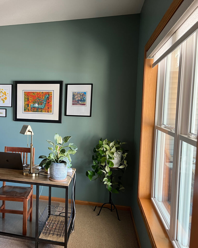
- Knoxville Gray has an LRV of 14, putting it well into the medium-dark range
- It can really sway depending on the room, sometimes looking a bit more blue than green or more green than blue – but never plain old gray
The Best Blue-Green Paint Colors
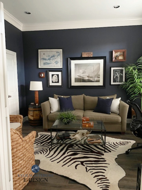
6. SHERWIN WILLIAMS GRIZZLE GRAY SW 7068
If you’re looking for a green-gray that doesn’t commit hard to either shade, Grizzle Gray is one of my FAVES – she’s a real moody Judy.
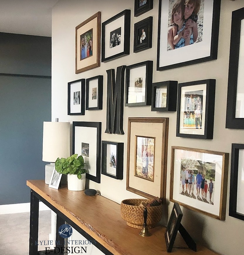
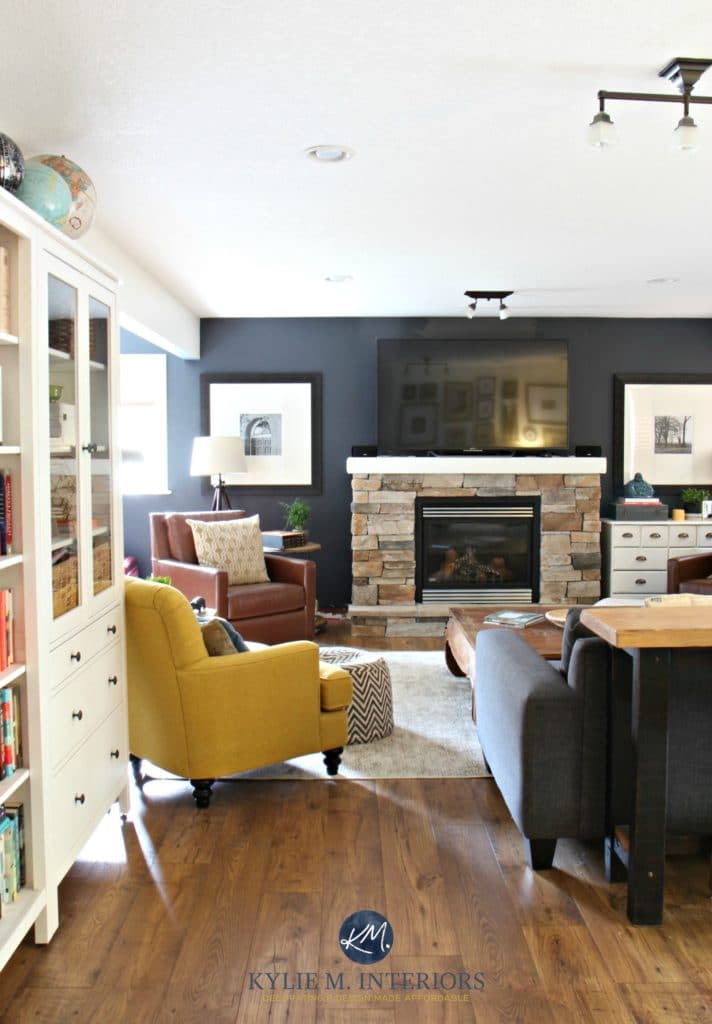
In the above photo, you can see a snippet of Grizzle Gray on the left, partnered with Sherwin Williams Colonnade Gray on the main gallery wall. With its LRV of 13, Grizzle Gray holds up well in a normal, reasonably well-lit room as well as a dark room.
- Grizzle Gray is a medium-dark green-gray blend. It’s not a WARM green, but it’s not icy cold
- If you don’t like green, don’t pick this color. While the green isn’t overwhelming, it’s noticeable
- Grizzle has an LRV of 13, so it’s got some SERIOUS meat on its bones!
- If you want a beautiful green-gray for your kitchen cabinets, Grizzle Gray is a gorgeous choice, especially with some of the older granite countertops
The 15 Best Steampunk & Industrial-Inspired Paint Colors
7. SHERWIN WILLIAMS GAUNTLET GRAY
Gauntlet Gray is a gorgeous color, whether for a low light room, basement, bright room, or accent wall – Gauntlet Gray DOES IT ALL!
Coming at you with an LRV of 17, Gauntlet Gray has some body and depth without the impact of some of the other shades on this page. This doesn’t mean it’s not WICKED DARK – in the world of grays, it is; it’s just not as saturated, offering a softer approach.
This windowless bathroom has personality with a dark paint color
Gauntlet Gray is a warm shade of gray with pretty darn non-committal undertones, making it so popular. It doesn’t lean into green or violet, so it’s more versatile than some other shades.
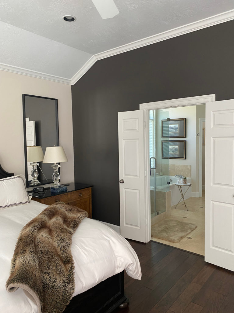
8. SHERWIN WILLIAMS URBANE BRONZE
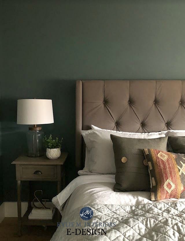
Urbane Bronze is a dark, rich approach to greige. Whereas some greige paint colors have little noticeable green undertone, Urbane Bronze is a more saturated shade. With its blend of gray, brown, and green, Urbane Bronze adds subtle warmth and TONS of interest to any wall, cabinet, or door. It also makes for a great accent wall, as shown in this bedroom with Benjamin Moore Maritime White walls…
Kylie M E-Design
- With an LRV Of 8, Urbane Bronze is pretty skookum (which is West Coast talk for substantial)
- Notice the rich depth and beautiful velvet appearance on the main part of the wall (which is why I always suggest a high-quality matte finish)
- While some people see Urbane Bronze as ‘too gray’ or ‘too brown,’ in the greige world, it’s RIGHT in the sweet spot!
- Urbane Bronze was the color of the year for 2021 and is still going strong
FULL Paint Color Review of Sherwin Williams Urbane Bronze
Sherwin William’s Best DARK Greige Paint Colors
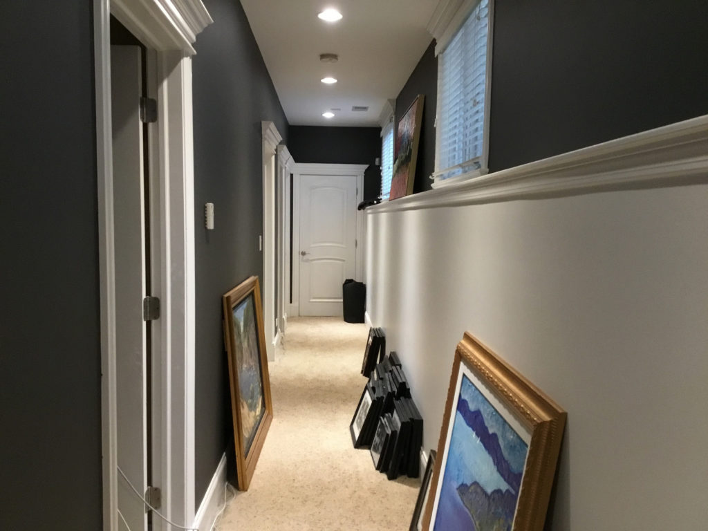
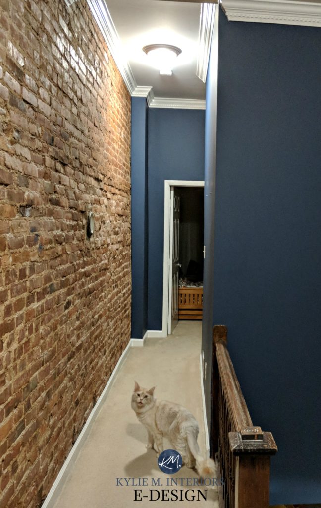
9. BENJAMIN MOORE GRAY 2121-10
Gray (you need the number 2121-10 to order it) is a classic darker shade. With a wicked low LRV of 11.5, Gray is a softer, muted approach while adding serious drama to your walls (or cabinets).
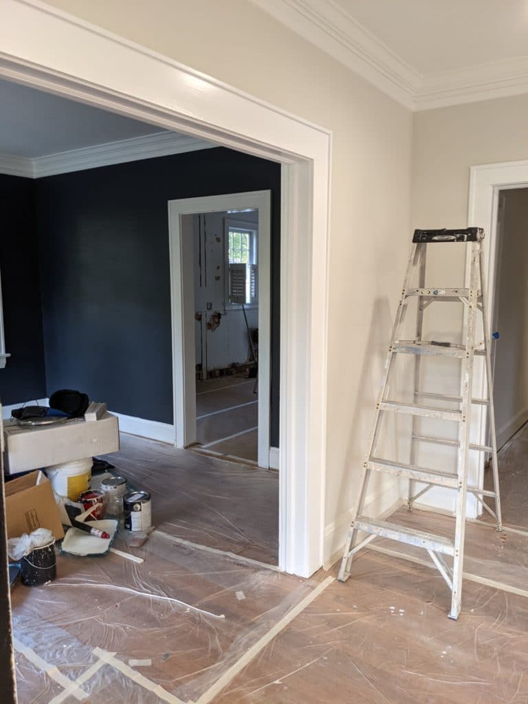
As shown in this dark hallway, and with some previous examples, dark colors respond well to CONTRAST via white trim, doors, wainscoting, or otherwise…
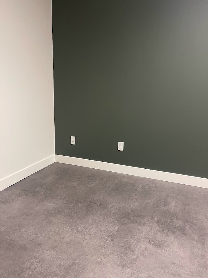
10. SHERWIN WILLIAMS PEWTER GREEN SW 6208
If you’re pining for a dark shade of green, Pewter Green is a great way to satisfy your need for green without dipping into the green-black range.
This is because Pewter Green has an LRV of 12, putting it at the top of the dark range, with a bit less visual weight than darker shades of green. As shown in this commercial space below, with NO windows, Pewter Green does a great job of adding drama without tons of visual weight…
If you love Pewter Green but want a BIT more warmth for your cozy basement or family room, Sherwin Williams Cast Iron is a similarly dark shade of green with a bit more brown tucked deep inside, giving a slightly more olive-toned look…
Looking at the bottom right of the above photo, you’ll see the rich green ‘color’ rise, whereas it falls back in the darker areas. Keep in mind, this room has VERY…LITTLE…LIGHT, and it looks wicked gorgeous.
The 13 Best MEDIUM TO DARK Green Paint Colors
SAMPLIZE offers peel-and-stick paint samples that are more AFFORDABLE, EASIER, and more ENVIRONMENTALLY FRIENDLY!
- Samples arrive ON YOUR DOORSTEP in 1 DAY
- They’re more affordable than the sample pots/rollers/foam boards that are needed for traditional paint sampling
- THEY’RE MADE WITH EACH BRAND’S REAL PAINT!
Visit the SAMPLIZE website HERE
11. SHERWIN WILLIAMS IRON ORE SW 7069
We can’t talk about dark colors without touching on Iron Ore.
Iron Ore is a soft black paint color. It’s not as dark as a traditional shade of black but is NOT a dark gray, either. Iron Ore is one of the more dramatic approaches on this page and is sure to get your friends talking.
Iron Ore has a KILLER low LRV of 6 – I LOVE IT!
- With a barely-there, soft green undertone, Iron Ore is an intriguing color; it isn’t simple like some more predictable shades of black.
- Iron Ore can be wrapped around an entire room, used on doors, or as an accent wall
12. BENJAMIN MOORE HALE NAVY HC 154
If you’re looking for a classic shade of navy blue – not primary blue, but not super grayed-out either, Hale Navy could hit the spot.
While some blues come on strong, Hale Navy has enough blue to make its point without being overbearing or overwhelming.
- Hale Navy has an LRV of 8.36, so while it’s DARK, it doesn’t fall too blue-black.
- If you have a darker room, Hale Navy should have enough ‘color’ to rise, whereas more grayed-out blues can disappear a bit – make sure you have decent lighting
13. BENJAMIN MOORE NEWBURYPORT BLUE HC 155
I have MAD love for the darker approach of Hale Navy, but it can sometimes sit a wink heavy in a dark room if the lighting situation is less than stellar. If you bump it up to Newburyport Blue, you’ll see a bit more of the blue while getting the benefit of a super dark shade.
And it would have been DAMN dark in this dark hallway had they not added a central light with some decent wattage to it. All the same, on the far right, notice how the blue of Newburyport still shows up to the party…
- Newburyport Blue has an LRV of 8. Not sure what LRV is? Read here
- Newburyport Blue is a great way to nod toward navy without going into the primary range
- Check out 11 other beautiful shades of blue
DON’T FORGET!
There are a few other things to think about before you finalize your paint color…
WANT TO LEARN ABOUT LRV? The Ultimate Guide to Choosing Paint Colors with LRV
WHAT’S YOUR ROOM’S EXPOSURE? North, East, South, West: Which Paint Color is the Best?
LOOKING FOR A LIGHTER COLOR? The Best LIGHT Paint Colors for a Dark Room
LET ME PICK YOUR COLORS FOR YOU!
Check out my Online Color Consulting!

ORIGINALLY WRITTEN IN 2018, COMPLETELY OVERHAULED IN 2023
Comments
Leave a Reply
More Posts

The 5 Best Creamy White or Off-White Paint Colors
THE ELUSIVE ‘CREAMY WHITE NEUTRAL’ When it comes to light, warm neutrals, it’s all in the undertones. And other than pink and green, yellow is the undertone many of my
Read More

The 8 Best Warm Neutral Paint Colors With NO Yellow Undertones!
The Top Light Depth, Warm Colors That Aren’t Cream! When choosing the best warm neutral paint color for your home, whether creamy white, beige, taupe, or greige, your choices are
Read More

The 12 Best Farmhouse Sinks of 2024
FIND YOUR DREAM SINK HERE… While traditional farmhouse design was all the rage in previous years, the embers have definitely cooled. As for MODERN farmhouse, it’s still kickin’ its cowgirl
Read More


Hi, I’ve been losing sleep trying to figure out whether to paint my entire North-West Facing, kinda dark master bedroom with all Chelsea Gray walls. I have high, angled white ceilings to help but when I painted a swatch of Chelsea Gray, it looked super dark and not at all mid-toned. The afternoon sun helps a bit to make it warmer but generally, it’s a pretty dark room. HELP! My other choice is Coventry Gray, which seems to look pretty in every light this room offers. However, I REALLY wanted that dark gray bedroom look so I can do a white colored bed and picture frames that pop off of the dark color. Thoughts?
Author
Hi Kosin, Chelsea Gray will look that bit darker when there isn’t a ton of light coming in, but it’s very stunning which is why it’s so popular. You could consider lightening it by 25% if you want to take a bit of the edge off, without having to go to a lighter gray like Coventry.
Hi Kylie, I’ve drawn so much inspiration from your site! We are about to repaint our entire basement, which is not a walkout and therefore does not get much natural light. Although I appreciate your post above about going for darker colors, would you have any lighter grays that you would recommend for a basement? We’ve been looking at SW’s Repose Gray, Benjamin Moore’s Moonshine and Classic Gray, and Behr’s Silver Drop. A lot of these color choices are based on the fact that I couldn’t decide between going all white, or going gray to be consistent with our upper floors (I don’t know what gray it is but I feel it is too cold of a gray up there). We want a clean, modern look, but want it to be warm and inviting as well without too much taupe underlay. I’m also worried my listed choices will look dirty or shadow-y in our basement as per your post above. Help?? Thank you!
Author
Hi Virginia, you have a right to be worried, basements can be tricky! YOu might want to check out my E-design, this way I can take a look at your flooring, lighting situation, etc… and come up with some solutions, otherwise I’m just guessing at what it all looks like! If that interests you, it’s affordable and fun! https://www.kylieminteriors.ca/online-decorating-design-services/
~Kylie
Argh! We just moved into a 130 year old farmhouse and it desperately needs a breath of fresh air into it. At the minute it has all dark greys, tans and browns on every wall, so I thought I would dare to go with whites. Soft and fresh is the vibe I was going for. My furniture is cream sofa with black accent chairs. I just painted the livingroom walls, trim and doors White Dove by BM but its really pulling yellow! It feels like I’m sitting in a bowl of french vanilla ice cream!! I have a large south facing window as well as a smaller west facing window thats under a covered porch. I tried changing the type of light bulbs, praying that would help, but nope, looks like I have to drag the paint supplies back out. Help!!
Author
Hi Cathy, that is not good! I’m wondering if you have southern exposure! Ahhh, yes, I just read that you do – that can definitely affect things. I do have a fabulous E-design service, so I can look at your room and come up with some colour ideas that will work.
Otherwise I”m just guessing on what exactly the room looks like! It is affordable and fun…https://www.kylieminteriors.ca/online-decorating-design-services/ You might also want to check out my blog post on the 8 Best Benjamin Moore White Paint Colours https://www.kylieminteriors.ca/the-8-best-benjamin-moore-white-paint-colours-undertones-and-more/
~Kylie
I support the premise that dark rooms need darker, saturated colors. If one has to turn the lights on eery time entering a room, you want to be greeted by color. We downsized to a 70’s ranch. The first floor has amazing light (south to north) and I chose B.M. Ice Formations for the public areas. The wide staircase leads to the lower level (sounds more sophisticated than cellar), but it is seen as you enter the front door. I hung a gorgeous lantern in the stairwell. So far, so good, but once at the bottom of the stairs there is darkness and the ceiling filled with drop boxes holding the plumbing, etc. I bit the bullit and painted walls and ceiling Raccoon Hollow. Taupe leather sofa and a red lacquer Chinese wedding cabinet were my inspirations for the rest of the furnishings. What would the rooms look like if I did all white? Just what you said in your presentation above. There would be loads of shadows, not only in the corners of the rooms, but all over the ceilings from the drop boxes.
Thanks for all your information. You are my go-to when deciding on colors.
Don’t forget SW Griffin. I could paint the whole house that color, I love it so much. And, throughout the day, it changes color. Thanks for these suggestions. Do you think SW Down Home is similar to Cardboard? Thanks, take care.
Hi! I have a room that we are turning into a bar/whisky lounge. It has a south facing window and west facing window. I am going for a dark and moody look. Do you have any paint colors you would recommend?
Author
I do love SW Cyberspace for this look!