How to Make a Dark Room Look Lighter & Brighter
Back in the day, a dark basement with wood paneling, orange shag carpet, and a faint musty smell would leave many homeowners hot to trot. These days, homeowners are focusing more on light, fresh, and updated when it comes to their dark basements, family rooms, windowless bathrooms, and gloomy rooms, and gloomy rooms.
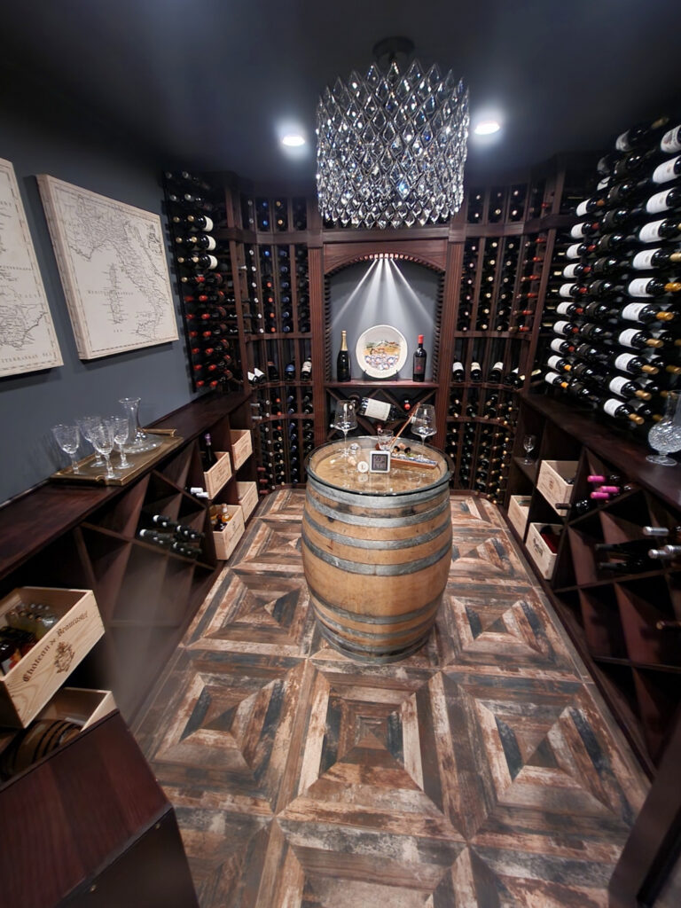
Of course, there are always exceptions. Some of us (myself included) love DARK colors, so I wrote a blog post about the best DARK paint colors for a dark room, geared towards those who want a cozy retreat for a wine cellar, movie viewing, or a dude hangout. But don’t worry- we’re not going heavy in this one.
LET THERE BE LIGHT!
But before we dive into colors that light up your life, let’s have a little chat (let’s be honest, I don’t do little chats; I do BIG ONES).
HOW TO LOVE YOUR DARK ROOM
Whether it’s a dark basement family room or a bathroom with no windows, low-light rooms can be challenging to choose paint colors for. You can try to make them look brighter with a light paint color and well-chosen furnishings and home decor, but if you don’t have enough interior lighting, it won’t work.
Why?
Oh, I love getting a chance to say this…
No paint color will save you if you don’t have enough natural or artificial light.
Why won’t a light paint color be the ultimate fix to a dark, gloomy room?
You can have a dark space that appears ‘bright, light and fresh’ with good lighting and a light paint color; however, you’ll need the right furnishings to support it visually, or it will look boooooring.
What does this mean?
Colors with depth and body are usually more interesting than light, subtle shades like white. You can have a room painted a super dark color with minimal furnishings, and it can have a personality of sorts. However, paint the same room a super light color with minimal furnishings, which looks void of life.
This means that a room painted a light color needs adequate well-coordinated furnishings and accessories to supplement a lack of personality and color on the walls.
IDEA 1: CONSIDER A DARK COLOR FOR YOUR DARK ROOM OR BASEMENT
I’m about embracing the home you have, not the one you WISH you had. While you can definitely do this with light colors (and are welcome to jump down to the color list below), before you do, I encourage you to THINK about using a darker shade in your dark room.
Dark colors, either neutrals or actual ‘colors,’ are a great way to give personality to a dark space. Again, if you don’t have the right furnishings to support a light paint color, a darker shade could give your room just the personality it needs! Sure, your room will still be dark, but it will be PURPOSEFULLY dark and could look really friggin’ cool.
PERSONALLY (so this is about me, not you), I’d rather have an interesting and slightly dark space (that I would fix with good lighting and other tricks) than a boring bright one. So, what this really means is that…
You don’t have to paint your walls light and white to make a dark space feel good
The 10 Best DARK PAINT COLORS for a Dark Room
2. CONSIDER AN ACCENT WALL IN A DARK ROOM
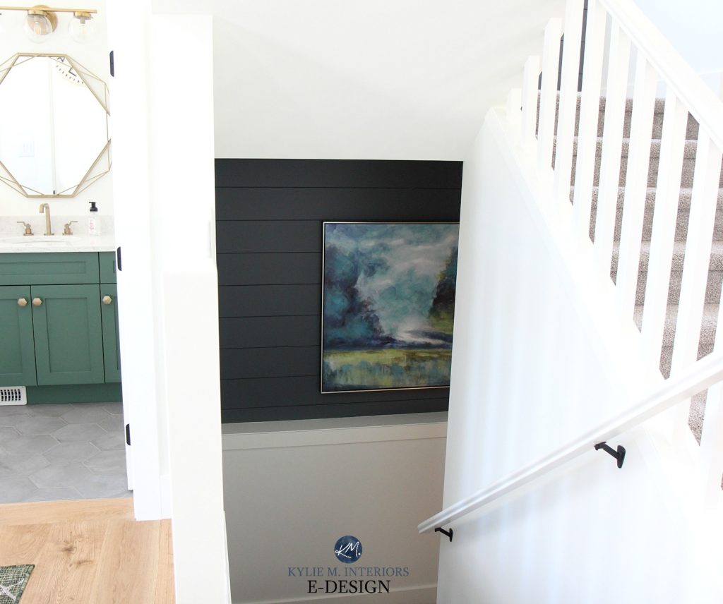
If you want the best of both worlds, consider painting your main walls white or off-white and adding an accent wall for depth and personality! An accent wall is usually on a wall with a main function, e.g., the headboard wall in a bedroom or the TV wall in a family room or basement. However, even hallways can be great spots for feature walls!
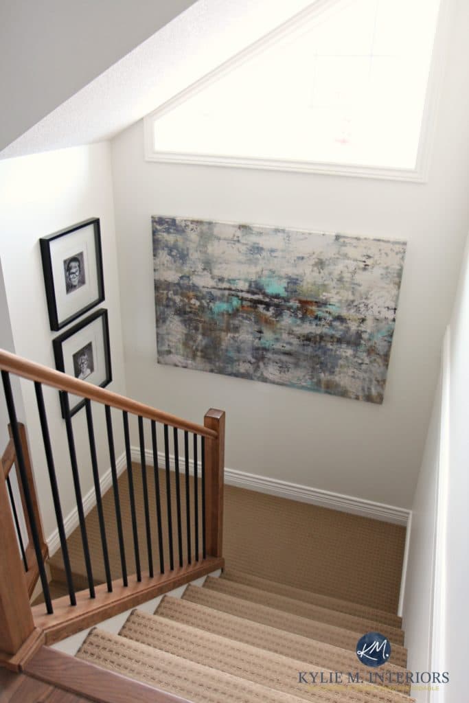
It’s not only the CONTRAST between your main walls and the accent wall that adds interest; adding COLOR is also a great way to avoid boring white walls, as shown on this dark stairwell landing…
See the whole home HERE
The above staircase is still dark…but now it has PERSONALITY.
Kylie, I hear you, but I want to paint ALL of my walls a light color.
For those looking for light colors (which is what this blog post is about), the most IMPORTANT thing to remember is that YOU NEED GOOD LIGHTING! If you don’t have pot lights or ceiling mount fixtures, invest in floor and table lamps with white or off-white shades to amp up the volume! Amazon sells battery-powered wall-mount lights, so there’s no excuse!
By the way, I don’t stop talking in real life, either.
I realize some of the photos below aren’t necessarily dark rooms. I rely 100% on my Online Paint Color Consulting client’s photos (I don’t ‘borrow’ from other Creators), so sometimes I can only show you the color as I’ve got it!
THE TOP SHADES OF WHITE/OFF-WHITE FOR A DARK ROOM
What is the one consistent feature of ALL light paint colors that are good for dark rooms?
They ALL have a high LRV.
LRV stands for Light Reflectance Value. This runs on a scale of 0-100 in the scientific world, but for the rest of us in the ‘useable paint world,’ it runs from 2 (which is black) to 94 (the brightest shade of white available to the residential market).
The first four colors listed below have LRVs above 80, making them shades of white or teetering between white and off-white. I’ve included a few extra colors for you to peruse – or, more importantly, they’re NEUTRALS, but they’re shades with a bit more depth. While I’d love to show you actual COLORS, I’m trying to appeal to the masses with this blog post! Stay tuned for a more colorful approach in the next few weeks.
1. SHERWIN WILLIAMS ALABASTER
Alabaster is a warm shade of white and one of the best paint colors for a dark room. While there are many beautiful warm whites, I suggest Alabaster for a dark room because of its softness and warmth.
Sherwin Williams Alabaster walls and trim
For example, I LOVE Sherwin Williams Pure White. It’s a warm white but SUPER PASSIVE in its approach to warmth. The challenge is that in a dark room, Pure White can look a bit chalky simply because it doesn’t have enough warmth to overpower a lower, potentially grayer light.
On the other hand, compared to a more muted white like Pure White, Alabaster helps battle a low-light room with its subtle undertone and gentle warmth.
Sherwin Williams Alabaster walls, Extra White trim
COLORS THAT ARE SIMILAR TO ALABASTER
What makes Alabaster so special is its creamy white, sitting close to the border between white and off-white. Some people see it as being too creamy to be white; others see it as too white to be cream! And while none quite compare, sample a few colors with similar approaches…
- Benjamin Moore Cloud White is a creamy white with a brighter take on it. With its LRV of 85.05, it’s lighter than Alabaster and a TOUCH less colorful. Cloud White was super popular in homes in the 90s and early 2000s, as it suited many of the finishes from these decades. Its popularity still holds strong for those who love a creamier approach to white.
- Sherwin Williams Greek Villa is lighter than Alabaster, with an LRV of 84. It’s also a bit cleaner, with a bit less gray. This means that Greek Villa’s yellow undertone shows up a wink more.
FULL Paint Color Review of Sherwin Williams Alabaster
2. SHERWIN WILLIAMS CREAMY SW 7012
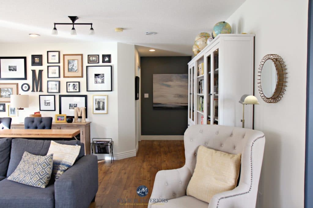
Creamy has a beautiful, soft warmth without turning obnoxiously yellow. Its LRV of 81 puts it at the top of the off-white range but borders on the creamy white world. A more muted, toned-down cream risks making your walls look dingy and dirty if your lighting isn’t adequate – even Creamy can be borderline, but it’s a GREAT place to start.
The family room shown above has Creamy on the main walls. The dark hallway behind it could be a basic, boring transition area. Instead, it has PERSONALITY via a dark gray accent color – Benjamin Moore Gray 2121-10.
COLORS THAT ARE SIMILAR TO CREAMY
If you like Creamy but want to explore shades that are a bit lighter, darker, or more colorful, here are a few to check out…
- Sherwin Williams Dover White is a touch stronger (more yellow) and lighter than Creamy, with an LRV of 83. Of the two, it’s also more likely to pick up a wink of green, but only if its surroundings support that. Read Dover White’s FULL COLOR REVIEW.
- Sherwin Williams Casa Blanca is a beautiful shade of cream. If Creamy is a bit too flat for your space, Casa Blanca has a stronger yellow-cream hue, with a touch more orange in its backdrop (which makes for a SUPER gorgeous shade of cream). Casa Blanca has an LRV of 76, which a darker room can usually handle because of Casa Blanca’s INCREASED level of color (chroma). Read Casa Blanca’s FULL COLOR REVIEW.
- Benjamin Moore Sugar Cookie takes things up a notch in color and brightness compared to Creamy. With an LRV of 85.89, Sugar Cookie is well into the white range but has far more color (yellow-orange) than Creamy or any traditional shade of warm white (meaning it’s great for walls but not as great for trims and cabinets.)
FULL Paint Color Review of Sherwin Williams Creamy
3. BENJAMIN MOORE WHITE DOVE OC-17
Benjamin Moore is my PERSONAL choice for our home’s dark rooms and hallways. White Dove is a soft, warm white, which makes it sound similar to Alabaster. However, White Dove is a bit lighter, with an LRV of 83.16. White Dove is also LESS warm, so it has less yellow-cream. So, if you’re nervous about yellow undertones but understand you need a BIT of them for this type of warmth, White Dove could be a great fit for your low-light basement or family room.
The Best Paint Colors for a Dark Hallway
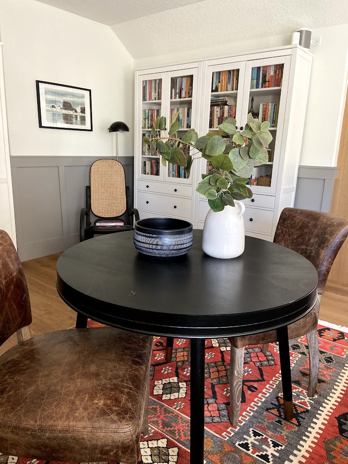
In this next photo, note the warmth of the White Dove walls compared to the Ikea Hemnes bookcases (which might be closer to a true white)…
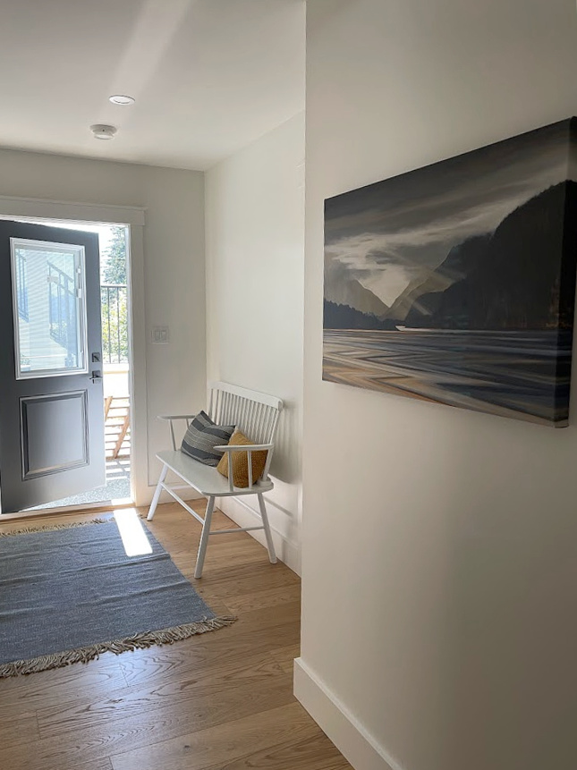
I could’ve edited this next photo to look brighter for you, but the point is to show you how it REALLY looks, which is also why I only use photos from my Online Color Consulting clients.
The back door is open, letting in some natural light, but you can imagine how dark it would be with the door closed and only the recessed lights on. If I cared (which I don’t, as this is just a transition space, and the pot lights are enough), I would add some wall sconces. However, I would definitely need to improve my lighting plan if it were a functioning room.
Benjamin Moore White Dove walls, Revere Pewter wainscoting & trim
FULL Paint Color Review of Benjamin Moore White Dove
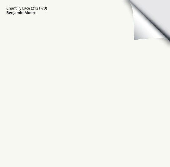
4. BENJAMIN MOORE CHANTILLY LACE OC-65
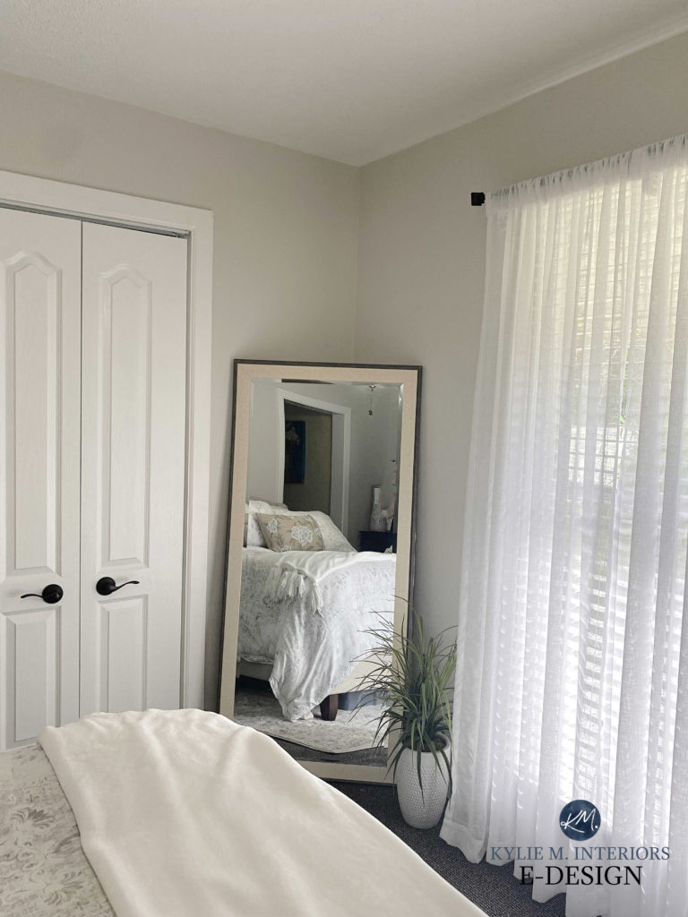
Chantilly Lace is a stunner if you want a bright white for your dark room. With an LRV of 90.04, it’s brighter than the previous three and will bounce that bit more light around (whatever light it’s given).
And while the previous shades of white were more noticeably warm, Chantilly Lace has only a wink of warmth, reading more like a true white than a soft, warm white. It’s NOT a true or crisp white, as there are whiter options, but the touch of softness in Chantilly Lace makes it so appealing for a dark room or basement.
The 3 Best Warm White Paint Colors from Benjamin Moore
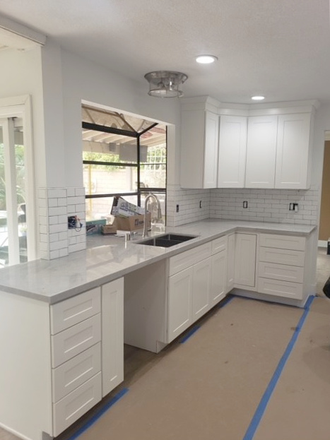
Even though this next kitchen could be a bit dark due to the overhang outside the window, the recessed lighting, combined with Chantilly Lace, brings this space to life…
Compare the last two photos and notice how different Chantilly Lace looks in the different qualities of light. This is because the exposure of the rooms, the amount of light fixtures, and the KELVINS of the light bulbs likely differ.
PAINT COLORS THAT ARE SIMILAR TO CHANTILLY LACE
In the white world, Chantilly Lace was a creature unto itself. That is until Sherwin Williams came out with its Designer Collection – full of BEAUTIFUL, versatile shades of white. But first, let’s start with Benjamin Moore…
- Benjamin Moore Simply White is similar to Chantilly Lace as it also has a higher LRV (89.52). Where they differ is that Simply White has more warmth with its yellow undertone – making Chantilly Lace look almost cool in comparison!
- Sherwin Williams White Snow is another brighter shade of white. It has the SAME LRV as Chantilly Lace – 90, making them both bright but still not TRUE shades of white. The difference is that White Snow has just a wink of warmth that you don’t necessarily see at first glance but shows up when you directly compare the two.
- Sherwin Williams Cheviot is a TOUCH warmer than White Snow and Chantilly Lace. With a similar LRV (89), this bright white has a soft yellow backdrop – not as noticeable as Simply White, but not as passive as the others.
FULL Paint Color Review of Benjamin Moore Chantilly Lace
SAMPLIZE offers peel-and-stick paint samples that have CHANGED the way I sample paint.
- Samples arrive ON YOUR DOORSTEP in 1 DAY, depending on the location
- They’re more affordable than the sample pots/rollers/foam boards that are needed for traditional paint sampling
- THEY’RE MADE WITH EACH BRAND’S REAL PAINT!
Get your PEEL & STICK SAMPLE OF CHANTILLY LACE HERE!
Shall we go a BIT darker?
The above colors are all white except for Creamy, which sits on the edge of the off-white and white worlds. Once we dip into the legit off-white range, we must pay attention to CHROMA, or the ‘degree of COLOR you see.’ As mentioned earlier, colors can rise above the shadows better than neutrals. So, while there are many off-white neutrals that I MADLY love, many of them will look dingy in a dark room.
HOWEVER, ‘colors’ aren’t as popular in dark rooms – y’all loooove your neutrals. So, while these next colors are worth exploring, remember that to PREVENT them from looking dingy and dull, you need to improve your lighting – otherwise, you should paint your walls a darker shade, or at least stick with the whiter, brighter shades.
The 5 Types of White Paint Colors
5. BENJAMIN MOORE CLASSIC GRAY OC-23
Classic Gray is a super popular off-white warm gray (almost taupe) with muted undertones. Its softness and subtlety make it a popular choice for ANY room, not just dark rooms.
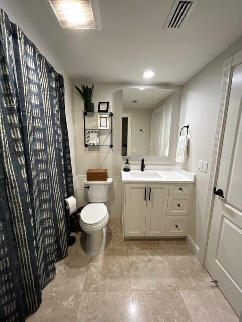
This next bathroom has no natural light but good interior lighting, helping Classic Gray do the job it’s meant to…
COLORS THAT ARE SIMILAR TO CLASSIC GRAY
Classic Gray has a few comparable shades that are worth exploring…
- Benjamin Moore Silver Satin is VERY similar to Classic Gray in depth (only a touch lighter) but is a bit grayer and cooler. You might also notice a bit more of a violet undertone in this. The reduced amount of brown (warmth) in Silver Satin can make it an interesting, less dirty approach to a dark room. However, Classic Gray is popular as it suits a wider range of interior finishes than Silver Satin. Read Classic Gray’s FULL COLOR REVIEW HERE.
- Sherwin Williams Egret White and Classic Gray are two shades of warm gray I often recommend for the same project when doing my Online Paint Color Consulting. These shades of warm gray/taupe offer a bridge between the gray and beige worlds. However, being darker than Classic Gray, Egret White (LRV 70) is more likely to look drab in a dark family room or basement. This means that between the two, Classic Gray is my preferred suggestion. Should you compare both? Sure, why not – comparison is the BEST way to find your perfect color! Read Egret White’s FULL COLOR REVIEW HERE.
- Benjamin Moore Calm is an off-white warm gray with an LRV of 76, making it slightly lighter than Classic Gray. As for undertones, both shades can grab purple, but Calm’s undertone is a bit more noticeable. Compared to Classic Gray, Calm is grayer/cooler and will look a bit cleaner than the above shades. Read Calm’s FULL COLOR REVIEW HERE.
Sherwin Williams Egret White in a reasonably well-lit room
FULL Paint Color Review of Benjamin Moore Classic Gray
6. SHERWIN WILLIAMS WHITE HERON
White Heron is an off-white that’s a bit of a color ninja. While it can pick up a subtle touch of taupe (violet-pink), it often leans into an almost creamy warmth – without looking like a typical cream paint color.
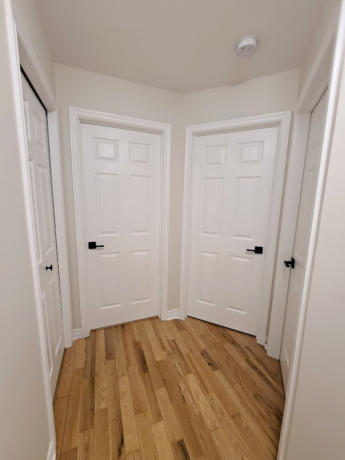
As you can see in this dark hallway with no natural light (below), White Heron looks beautiful with adequate interior lighting, offering a soft contrast with white doors and trims without weighing a room down.
COLORS THAT ARE SIMILAR TO WHITE HERON
I’m YET to find a paint color as elusive as White Heron – it really is a shape-shifter, which is what makes it so darn versatile! However, for the sake of comparison (which is KEY to choosing your room’s best paint color), check out these shades…
- Heron Plume is a good comparison. With an LRV of 75, Heron Plume is more or less the same depth as White Heron (76), making them both off-whites. Where they differ is that Heron Plume has more gray in it, making it a warm gray paint color. It also has a slightly more noticeable violet undertone compared to the muted flexibility of White Heron. This isn’t a bad thing either; some rooms need more commitment to color! Read Heron Plume’s FULL COLOR REVIEW HERE.
- Sherwin Williams Aesthetic White is one of my favorite off-white paint colors – if it had just a TOUCH more brightness, I might have put it on the list! Aesthetic White is a bit more toned-down compared to White Heron, leaning into beige rather than cream or taupe. And while it’s in the off-white world, it’s a bit darker than White Heron with an LRV of 73. If it even mildly intrigues you, check it out, as it’s at the top of my list of ‘best colors in general.’ Read Aesthetic White’s FULL COLOR REVIEW.
The 6 Best Off-White Paint Colors
7. SHERWIN WILLIAMS GOSSAMER VEIL
While I would personally go lighter, if you want more depth on your walls and don’t love white, I get it (you do you, boo). Gossamer Veil is a pretty, misty gray with passive warmth – not enough to make it a greige but enough to lift it beyond the cool gray world.
It also has a pretty green undertone that ‘usually’ shows up to the party – not enough to be obnoxious, but it can potentially add subtle interest to a low-light space. Gossamer Veil can be a great substitute for Benjamin Moore Revere Pewter, which can be too heavy and muddy for a dark room (but has a HUGE following).
FULL Paint Color Review of Sherwin Williams Gossamer Veil
8. BENJAMIN MOORE MARITIME WHITE
If you’re hankerin’ for a bit more warmth, let me introduce you to Maritime White. Maritime White is a modern take on beige. That’s right, no more heavy, golden hues reminiscent of the Tuscan trend from the early 2000s; Maritime White and its comparables offer a more modern, fresh take on beige.
While this dining area isn’t dark, it’s not overly bright either
COLORS THAT ARE SIMILAR TO MARITIME WHITE
One of the great things about Maritime White is that several similar shades are worth exploring, meaning you can really fine-tune the look you want.
- Sherwin Williams Moderate White has a modern approach similar to Maritime White; it just has a bit more ‘color’ (chroma), making it look a bit warmer. Maritime White has an LRV of 71.6, putting it at the TOP of the light range, whereas Moderate White sits at 74, making it off-white and lighter than Maritime.
- Sherwin Williams Divine White is in the same world as Maritime White and Moderate White. The main difference between these three is that Divine White has a touch more pink tucked deep inside. But don’t be scared; this little tweak can make it the PERFECT shade for a bunch of interior finishes that could otherwise be hard to coordinate with.
- If you like the warmth of Maritime White but want a bit less of it, compare it to Sherwin Williams Aesthetic White. This is an off-white beige that’s been feather-dusted with gray, which tones down its warmth without taking it away.
FULL Color Review of Benjamin Moore Maritime White
THE TOP 8 PAINT COLORS I USUALLY AVOID IN DARK ROOMS
Some colors are known as ‘fool-proof’ and ‘in the top 10’ of every ‘best color’ list. However, just because they work for SOME rooms doesn’t mean they work for all rooms. And while they might be some of my faves, these colors listed below can be touch-and-go in a dark room.
Notice how Repose Gray sits pretty where the light hits but gets murky in the shadows
Why?
While their moderate LRVs (between 55-65) might have you thinking they’re light enough for a dark space, their depth, combined with their undertones and temperature (warmth), makes them usually too dark for a low-light room and can make it look dingy, dirty, and dull.
- Sherwin Williams Agreeable Gray
- Sherwin Williams Repose Gray
- Benjamin Moore Edgecomb Gray
- Benjamin Moore Revere Pewter
- Sherwin Williams Worldly Gray
- Benjamin Moore Stonington Gray
- Benjamin Moore Manchester Tan
- Sherwin Williams Accessible Beige
This doesn’t mean they won’t work for YOUR room if you have the lighting to support them, but sample carefully!
READ MORE
How to Fix a Dark Room – And It Ain’t With Paint
The 6 Best Off-White Paint Colors
The Ultimate Guide to Choosing White Paint Colors
Not sure which paint color is best for YOUR dark room?
Check out my affordable E-Decorating and Color Consulting Services!
Chat soon,
READ MORE
The 10 Best DARK Colors for a Dark Room or Basement
4 Ideas: How to Make a Dark Room Look Brighter
How to Brighten a Low Energy or Dark Room with Sheen
Originally written in August 2017, updated mid-2019
Comments
Leave a Reply
More Posts
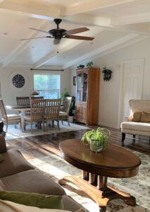
The 5 Best Creamy White or Off-White Paint Colors
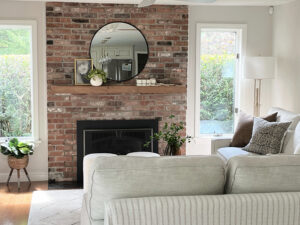
The 8 Best Warm Neutral Paint Colors With NO Yellow Undertones!





Dear Kylie,
my husband and I just bought an apartment and now I am spending every free minute trying to figure out what colour floors and walls I want. It turns out its really not that easy. Thats how I found your blog. Thanks for all the interesting information. I really liked the post about LIGHTING! : )
Since my husband and I are German and we live in Germany, I unfortunately cannot buy all those pretty paint colours you are talking /writing about. I have to go to the hardware store and just pick the colours myself.
Maybe you could give me some advice on what undertones I need to look for when it comes to picking paint colours for northern rooms, since the bedroom (150 sq feet) and the kitchen (130 sq feet) are on the northern side of the house. I was thinking of using light neutrals but now I have a problem with the darn undertone. Do I go with cool or warm undertones for the paint?
Thank you so much!
Greetings from Germany
Eva
Hi Eva, thank you for your note! And Germany – now THAT is cool! So, you’ll want to look for neutrals that are on the warm side. The coolest I might go would be a greige, but you’ll find it will lean to the gray side. Beige will be a good place for you as will cream and brown! If you want a bit of colour, look for a neutral that has a warm green undertone as that means the green will have some yellow in it instead of blue.
I hope that helps!
I just gone done with eider white in the basement. And it is looking quite taupe. Since it is over a year, I am wondering how did you overcome the taupe.
Author
So, I’ve found that ‘taupe’ can mean different things to different people. Is it the subtle warm, almost purple tone you’re referring to?
Kylie,
I am looking to paint my upstairs bedroom! I have tried samples of light paints and they are too light. I have tried samples of darker paint and they don’t seem to show up. Would I be best to go with a really bold color or a lighter color? . Any suggestions you have would be helpful. My upstairs bedroom tends to get a lot of light during the day
Author
Hi Dona, have you thought about doing a feature wall? This way you could add some personality to the room without committing on a larger scale. Or maybe you need something in the light/medium range that has a touch more colour in it (ie: a neutral with decent coloured undertones…)
I hope that helps!
~Kylie
Thank you very much for these valuable advices. I plan to use BM Navajo White and Hale Navy (accent wall) to deeply transform our dark basement. And of course, we will change our lighting for something more powerful. I am very excited but a little worried about the result. I hope that our basement will be more welcoming. Thanks again!
Author
Thank you for the note Manon, you’ve made some beautiful choices and will have a gorgeous contrast (which can make a darker, maybe boring basement a bit more inviting and fun!)
Which color do you have in your family room accent wall & hallway ? I love the dark grey and would love to know what this one is! Thanks!
Author
Hi Vanessa, that was BM Steel Wool – it’s a stinkin’ gorgeous colour!
Hi Kylie! I just discovered your blog post while searching for advice on paint colors for a dark room, and I’m so very glad I found you! I used both your SW Creamy suggestion for our living room and the SW Silver Strand for an office, guest bedroom (the “dark room”) and our master bedroom. Absolutely gorgeous colors …thank you thank you for sharing your wonderful knowledge of paint colors. I can’t wait to read more of your posts (and clearly have nothing but time these days), and just bought one of your E-books. I’m a big fan 🙂
Author
Oh Janine, that’s JUST what I needed to hear today – thank you…
Hi Kylie! I’m a painter by trade and reference your blog to my clients when choosing colours. I go back to your guide to greys more than I care to admit. Now when it comes to my own home I’m of course too picky. We’re moving into a small, narrow basement suite with fairly good natural lighting. I’m leaning towards BM Grey Owl but unsure if it’ll come off as dark. Any thoughts or suggestions? We like light grey with white trim and we’ll do a darker turquoise feature wall in the living room. Thank you!!
Author
Sweet, I LOVE to hear that Adam! So, with your explanation…I have to agree that Gray Owl can be a wink much. Moonshine is ‘approximately’ 25% lighter, with an LRV up at 68, whereas Gray Owl is 65. There’s also SW First Star which is 69, but it’s a bit cleaner looking than Gray Owl/Moonshine, so a bit COOLER looking.
I hope that helps!
Hi Kylie,
I love your blog and your taste. Painter is coming next week and I still can’t pick my trim color that will go with Benjamin Moore Calming Cream. We have a tremendous amount of molding and trim. Do you have a suggestion what trim color would be best? I guess because there will be so much I don’t want it to be stark white but I would like a contrast between the trim and the walls.
Author
Hi Lisa, with the degree of warmth in Calming Cream, I would HANDS-DOWN look at BM Simply White – I have a review on it you can check out :). https://www.kylieminteriors.ca/a-colour-review-benjamin-moore-simply-white/
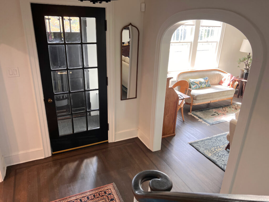
I know this is an older post but I just found it (I love your blog & IG)! I like the paint color in the pic of the hallway with dark floors and dark stair balusters. Can you share what color it is? We have a north-facing 2-story foyer and just upgraded floors from honey oak to darker stain (Jacobean). We are painting the other side of the house accessible beige but that looks too dark in the foyer. Thanks!
Author
Hey Courtney, THANK you! That’s Benjamin Moore Collingwood. Just be careful as warm colors (Accessible BEige) don’t LOVE being partnered with colors that are cooler and lighter than them – AB prefers cool colors that are at least the same depth…or darker. YOu can do lighter and WARMER, just not cooler. Collingwood is borderline, but if you don’t love it when you get a sample, DON’T go any lighter than it :).
Hi I am trying to find paint for a dark room (our foyer) to look good with a very white trim. We have a lot of dark wood furniture with cream/wine/black decor with green plants. What LRV # color would go with a bright white trim? Thank you!
Hey Kylie!
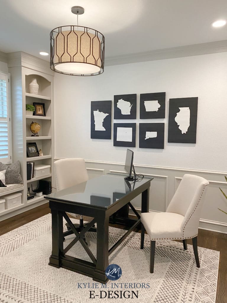
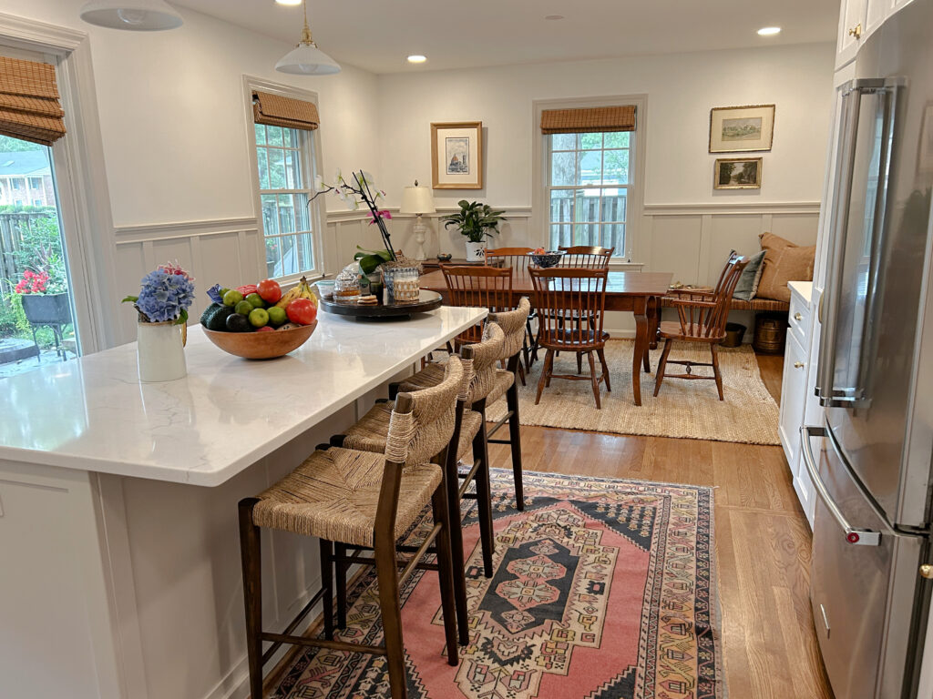
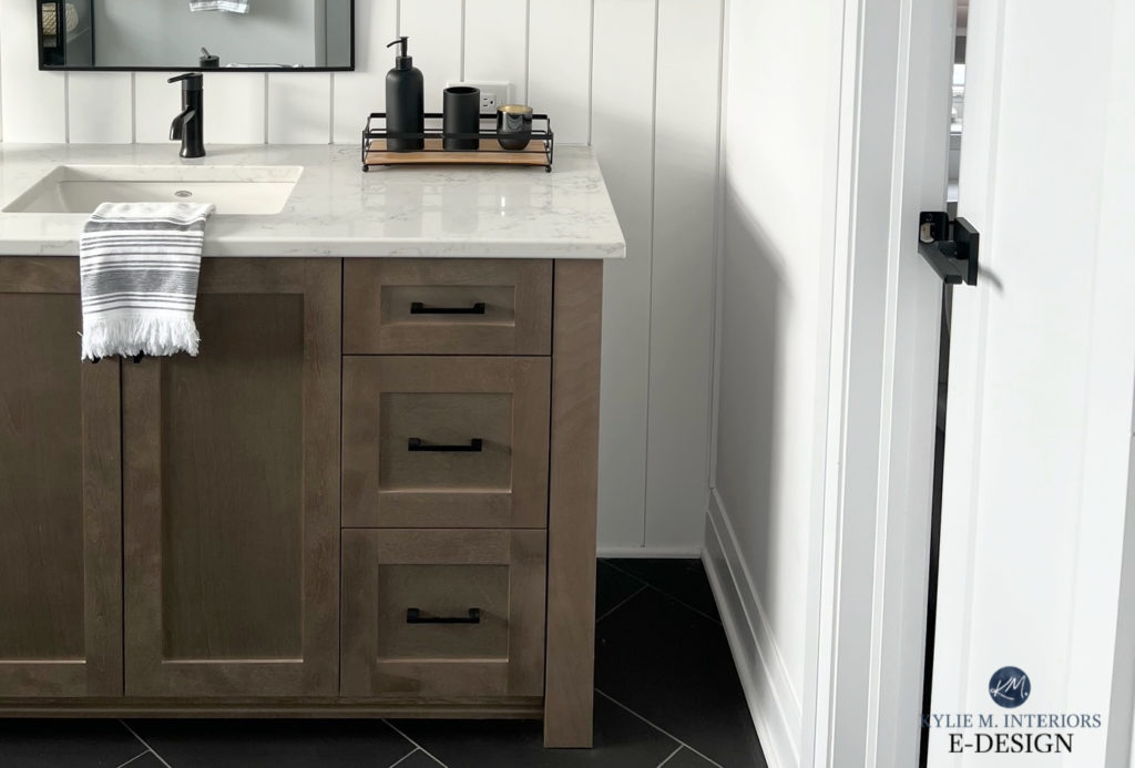
What’s the paint color used on the wainscoting in picture 4 with Chantilly Lace?
Thanks!
Author
Hey Brynn, that’s the EVER BEAUTIFUL AND AMAZING – Agreeable Gray. While I have a color review on it, this might be more helpful for what you’re doing 🙂 https://www.kylieminteriors.ca/the-best-light-greige-cabinet-color-sherwin-williams-agreeable-gray/
I love love love this article. Hoping you can help with something. Hoping to paint dark staircase walls a fun bright color. To give you an idea, my fave colors so far are all BM colors: Budding Green, Sun Blossom, and Peach Yogurt. I’d really love to find a blue with a high LRV that gives a French Country vibe. Any advice is greatly appreciated. Thanks!