
Posted on February 6, 2021 by KylieMawdsley
Choose the right COLOR to sell your home fast!
Partner post: The Top 8 LIGHT NEUTRAL Paint Colors for Home Staging
I’m not a consultant who believes that all homes sell better when painted light, neutral colors. In fact, many homes sell faster and for more money because their colors resonate on an emotional level with buyers, whether it’s because they have more COLOR (chroma) to them or more DEPTH than the average light neutral paint color.
This post may contain affiliate links. If you make a purchase through links on our site, we may earn a commission.
So, this blog post is not only about COLORS, it’s also about neutral with a bit more meat on their bones, ones that my Online Paint Color Consulting clients (and home buyers) seem to fall in love with at first sight. Colors that might help YOU add some emotional and ACTUAL value to your home.
See the BEFORE & AFTER as well as color details HERE
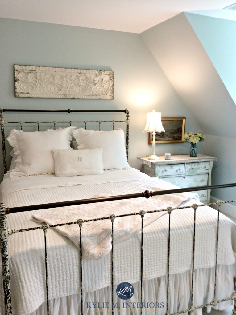
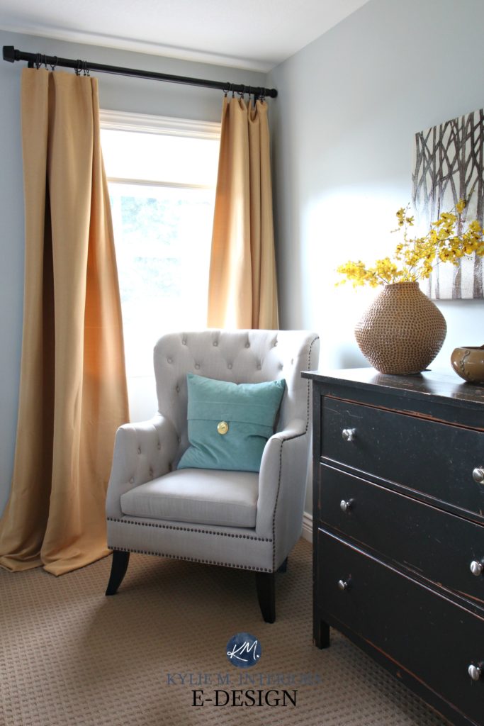
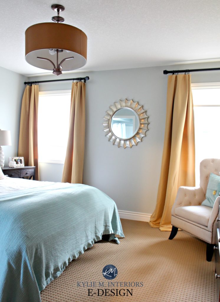
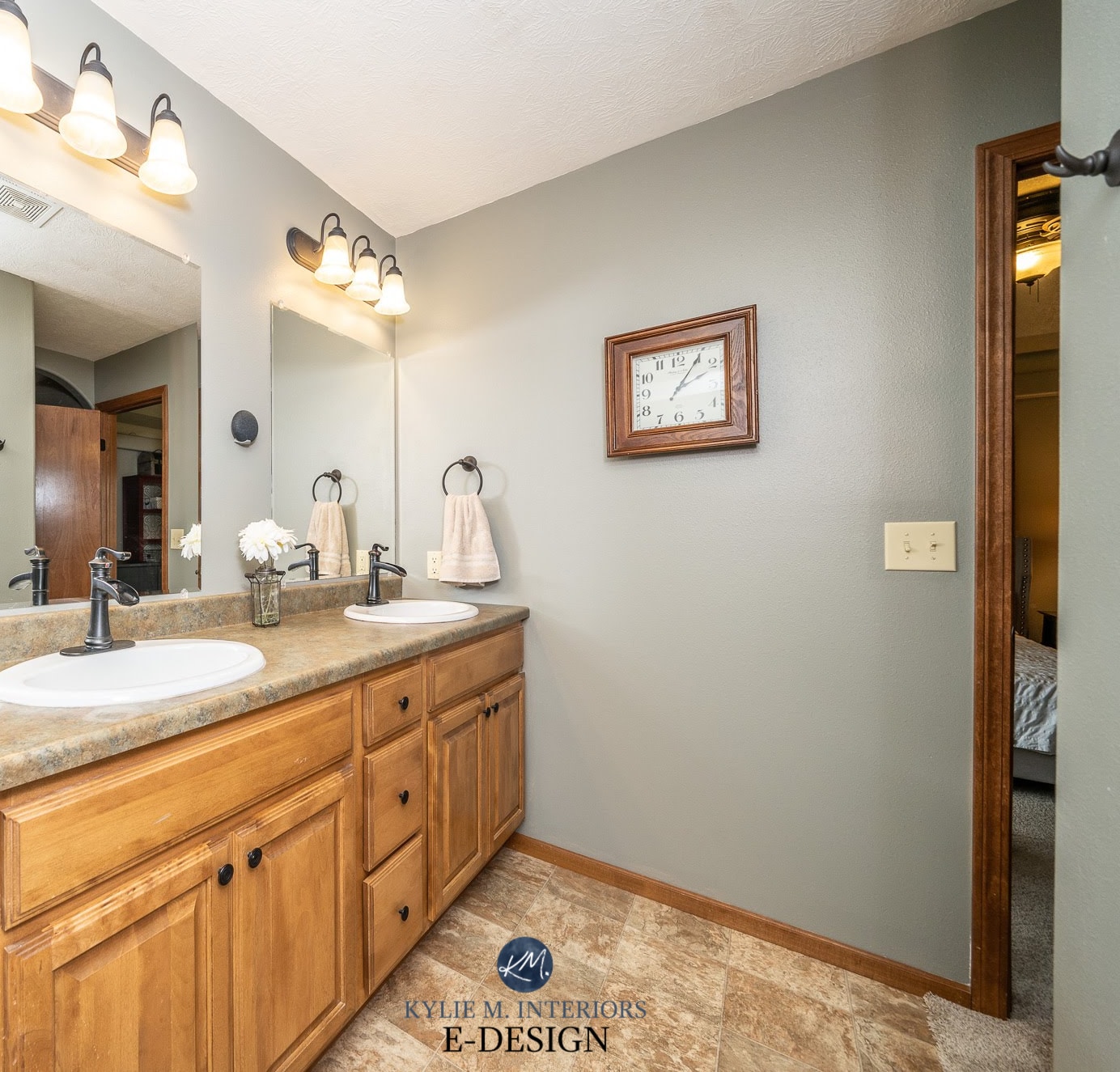
1. SHERWIN WILLIAMS SEA SALT SW 6204
This is definitely one of the more popular green-blue inspired paint colors on the market! Sea Salt is a beautiful light green with a decent gray backdrop, but be warned – it also loves to flex into blue due to its particular blend!
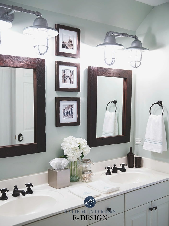
Sea Salt has an LRV of 63, a GORGEOUS depth for the average room (read more about that HERE). It handles itself reasonably well in low-lit and brighter light, but like I always say, ‘if you don’t have enough artificial or natural light, there’s no paint color that will save you’.
THE BEST ROOMS FOR SHERWIN WILLIAMS SEA SALT
- a master or guest bedroom
- bathroom
- homes with a beachy vibe
- Sea Salt is not a color you would do multiple rooms in, its best for singular spaces
PAINT COLORS THAT ARE SIMILAR TO SEA SALT BUT WITH A SLIGHTLY DIFFERENT LOOK
Sherwin Williams Rainwashed is similar to Sea Salt but leans harder into a blue undertone. Benjamin Moore Palladian Blue is VERY comparable if you prefer one brand over another.
The Ultimate Guide to Choosing Paint Colors with LRV
Paint Color Review: Sherwin Williams Sea Salt
2. BENJAMIN MOORE STEEL WOOL 2121-20
Steel Wool is AWESOME. It’s a medium-dark toned charcoal gray with a decent blue undertone. Blue loves to lean either green or purple, and this one leans slightly purple.
In fact, I used Steel Wool in our LAST home and it got RAVE reviews (and yes, the house did go into multiple offers).
Steel Wool has an LRV of 19 – BOOM! It’s certainly got some visual weight to it but NEVER looks black, even in a darker space.
THE BEST ROOMS OR WALLS FOR BENJAMIN MOORE STEEL WOOL
- a bedroom that is reasonably well-lit
- a family room
- as a feature wall
PAINT COLORS THAT ARE SIMILAR TO STEEL WOOL BUT WITH A SLIGHTLY DIFFERENT LOOK
Sherwin Williams African Gray is a great comparable to Steel Wool, whereas Benjamin Moore Trout Gray has a bit less undertone and more depth. For even MORE depth, check out Benjamin Moore Gray 2121-10.
Paint Color Review of Benjamin Moore Steel Wool
3. BENJAMIN MOORE REVERE PEWTER HC-172
Revere Pewter is a lovely warm gray paint color that’s been HUGELY popular in the last five years – and is still going strong. While many grays pick up a blue or purple undertone, Revere Pewter is more likely to pick up a faint earthy-green that makes it look warmer than the average gray. And because it’s likely to pick up a bit MORE undertone than many grays, I’ve included it in both the ‘best light NEUTRAL paint colors for staging‘ as well as this more COLORFUL blog post.
With an LRV of 55, Revere Pewter has a bit more depth and undertone than the average ‘home staging paint color‘. But let me tell you, it has HUGE mass appeal and suits MANY styles of homes.
All About Benjamin Moore Revere Pewter
THE BEST ROOMS FOR BENJAMIN MOORE REVERE PEWTER
- any or all of the 5 Key Rooms
-
bathrooms
-
south-facing rooms (to balance out the warm exposure a bit)
-
small or large rooms
-
when lightened by 25-50%, it is great for dark rooms or hallways
- I also have a soft spot for the slightly darker, Sherwin Williams Amazing Gray
PAINT COLORS THAT ARE SIMILAR TO REVERE PEWTER BUT WITH A SLIGHTLY DIFFERENT LOOK
Benjamin Moore Rodeo is great if you want a color that’s slightly lighter. Sherwin Williams Amazing Gray is a shade that’s similar to Revere Pewter but has a bit more depth and undertone.
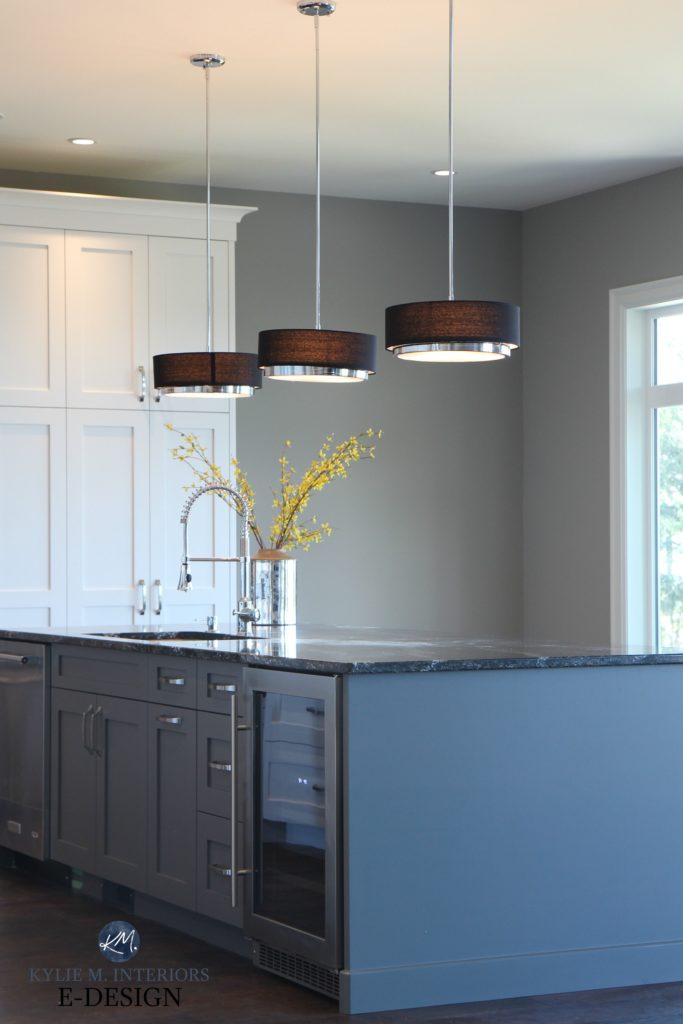
4. BENJAMIN MOORE GIBRALTAR CLIFFS 1587
Gibraltar Cliffs is HANDS-DOWN one of the prettiest gray-blue paint colors, with just the right depth to envelop an entire room or act as a feature wall to light neutral paint color.
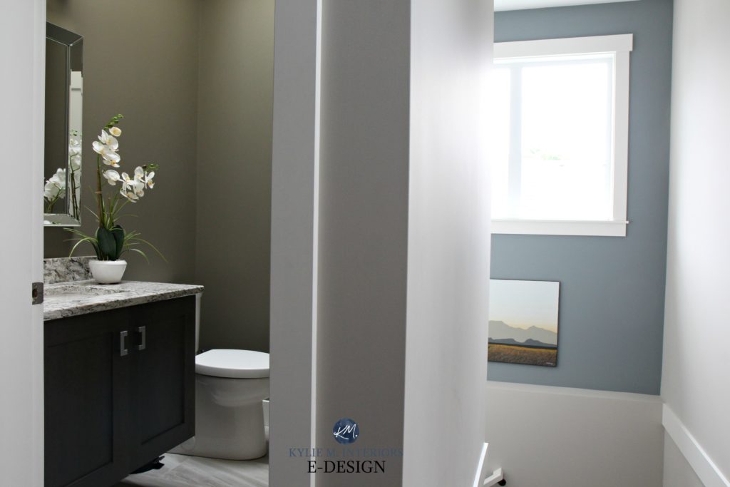
Sherwin Williams Anonymous on the left, Gibraltar Cliffs and Sherwin Williams Colonnade Gray on the right
Gibraltar Cliffs has a reasonable depth with its LRV of 30. And not only is it a blue-gray blend, but it also has a soft green hiding in it as well.
THE BEST ROOMS FOR GIBRALTAR CLIFFS
- bedrooms that have reasonable natural light
- a small bathroom
- feature wall
- cabinets or bathroom vanities (can be stunning)
Paint Color Review for Benjamin Moore Gibraltar Cliffs
PAINT COLORS THAT ARE SIMILAR TO GIBRALTAR CLIFFS BUT WITH A SLIGHTLY DIFFERENT LOOK
Benjamin Moore Mount Saint Anne is similar to Gibraltar Cliffs and is great if you want a lighter approach.
Undoubtedly, you’ll be heading out in the near future to grab paint samples – stop right there! I want you to check out SAMPLIZE. Samplize offers peel and stick paint samples that are more AFFORDABLE, EASIER and more ENVIRONMENTALLY FRIENDLY than traditional paint pots. Here are just a FEW reasons why I recommend Samplize to my clients…
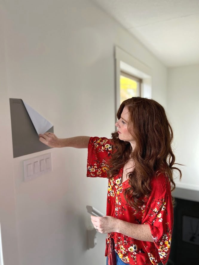
- samples arrive ON YOUR DOORSTEP in 1-3 business days, depending on location
- they’re more affordable than the samples pots/rollers/foam boards that are needed for traditional paint sampling
- if you keep the samples on their white paper, you can move them around the room
CHECK OUT SAMPLIZE HERE
5. BENJAMIN MOORE CHELSEA GRAY HC 168
Looking to make an impact? Then check out Chelsea Gray. This medium-toned gray color makes for a striking feature or accent wall or can completely envelop a room in its loveliness! Is it brave? HECK YA, but if you have the right room, you can make a great statement with it.
Keep in mind that while it’s SAID to be a warm gray, Chelsea Gray usually looks cool (like me in aviators) and can pick up a minor green undertone.
The 4 Best Gray and Greige Paint Colors for Cabinets
With an LRV of 22, Chelsea Gray has some serious meat on its bones. But, time and time again, it holds up well, even in darker spaces (when you want more of a moody look vs light and bright).
THE BEST ROOMS FOR BENJAMIN MOORE CHELSEA GRAY
- feature or accent walls
- media rooms
- cabinets
PAINT COLORS THAT ARE SIMILAR TO CHELSEA GRAY BUT WITH A SLIGHTLY DIFFERENT LOOK
I LOVE the slightly darker Benjamin Moore Amherst Gray for some serious impact and drama. As it relates to Sherwin Williams, check out Classic French Gray and the warmer Sherwin Williams Dovetail
Paint Color Review: Benjamin Moore Chelsea Gray
Click HERE or on the above image to see available packages!
6. SHERWIN WILLIAMS SILVER STRAND SW 7057
Silver Strand is a light, but not a washed-out blend of blue, green, and even shades of gray. It’s also a bit of a chameleon as it seems to change its look based on WHO’S LOOKING AT IT! Some call it a blue-gray, others, a blue-green, but NOBODY calls it boring.
The 8 Best Blue and Green Paint Colors
With an LRV of 59, Silver Strand is a great way to get some color on your walls and contrast with white trim, without overwhelming a space.
THE BEST ROOMS FOR SHERWIN WILLIAMS SILVER STRAND
- bedroom or bathroom
- a room that needs to look restful and relaxing
- great for a bit of color without going TOO far
PAINT COLORS THAT ARE SIMILAR TO SILVER STRAND BUT WITH A SLIGHTLY DIFFERENT STYLE
If Silver Strand is just too colorful, you might want to bump back to Benjamin Moore Gray Owl, which is a light gray with green-blue undertones. If you love that bit of color, check out Benjamin Moore Gray Cashmere or the slightly darker Sherwin Williams Argos (mad love).
Paint Color Review: Sherwin Williams Silver Strand
7. BENJAMIN MOORE ANCHOR GRAY 2126-30
Anchor Gray is STUNNING. And while not every home can handle a strong navy blue, Anchor Gray is a great way to get the navy look, without going overboard (get it?).
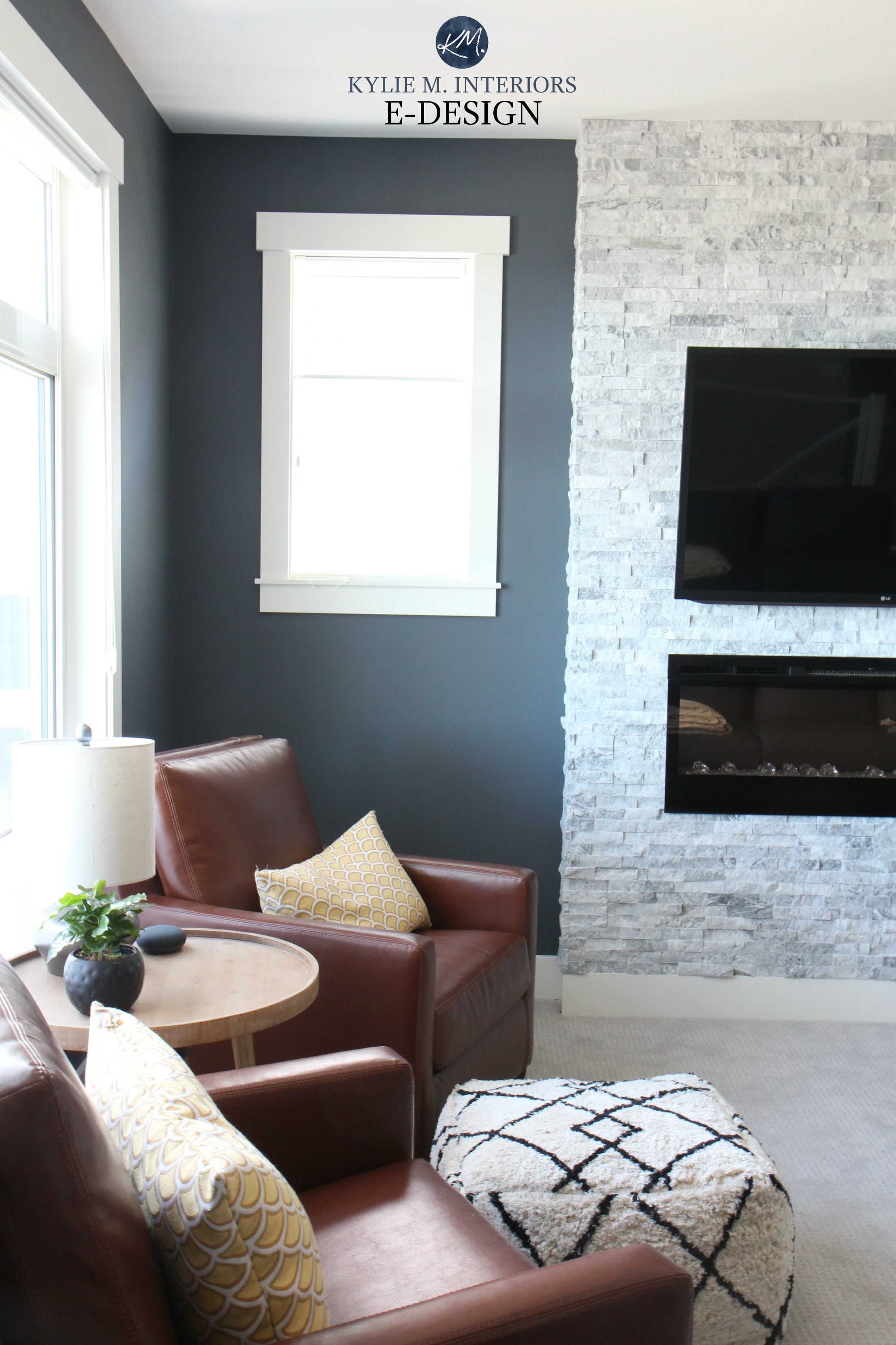
THE BEST ROOMS, WALLS OR SITUATIONS FOR BENJAMIN MOORE ANCHOR GRAY
- feature or accent walls
- cabinets or kitchen islands
- entire rooms, as long as they’re reasonably well-lit (check those bulbs!)
PAINT COLORS THAT ARE SIMILAR TO ANCHOR GRAY BUT WITH A SLIGHTLY DIFFERENT STYLE
Of course, there’s ALWAYS Benjamin Moore Hale Navy which is a navy blue with more depth and color than Anchor Gray. I also love the more muted approach of Benjamin Moore Trout Gray, which is a VERY popular medium-toned gray with violet-blue undertones.
The Best DARK GRAY Paint Colors from Benjamin Moore
8. BENJAMIN MOORE WOODLAWN BLUE HC-147
Woodlawn Blue is a GORGEOUS blue paint color with just the right shade of gray to calm it down. As mentioned earlier, blue can lean either blue-purple or blue-green – this lovely one leans lightly into blue-green.
THE BEST ROOMS FOR BENJAMIN MOORE WOODLAWN BLUE
- a bedroom
- south-facing room to help balance the warm light
PAINT COLORS THAT ARE SIMILAR TO WOODLAWN BLUE BUT WITH A SLIGHTLY DIFFERENT STYLE
If you add a wink of green to Woodlawn Blue, you’ll end up with a color like Sherwin Williams Rainwashed, which is equally as pretty.
The Best Blue-Green Blend Paint Colors
The Best Blue-Gray Blend Paint Colors
OH, WHAT THE HAY, LET’S DO A FEW MORE…
9. SHERWIN WILLIAMS DORIAN GRAY SW 7017
I LOVE DORIAN GRAY! Dorian Gray’s LIGHTER version, Repose Gray, is definitely one of the more popular LIGHT warm gray paint colors, but for me, I love the body and contrast that Dorian Gray offers. When it comes to undertones, you’ll find this soft, medium-toned warm gray can pick up a very vague purple undertone that can sometimes flash a TINY wink green (vague).
THE BEST ROOMS, WALLS & SITUATIONS FOR DORIAN GRAY
- a kinky Friday night (50 Shades of Gray reference, for those in the know)
- entire rooms that are reasonably well-lit
- feature wall, if the other walls are off-white
- small bathroom
- I also love the slightly warmer Sherwin Williams Mega Greige
PAINT COLORS THAT ARE SIMILAR TO SHERWIN WILLIAMS DORIAN GRAY
If you want a bit more depth, check out Sherwin Williams Dovetail which is particularly popular for feature walls and cabinets. Benjamin Moore Metropolis is also a beautiful medium-toned gray paint color that has a bit more warmth.
Paint Color Review of Sherwin Williams Dorian Gray
10. BENJAMIN MOORE ARCTIC SHADOWS 1559
Arctic Shadows is one of the only true greens on this page. Why? Blue has WAY more mass appeal, whereas the wrong green can actually date a space.
Arctic Shadows is a green-gray blend. So while you get COLOR, you aren’t smacked upside the head with it, which is one of the reasons why it’s popular.
Kylie M & Tim Hanson Productions
The Best Benjamin Moore Green Paint Colors
THE BEST ROOMS FOR ARCTIC SHADOWS
- entire rooms
- cabinets and bathroom vanities
- rooms with wood surfaces if you want to ACCENT the wood
- balance south-facing or afternoon western sunshine
READ MORE
Home Staging Tips – 5 Key Rooms
The Best Light, Neutral Paint Colors for Home Staging
The 12 Best WHOLE HOME Gray & Greige Paint Colors
The 8 Best WHOLE HOME Warm Neutral Paint Colors
NEED HELP?
Check out my Online Consulting and Paint Color services!
Chat soon,

Originally written in 2015, updated with new info and photos in 2021!
Comments
Leave a Reply
More Posts

The 5 Best Creamy White or Off-White Paint Colors
THE ELUSIVE ‘CREAMY WHITE NEUTRAL’ When it comes to light, warm neutrals, it’s all in the undertones. And other than pink and green, yellow is the undertone many of my
Read More

The 8 Best Warm Neutral Paint Colors With NO Yellow Undertones!
The Top Light Depth, Warm Colors That Aren’t Cream! When choosing the best warm neutral paint color for your home, whether creamy white, beige, taupe, or greige, your choices are
Read More

The 12 Best Farmhouse Sinks of 2024
FIND YOUR DREAM SINK HERE… While traditional farmhouse design was all the rage in previous years, the embers have definitely cooled. As for MODERN farmhouse, it’s still kickin’ its cowgirl
Read More


Hi Lanie, check out Navajo White and Gentle Cream – both would look fab with white beadboard for a fresh and warm space! For the bathroom you HAVE to check out Stonington Gray by Ben Moore – loooove this colour!
Hope those colours help you out – they are some of my go-to’s!!
~Kylie
Hi Sharon, you are totally on the right track with looking towards a more Neutral colour for your walls – your space sounds lovely by the way – I love colour!
First off, because I’ll probably forget to mention otherwise, use Eggshell finish for your walls or something like an Ulti-Matte (Regal Benjamin Moore) which is a wipeable flat.
Okay, so back to colour. Lenox Tan I think would be too heavy and just kind of a weird colour when placed next to all of your colourful things.
However, on the same lines, I’d love for you to check out these ones…
1. Monroe Bisque – a bit lighter and more neutral option – but still with nice warm undertones
2. Stone House – similar idea to Monroe Bisque, just a little bit less warmth.
3. Cable Knit – quite different from the other 2. It’s more of a ‘colour’ rather than a Neutral. I had this in my home for a while and it was very versatile as I could change any accents/accessories/colours around it and it always looked great. In some lights it looked more yellowish and other lights it would go a wee bit more neutral.
Let me know what you think of those Sharon, hope it helps!
~Kylie
Hi Kylie!
I’m struggling with trying to find a paint color for,my boys bedroom (ages 4 &6). They have PB sun valley espresso finished bunk beds and PB navy window panels. The carpet in the room is wall to wall beige. I went into my neighborhood hardware store today and the “color consultant” there said gray would not go well with the beige carpet. It is a small room and doesn’t get all that much light. I don’t want it to be depressing for them and I’m stuck with the carpet and navy blue panels due to $$$. Any suggestions? Thanks, Kylie!
Help. Painters coming and I still can’t decide on interior wall colors. Our open plan includes entry foyer, dining room, 2 hallways and kitchen/family room/eat in kitchen with cherry cabinetry and red oak floors that have aged to honeyed tones. The countertops in kitchen are a neutral laminate of dark brown, warm grey and tan. I was thinking of using shaker beige in these areas. The office faces north with a palladium window and thought lenox tan. Guest bedroom has little natural light and thought to keep shaker beige. Guest bath is off hall across from office and next to guest bedroom. It has cherry cabinets and “dirty” brown/gray/beige tile. The master bedroom has a neutral tan carpet faces south and bath is the same as guest. The laundry room is off hall next to master and has pinky,taupe brown gray tile facing south. Confused. Any thoughts. Please. Thank you.
Why do you advise not using BM Sandy Hook Gray as an all over color?
I do loooove Sandy Hook Gray and I love it as an all over colour in a room, but in an entire home Sandy Hook Gray is best suited to South facing, or warmer exposure rooms because it’s a cool colour. In North Facing rooms, particularly ones with smaller windows or a patio overhang it can feel very cool and you can lose the beauty of the colour. I love the balance it offers to a warm exposure room.
In a Northern (cool) exposure room it would need to be accommodate by a lot of cream and chocolate brown to help add some visual warmth back to the space.
I hope that answers your question and thank you for asking it. I like it when I need to ‘think’ 🙂
~Kylie
I am stuggling to find a color for our bedroom. We have a large master bedroom with a sitting room off to the side which will be the closet area. We are installing hardwood floors as well, color and wood to TBD. The room is not a very bright room. We have sampled so many colors. Our furniture is cherry wood. We have greens in so many rooms in the house that we are leaning away from greens. We painted the room Thunder but hate it with the furniture. We have Thunder in our dining room which looks great. Any suggestions with the cherry furniture would be great. We have spent a ton on samples thus far.
Thank you!
Hi Robyn, I’m so sorry for my delayed reply! I’m just been crazy with Online Consultations and my day-to-day work that I’ve been directing a lot of questions towards my Online Consulting. https://www.kylieminteriors.ca/online-decorating-design-consultation/
But, you’ve been waiting so long and maybe I can help you with a few quick ideas. If they don’t work you might want to consider an online consult ($30 for this question) as you then you can send me some photos and we can really hit it!
Okay, so here’s a few thoughts for you.
Anything in the greens/yellows would accent your furniture, so while yellows would be brighter, I’m not sure that’s where we want to go. Blue tones, purple tones and neutrals is probably a better bet (which is probably what led you to Thunder so you ARE on the right track!)
(and keep in mind that if these are too dark for you, you can get the lightened)
So, I did have a client with Cherry cabinets and we tried Elephant Gray and it was ‘beautiful!!!’ It’s light enough to not feel heavy, gray enough to not be ‘too’ purple – and just gorgeous with the cherry cabinets.
If you want safe and neutral, then Grant Beige is a safe bet. It’s not necessarily as ‘interesting’ as the other colours, but it would allow you to do any number of accent colours with your toss cushions/drapes/etc…
If you like that idea but want something slightly warmer, the Muslin would give you the similar effect, just on the warmer end of things.
Okay, I hope that helps Robyn, let me know!
~Kylie
Sandlot Gray is very similar but a bit warmer
Hi Kylie,
I enjoy reading your posts and while I always agree with your suggestions, I rarely come up with any on my own, without a million trips to the paint store. The guys there don’t quite dread seeing me coming in but know they are in for a million questions.
Most recent paint color selection dilemma is for our living room:
– three large windows and and side windows around front door but has a NE exposure and front yard is completely shaded
– white plantation shutters over windows are always kept open (slats, not the actual shutters)
– medium brown oak floors
– entry way is someone separate from living area but not closed in
– leather sofa, love seat and chair are cocoa brown + brown rocking chair – already had these pieces before we bought this house…
– got a bright orange/blue – jewel tones – rug which lightens things up + multi colored/patterns pillows
– tables are antique oak + a table painted light taupey color and one that is orange (not ugly, just colorful)
– connects to dining room with a medium oak dining set – again, had before we bought this house
Have been looking at grays but they seem so cold. Previously taupey color but also too dark. After that, pastel yellow. Right now it is a blah very light off-white with a bit of yellow in it. Boring.
Benjamin Moore is our paint store. Have ‘fan book’ of colors which is 15 years old + a ton of sample color strips + Web site which I pour over and now I have discovered your site.
We typically get a color and end up cutting it by 1/4 or 1/2 white.
Gentle Cream and Cable Knit seem to goldy/yellow. Rocky Road a little too purpley. See what I mean about driving paint store guys crazy? What do you think of Ranchwood? Maybe cut 1/3 white?
Thanks!
Rebecca Gunder
Hi Rebecca, I would LOVE to help you out but lately I’ve been inundated with questions as well as my busy ‘everyday’ decorating work. I’m directing people toward my Online Consulting https://www.kylieminteriors.ca/online-decorating-design-consultation/ which I’ve priced to be AS affordable as possible for those in need!
I can see that your question would just be a 1 hr consult at $30.
I do hope I’ll get the chance to help you out! Otherwise I’m happy to include your questions on my list of questions to answer, but I have to give priority to my Online/In-home consults and can’t guarantee when I’ll get to your question….
Thanks Rebecca!
~Kylie
Hi Rebecca, I’m happy to give you a quick tip or 2, but I’m been just SWAMPED with questions on my Online Consulting as well as my day-to-day decorating that I’ve had to direct most questions to my Online Consulting https://www.kylieminteriors.ca/online-decorating-design-consultation/ (as you can send me photos of your room then which helps ALOT!)
But to give you a foot forward here’s a few thoughts for you 🙂
#1 – Have you looked at Muslin? It is similar to Gentle Cream, but takes the yellow out of it – making it a bit more ‘neutral’ (without being cold)
I also like Stone House, but sounds like it might be just a touch heavy for your space
#2 – Sounds like Ranchwood would be too cool toned for your space with your exposure
Sounds like you have some great neutrals with your couches/flooring and some fun accent colours. I guess it’s whether you want to play off of one of those colours or make things ‘neutral’ so that you have flexibility. Seems to me like flexibility would work well and then if your entryway is set up right you could put one of the accent colour (jewel tones from your rug) in that space to link the 2 spaces visually.
I hope that helps Rebecca!!!!
~Kylie
Hi Kylie,
I’m trying to paint our kitchen and family room which has no divider in between. Our kitchen has off-white (a little bit yellow) cabinets with hazelnut glaze. The countertop is black galaxy granite. The kitchen and family room are facing southeast. Besides, we have green/light green blinds in both kitchen and family room. I used BM Powell Puff but the color came out lighter during daytime but became more yellow under yellow light bulks. I don’t want to use darker color because it will go to the family room. Any suggestions?
Thanks,
Christina
HI, would Revere Pewter work with orange accents? I am looking for a stone color color that is warm and will of well with orange accents. I now have french white on the walls and it is too creamy I would like to brighten up the room.
Author
Revere Pewter would be beautiful with orange, particulary a more grounded kind of pumpkin orange!
I have more of a burnt orange couch and oversized chair. The rug has Burgundy and orange and little pops of turquoise but is mostly dark feeling. I have purchased Accessible Beige for that room, but now I’m second guessing my choice. I feel like it needs something a bit heavier/cozier? It’s 15 ft ceilings and lots of windows and south facing. Would Revere Pewter be better? I also considered Edgecomb Gray. Painters will be here in the morning–any help or opinions would be so appreciated!!
I recently found your website and love it!
We purchased our house a year ago. It has cathedral ceilings and big windows facing south. So lots of light. The previous owners painted the trim cream and the walls a pea green (or diarrhea green) , peachy orange, and the kitchen (open concept) a warm dark orange. Horrible!! The cabinets are 90’s yucky oak.
After reading numerous of your posts, I settled on Lenox Tan for the main body of the living room with Whitall Brown as an accent wall. It looks amazing.
I am so glad I found your website, I never would have thought of those colors before.
I painted a sample of Lenox Tan on one of the kitchen walls, and it looks green. So wierd because the lighting is about the same, the kitchen gets south and west sun.
I tried some BM Fennel Seed, certainly more yellow (which I love) and it looks better and goes well with the cream trim and Lenox Tan and Whitall Brown. Yet, I am not convinced. The counter tops are very dark, black with brown, same with the tile and stainless and black appliances. The island is a dark brown, almost black.
Do you have any ideas on a wall color that would be better than Fennel Seed?
Author
Hi Hillary! There is NOTHING like Diarrhea Green to warm up a room! Now, I do try to give as much helpful info on my blog, and if that doesn’t work, you might like to check out my E-design it is affordable and fun – this way I can look at photos of your space and spend some time with it! There’s more to consider, such as exposure, amount of natural light, furnishings, etc…and I don’t like to just guess! https://www.kylieminteriors.ca/online-decorating-design-services/
~Kylie
Kylie – would Sherwin Williams Sea Salt go with a small kitchen with cherry cabinets, brown and beige granite countertops and a light beige stone backsplash. My living, dining, and kitchen are all one open space. I need a paint color that will be light , airy, and go with the beachy, cottage feeling he rest of the house has.
Author
Hi Susan, I do worry that Sea Salt could be a touch too gray/green/blue for the more beige/warm/reds of your kitchen – it could be just a touch too much colour/cool for the space! If you’d like me to take a look, I do have affordable E-design consulting – and it’s fun! https://www.kylieminteriors.ca/online-decorating-design-services/
How do you feel about comfort gray? I’m deciding between that and agreeable gray. Leaning toward comfort gray but afraid may be too dark. North facing living room. Both s Williams paint
Author
Hi Judy! Well, they are so different it’s hard to compare! Comfort Gray will have a bit more personality but does have that bit of depth to it. Both can flash a bit cool in a north facing room, but Agreeable is a softer look… 🙂
I love the blue room and the sea salt bathroom. The potato chip joke was hilarious when I finally got it lol
Author
Oh good, I’m glad someone likes my cheesy humour 😉