
Posted on January 2, 2022 by KylieMawdsley
The Top 8 Shades of Green: Benjamin Moore
Partner Post to The Best Blue-Green (Teal) Paint Colours
Many of us get the chills just thinking about painting our homes a cool colour like blue, violet or green. And while there are many cool colours that will give a ‘cool and crisp’ feeling, there are others that can look warmer due in part to their depth and undertone. It’s all about picking the right colour for the job.
This post may contain affiliate links. If you make a purchase through links on our site, we may earn a commission.

WHERE DO GREEN PAINT COLOURS WORK THE BEST?
SOUTH-FACING ROOMS
In rooms where the sun beats in relentlessly, cool colours like green can help balance the ‘visual’ temperature of the space. Learn more about south-facing rooms here: The Best Paint Colours for South-Facing Rooms.
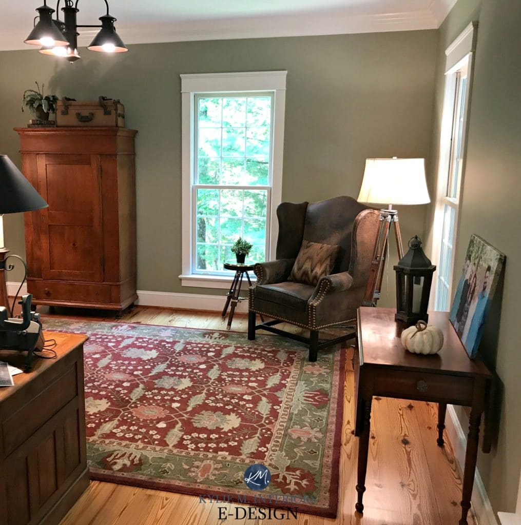
ROOMS WITH A LOT OF WOOD
If you LOVE your wood cabinets, flooring or furniture, you might love how green will ‘accent’ your wood pieces, whereas a warm colour would blend in with your wood tones. Read ALLLL about this here: The Best Paint Colours to Update Wood Finishes
The Top Benjamin Moore Green Paint Colours
(Including some greens with a touch of blue/gray undertone)
1. BENJAMIN MOORE ARCTIC SHADOWS
Arctic Shadows is for those of you who love green but don’t want to make too much of a STATEMENT about it.
While Arctic Shadows is OBVIOUSLY green, it has a neutral base to calm it down, making it a stronger earth tone.
Mountain Air has an LRV of 53.58. Not sure what LRV is? It could save your paint lovin’ life (HERE).
PAINT COLOURS THAT ARE SIMILAR TO ARTIC SHADOWS
- Sherwin Williams Rare Gray has a similar approach to Arctic Shadows
2. BENJAMIN MOORE ANTIQUE PEWTER 1560
Antique Pewter is a medium-toned green paint colour with a soft neutral base calming it down – essentially making it a darker version of Arctic Shadows. This is a SLIGHTLY warm green, but more modern looking than a traditional olive green.
Antique Pewter has an LRV of 24.15, so it’s tucked nicely in the medium range with some good meat on its bones.
PAINT COLOURS THAT ARE SIMILAR TO ANTIQUE PEWTER
- Benjamin Moore Crownsville Gray. A bit more of a rich, slightly darker take on Antique Pewter
- Benjamin Moore Copley Gray. It’s like taking MOST of the green out of Antique Pewter, leaving more of a greige look with subtle undertones
3. BENJAMIN MOORE FERNWOOD GREEN 2145-40
Fernwood Green is a beauty. It doesn’t have that modern gray-green-blue blend that you’ll find in a lot of today’s paint colours as it’s in the LEGIT green zone with a wink of warmth.
Fernwood Green is just slightly warm without getting too funky about it and would add a bit of life to a north-facing room especially. With its LRV of 57.98, it’s a light depth paint colour, but one with a BIT more body compared to ones closer to my MAGICAL LRV number.
Similar to Fernwood Green in southern or afternoon western sun
North, East, South, West – Which Paint Colour is the Best?
PAINT COLOURS THAT ARE SIMILAR TO FERNWOOD GREEN
- Benjamin Moore Dill Pickle. One of my faves as it’s a slightly more funk-da-fied warm green
- Benjamin Moore Camouflage. Still a warm green but it has a more neutral base, making it earth-toned
4. BENJAMIN MOORE NANTUCKET GRAY HC-111
Nantucket Gray is GORGEOUS if you want an earth-toned, muted, but still green look on your walls.
Nantucket Gray has an LRV of 39.49, so while it’s got some depth to it, it’s not a HEAVY medium tone. If you haven’t touched up on LRV yet, I highly recommend you do HERE.
PAINT COLOURS THAT ARE SIMILAR TO NANTUCKET GRAY
- Benjamin Moore Jockey Hollow Gray. Similar, but less ‘colour’
- Benjamin Moore October Mist. A cleaner look than Nantucket with less greige in it
5. BENJAMIN MOORE CAROLINA GULL 2138-40
Seriously, I have mad love for Carolina Gull. Whether it’s a bathroom, kitchen, living room or stairwell – this colour never fails to impress! Women often love this colour as it’s almost like a modern, more grayed-out version of teal (which is a popular accent). Men love this colour because they tend to love green, blue and gray, and this colour is a fantastic blend of those three. Predominantly green, with a decent gray, then a submissive blue undertone.
Carolina Gull has an LRV of 26.37, so he’s a solid fella.
PAINT COLOURS THAT ARE SIMILAR TO CAROLINA GULL
- Benjamin Moore Caribbean Teal. Just like Carolina Gull, but with considerably less gray and more COLOUR!
- Benjamin Moore Heather Gray. Very close, just more gray, really
Undoubtedly, you’ll be heading out in the near future to grab paint samples – stop right there! I want you to check out SAMPLIZE. Samplize offers peel and stick paint samples that are more AFFORDABLE, EASIER and more ENVIRONMENTALLY FRIENDLY than traditional paint pots. Here are just a FEW reasons why I recommend Samplize to my clients…
- samples arrive ON YOUR DOORSTEP in 1-3 business days, depending on the location
- they’re more affordable than the samples pots/rollers/foam boards that are needed for traditional paint sampling
- if you keep the samples on their white paper, you can move them around the room
Visit the SAMPLIZE website HERE
6. BENJAMIN MOORE JOCKEY HOLLOW GRAY HC 108
Jockey Hollow Gray is a GORGEOUS colour for bedrooms as it’s restful and relaxing and beautiful with woods like fir and cedar. Its blend of green and greige makes for a soft, grounded looking green that hovers right between the colour/neutral worlds – it would be open to interpretation for sure. Gettysburg Gray is the slightly darker version, adding depth and therefore, subtle warmth to any room.

Sandy Hook Gray has an LRV of 38.79, so it’s a medium-toned paint colour. Gettysburg Gray has an LRV of 29.92, so it’s a solid tone darker.
PAINT COLOURS THAT ARE SIMILAR TO JOCKEY HOLLOW GRAY & GETTYSBURG GRAY
- Benjamin Moore Rockport Gray. Same idea, but a bit more of a taupe base which cuts back on a lot of the green and can flash slightly purple at times
- Benjamin Moore Clarksville Gray. The warmer cousin to Jockey Hollow, with a bit more beige/less gray in it
The 15 Best Paint Colours to go with Wood
7. BENJAMIN MOORE DRY SAGE 2142-40
Dry Sage is a gorgeous soft gray-green blend. It leans a bit more to the warm side, but not enough to make it SUPER olive toned or greige. It also leans MORE into green than it does its neutral base.

Dry Sage has an LRV of 34.1 – medium depth for sure.
PAINT COLOURS THAT ARE SIMILAR TO DRY SAGE
- Benjamin Moore Gray Mirage. The lighter version of Dry Sage (mad love)
- Benjamin Moore Cheyenne Green. Like a slightly lighter, more muted/less green Dry Sage
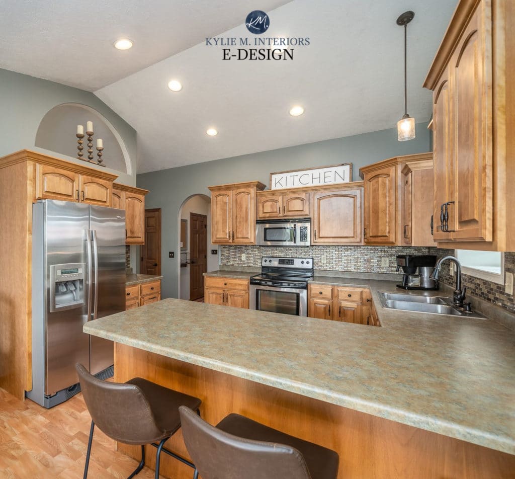
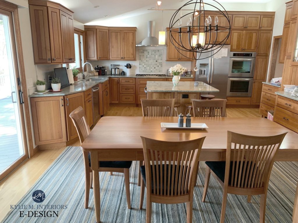
8. BENJAMIN MOORE CALDWELL GREEN HC-124
Caldwell Green is a bit more GREEN and a bit darker than many of the above colours – but daaang, is she ever gorgeous. With an LRV of 16, Caldwell Green is a medium-dark green paint colour. And while there’s a BIT of gray in there to calm it down, you’re still left with a whole lot of glorious green.
Caldwell Green looks MUCH more green on these upper cabinets via the natural light, interior lighting and photography. But if you take a good look at those lower cabinets, you’ll see a bit more typical shot of Caldwell in action.
Oh, you know I can’t even help myself – let’s do another one…
9. BENJAMIN MOORE NOVEMBER RAIN 2142-60
I didn’t touch much on the LIGHTER range with the above colours as MOST of my clients who are wanting green, want one with a bit of meat on its bones!
However, something must be said for the beauty of a soft, gentle green like November Rain. With an LRV of 71, November Rain is on the HIGH end of the light range – winking at off-white. It’s also a WARM green with a greige base to calm it down.
THE BEST DARKER GREEN PAINT COLOURS TO CHECK OUT
To hit a nice range, we’re looking at Benjamin Moore AND Sherwin William’s popular shades of green.
- Benjamin Moore Ashwood
- Benjamin Moore Narragansett Green & (a lot of blue in these)
- Benjamin Moore Artichoke
- Benjamin Moore Tarrytown Green (relatively legit)
- Benjamin Moore Salamander (cool and DARK!)
- Sherwin Williams Hunt Club (legit green)
- Sherwin Williams Ripe Olive
- Sherwin Williams Rock Bottom
- Sherwin Williams Jasper
- Sherwin Williams Shade-Grown
A FEW MORE POPULAR LIGHT GREEN PAINT COLOURS TO EXPLORE
- Mountain Air is a soft, warm green with a gray-greige base to calm it down. It’s a light-medium colour depth colour with a slightly fresh vibe.
- Benjamin Moore Spanish Olive is just a WEE wink warmer than Mountain Air – a great comparison.
- Benjamin Moore Camouflage. Camouflage is a beautiful WARM green paint colour with a soft greige base to calm it down.
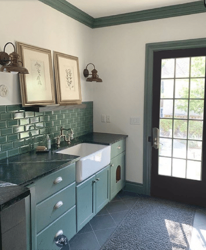
And for a bit of FUN, let’s look at this gorgeous mudroom in Benjamin Moore Avon Green! Before, the room was flat with a heavy cabinet and murky walls, but my client wanted to keep ALL of the existing green surfaces while freshening up the space…
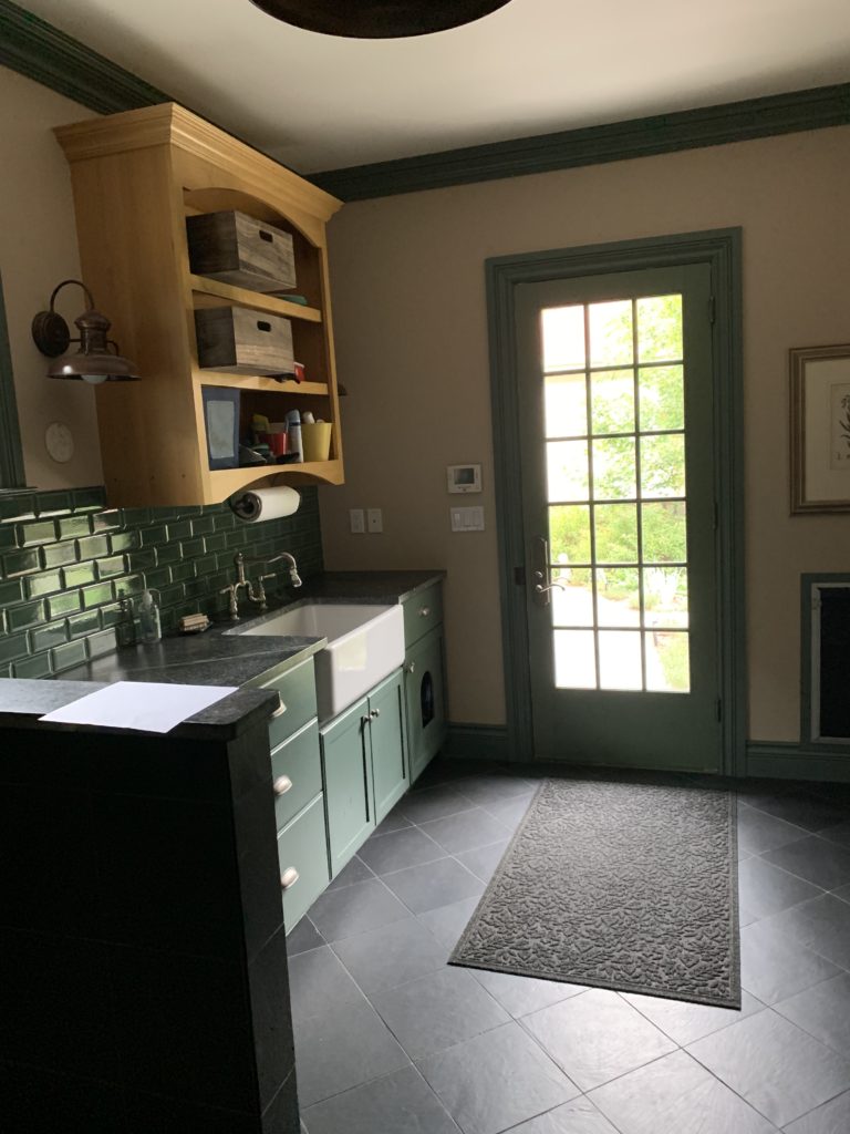
With a fresh coat of paint on the walls and door and the removal of the honky cabinet above the sink, the room looks SO much better (the pictures will be hung shortly).
Now, if you love the IDEA of those, but find them a bit too green, you might want to check out the gray or greige range with green undertones, something like Benjamin Moore Revere Pewter for example.
READ MORE
How to Choose the Best Green Paint Colour For Your Home
The 8 Best Blue Green Blend Paint Colours
Paint Colour Review: Sherwin Williams Evergreen Fog
North, East, South, West: Which Paint Colours is the Best?
The Best WHOLE HOME Gray and Greige Paint Colours
Looking for a great green?
Check out my Online Color Consulting for your own personal consultation!

ORIGINALLY WRITTEN IN 2019, TOTALLY OVERHAULED IN 2022
Comments
Leave a Reply
More Posts

The 12 Best Farmhouse Sinks of 2024
FIND YOUR DREAM SINK HERE… While traditional farmhouse design was all the rage in previous years, the embers have definitely cooled. As for MODERN farmhouse, it’s still kickin’ its cowgirl
Read More

Trendy & Popular Paint Colors for Your Kitchen Island (Mixed Bag!)
Islands, Vanities, Lower Cabinets? These Colors Have Em’ Covered…Literally It’s hard to beat paint when it comes to affordable kitchen and bathroom updates. However, whether you have wood cabinets or
Read More
The Best Paint Colors to Go With Golden Oak (Cabinets, Flooring, & Trim)
Modernize Your Outdated Golden Oak Home With COLOR! I’ve written a lot of blog posts on updating wood cabinets, covering a wide range of wood stains and grains. This one
Read More


Hi Kylie. I love your ideas and creativity! We just painted our kitchen Benjamin Moore Lenox Tan and the dining room Benjamin Moore Carolina Gull (both Sherwin Williams custom match colors). Now we’re getting ready to paint the laundry room. We wanted to paint this room a shade of blue. The ceiling, trim and cabinets are white and the counter top has a mixture of cream, grey and tan. I really like BM Palladian Blue, but I’m thinking it might be too light compared to the other two paint colors we just used. So then I thought maybe Sherwin Williams Interesting Aqua 6220, Meditative 6227 or Jubilee 6248 might look better. What do you think? Or, do you have other suggestions? Thank you.
Hi Beth, great quick question! Normally I refer people to my Online Consulting, but you caught me at a good time 🙂
Okay, so I LOOOVE Carolina Gull almost as much as I love Palladian Blue, however Palladian Blue is in a slightly different colour family from Carolina Gull, also the blue of it is a tough sell with the green of Carolina Gull. So, if you want that ‘look’ but in a colour family that is better suited to Lenox and Carolina then you’ll want to check out these….
1. Prescott Green. More green than Palladian and still not quite in the same colour family, but it’s the green in it that is a bit more compatible with Carolina (although I like Palladian better, Prescott is still pretty)
2. Blue Grass. Just a weeee bit lighter than Palladian with a tiny tiny bit more gray in it – making it a slightly better fit
3. Flora (an Aura b.m. colour) is an AMAZING colour. Now it’s closer to Carolina Gull than not (so you could have it lightened by 1/4) however I’ve seen this one in action and it flees throughout the day between greeny blue and then to bluey green – it’s pretty awesome!
4. Purple tones also look great opposite Carolina Gull and while purple isn’t everyone’s thing it does look great with grays (like in your countertop). Check out Gull Wing Gray as it’s gray with a purple undertone with a WEEEEE bit of blue in it – making it not obnoxiously purple. Just humour me 😉
I hope that helps you out!!!
~Kylie
I’m glad you found it helpful and hope you found a few faves!
Chat soon,
~Kylie
Have you done a Blog on your favorite coastal/beachy colors? I’m gathering a palette of Benjamin Moore paints to repaint my entire home. My vision is: blue, green, aqua/teal, driftwood gray/brown, sandy brown/tan, and a creamy off- white for trim and maybe even an orangy coral (not too pink) just for fun. I know it’s winter time currently, but if you haven’t done a blog like that already, I would love it if you did.. I think I have most of my palette pretty much figured out, but I just can’t decide on a blue. I have chosen a beautiful, soft, natural green- fernwood green. I’m looking for a blue just like that. Not too light so it’s powder blue. Not too dark and bold. Not too much green or gray. Any suggestions? What are your favorite beachy blues? Thanks, Sara
Author
Hi Sara! If you’re looking for a blue that’s along the same lines as Fernwood – but blue, not green, check out BM Smoke. Now I don’t know if it will suit your home/furnishings, but it is a pretty grayed-out blue!
~Kylie
Queen Anne Lilac! Sherwin Williams. I painted my bedroom walls. Just finishing the woodwork with original white. SW. STUNNINGLY SOFT
My bedroom at my old house was painted this color! Loved it. Going to use it again in our new house.
My master bedroom is east facing with 2 windows. I’m looking for a green color that doesn’t have a lot of gray. Could you tell me if Guilford green or Prescott green would work? I’m struggling with this decision and could really use and appreciate any help you could give this old gal. I just love reading everything you’ve written about, you’re by far the most knowledgeable source for paint colors I’ve ever come across!
Author
Hi Vicki! Well, it all comes down to personal preference and perception! I would say that Guilford and Prescott are GORGEOUS greens that have soft and subtle neutral backdrops, but nothing OVERLY gray. And they are both wicked gorgeous, good for say, a country or farmhouse look. Guildford is the ‘greenest’ by far, whereas Prescott is a green-blue and with your exposure, I would worry that it would feel less green for you. If you cleaned up Guilford just a wink, you’d hit something like Spring Meadow, which comes across a wink greener and shows the slightly more greige base (gray/beige) that is tucked into Guildford :).
Do you have any thoughts on which of the above greens pair well with each other? I have Carolina Gull in my living room and want a green for my eat-in kitchen which is adjacent. I thought maybe Sandy Hook Gray? We have Sherwin Williams’ White Duck in the other areas on the same floor. We’ve got a lot of oak furniture and stained glass shades in the kitchen and it’s just not a house that suits any sort of modern colours. I love love love the Carolina Gull with our rustic red brick fireplace and cranberry velvet drapes but it sure is a hard colour to pair with!
Hi! In the above you show a mudroom using Avon Green, which I love! Can you share what color of white you used to paint the walls to give it the refresh you mentioned? It is absolutely beautiful and lets the green shine.
Author
Oooo, I believe it was BM White Dove!
Do you think Sage Green will go with honey oak orangey kitchen cabinets and natural linen?????
Author
Oooo, it depends on the green, but off the top of my head – YES!
OOOOOOOPS!!!! ……
Do you think Dry Sage will go with honey oak orangey kitchen cabinets and natural linen?????
Author
Oooo, I LIKE the sounds of this!
I am struggling so much with a green for my kitchen, it currently looks like a patchwork quilt from all the samples I’ve tried. Everything either looks too yellow, too blue, or too grey. It will be going up against dark wood cabinets (with a reddish hint), and Sea Haze grey in the living room, with quite a bit of South sun coming in. I have Mysterious blue as an accent in some rooms and love it, so am looking for something tonally similar to that but less dark.
I have tried Lush and Avon green and they both look so much more blue from the swatch to the wall. I have also tried High Park and like the tone but it feels to light/ maybe a bit too grey.
I would be beyond grateful for any recommendations.
Author
Oh Angela, it’s just SO hard to say without seeing your space and its finishes – I’d literally be throwing thoughts at an empty wall! I do have a great colo consulting service that can be fun and SUPER effective! https://www.kylieminteriors.ca/hire-kylie/