
Posted on January 14, 2024 by KylieMawdsley
WHAT PAINT COLORS COORDINATE WITH MARBLE?
Whether you’re dealing with real marble, or quartz/porcelain that looks like marble, there’s no doubt it’s a popular finish for kitchens and bathrooms. Calacatta, Carrara, Blanco – they’re all being installed in today’s modern (and classic) home.
Why?
This post may contain affiliate links. If you make a purchase through links on our site, we may earn a commission.
Although the maintenance issues and cost leave a lot to be desired (for this budget-friendly, low-maintenance gal anyway), the look of marble is a timeless classic that undoubtedly adds style and value to a home.
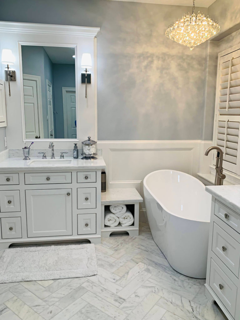
See this full bathroom here – IT’S GORGEOUS
Today’s most popular marble tiles and countertops are usually a mix of white and gray. However, if you’ve been hangin’ with me for a while…
You know that all grays have subtle (or not so subtle) undertones – and the gray found in marble is NO exception.
Gray Paint Colors: The Undertones You Have to Consider
The most common undertones in marble are blue and purple. Once in a while, you’ll get a warm gray-greige with a wee smidge of green, but it’s not as common. The same goes for beige or gold as you can find them in marble and marble-look finishes, but they’re not as common.
WHAT ARE THE MOST POPULAR TYPES OF MARBLE (COUNTERTOP/TILE)?
While there’s a lot of Emperador, Black, Cream, and Crema Marfil out there, they’re a blog post unto themselves. This blog post covers the more popular, traditional marble, including…
STATUARY/STATUARIO MARBLE. Is a more classic, simple approach to marble with its white or light gray backdrop and predominantly gray veins (often blue-violet undertone). Statuario’s veins tend to be thinner than that of Calacatta and the odd dash of gold pops up.
CARRARA MARBLE. This type of marble tends to have an off-white gray base color, with lighter or darker gray veining (more commonly with blue or violet hues). The veining tends to be thinner and often more ‘fleck-like’ than those found in Calacatta.
CALACATTA MARBLE. This marble is way more varied and veiny than Carrara. With a predominantly white backdrop, the veins can include warmer amber, brown, and gold tones, as well as grays and shades of taupe. Calacatta is a bit more of the wild child of the marble world with more dramatic, thicker veining.
Now, as for the best colors to go with marble, I can’t account for EVERY marble and every type of marble surface. This is why these paint colors are ‘guiding’ colors to get you on the right path.
HOW DO YOU MATCH MARBLE?
Assuming you have some form of gray in your marble (as this is what this blog post caters the most to), it’s about figuring out which TYPE of gray it is. And the best way to do that is to compare it to paint colors with a variety of undertones. The colors that blend or match the best will tell you your marble’s undertones!
- COOL GRAY (violet or blue hues)
- STORMY GRAY (more muddy, heavy violet hues)
- WARM GRAY (muddy violet or violet-pink tones, the odd flash of green, brown, or gold)
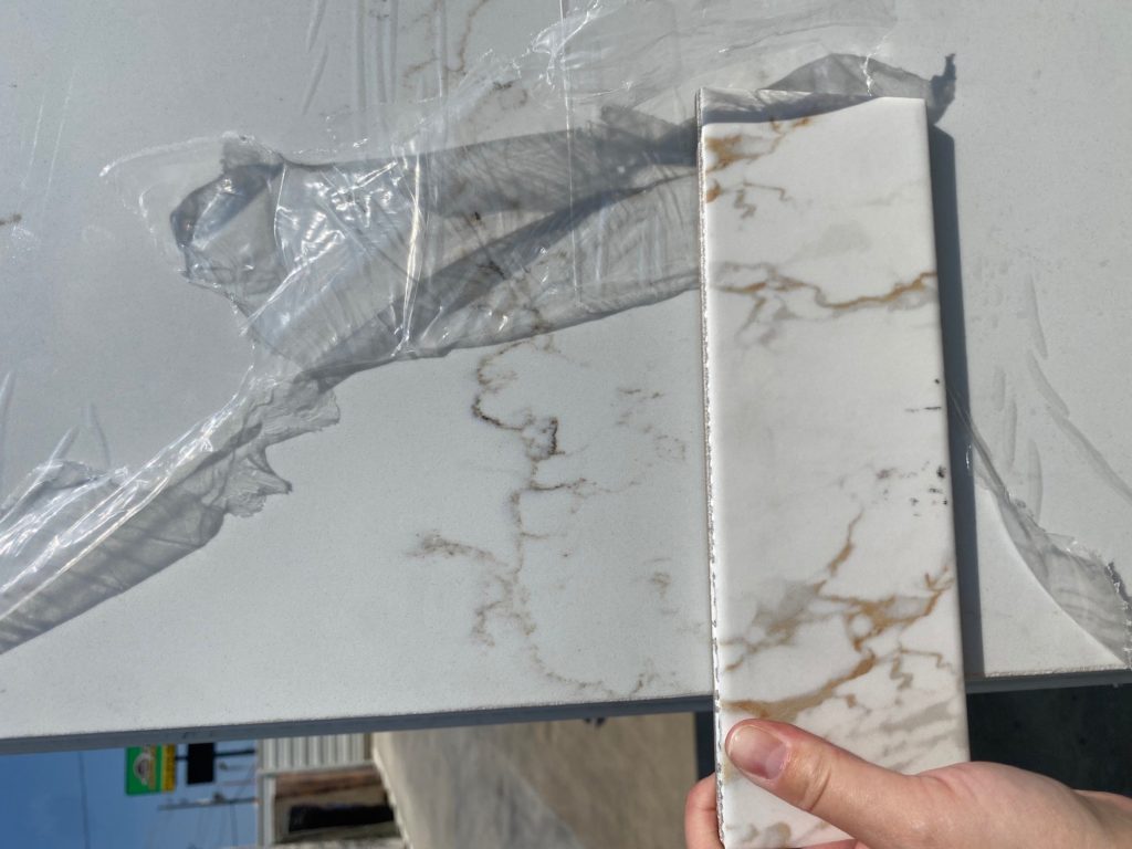
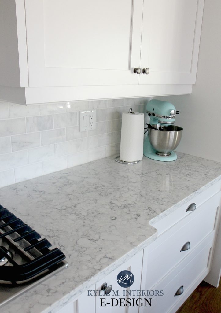
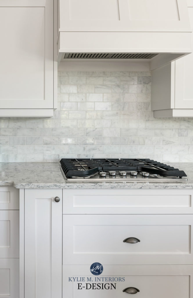
The bottom surface shown below is a quartz made to look like a white marble countertop. It has a rich brown vein as well as a bit of gray-violet. The tile on top has warm gray-violet/taupe tones as well as a strong orange-gold.
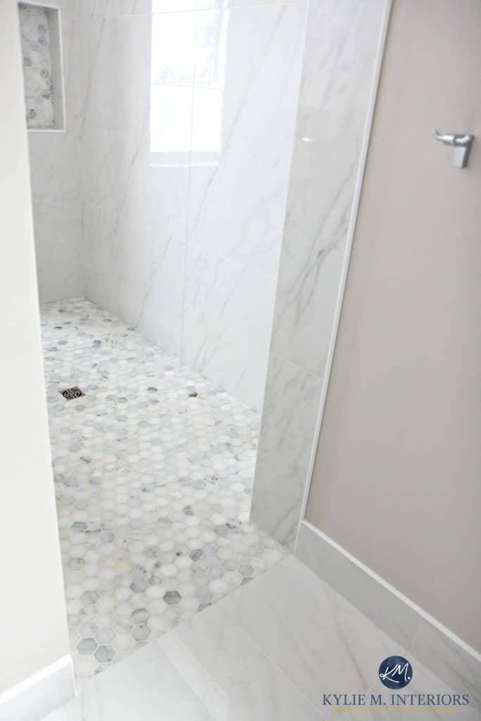
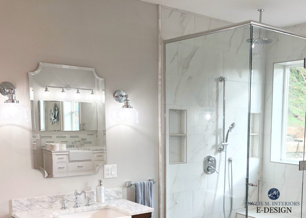
However, the real thing more often looks like this tiled shower with its stormy gray (violet) tones…
Or like this marble subway tile backsplash with its feather-light dusting of gray-violet (with a touch of blue). The white quartz countertop has stormy gray-violet tones…
Marble, Zellige, Subway Tile – Today’s Backsplash Trends
A FEW MORE THINGS TO CONSIDER BEFORE FINALIZING YOUR COLOR CHOICE
- Marble can accommodate a variety of paint color depths, from white and off-white up to medium-dark and sometimes even black. However, too much ‘color’ can overpower many gorgeous marble surfaces.
- Decide whether you prefer a ‘neutral with subtle undertones‘, eg. white, grey, greige, taupe, or if you want some more noticeable color, eg. blue-green with some gray to calm it down. Knowing the general direction you’re heading in will help you narrow things down. If you’re not sure, check ’em all out!
- Don’t forget your room’s exposure. If your marble can humor a few different shades, you might choose the one that best suits your marble AND your room’s exposure.
- Make sure your trim/cabinet colors are the right ones for your marble (here are the best whites, in general). If so, they should suit the same wall colors. If not, you might want to touch up your trims/cabinets!
- Take note of any other non-marble, surrounding finishes. Eg. you might have a marble backsplash as well as a quartz countertop or tile floor to accommodate.
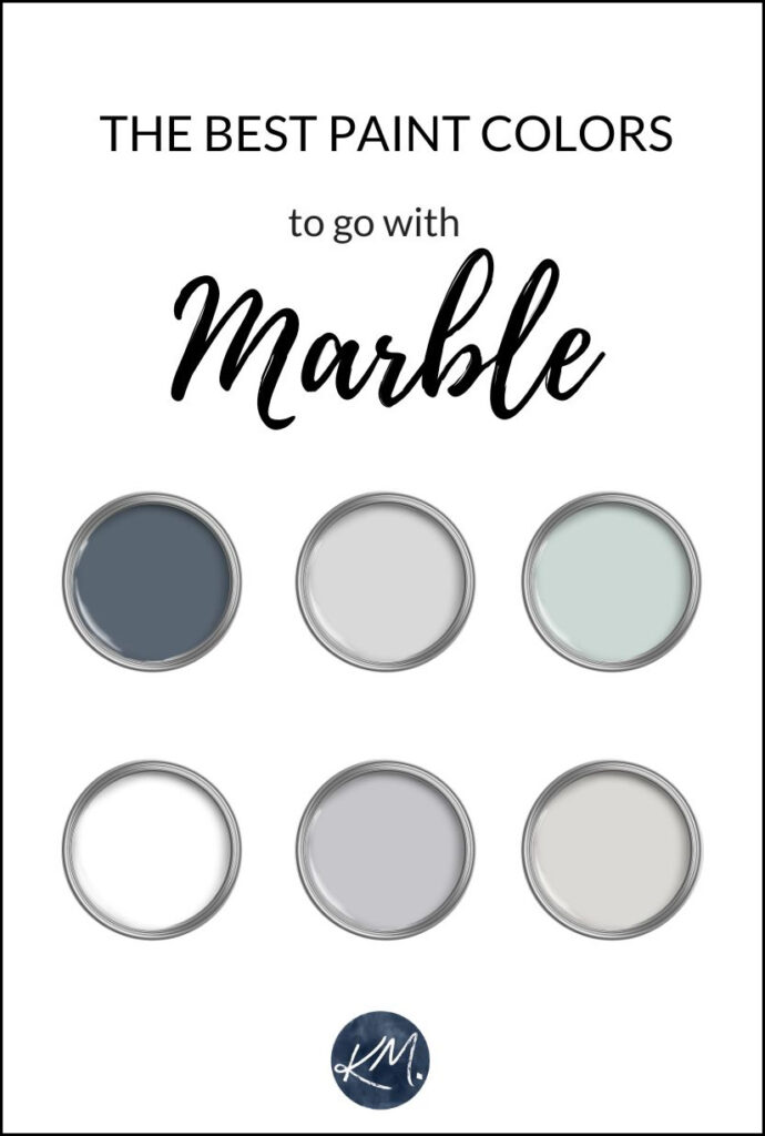
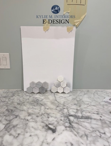
The above blobs are basic placeholders for some of the colors below
1. LIGHT GRAY COLORS WITH BLUE OR VIOLET UNDERTONES
Shades of blue and violet are the most common in marble tiles and countertops. This is why it’s a natural place to start your color adventure.
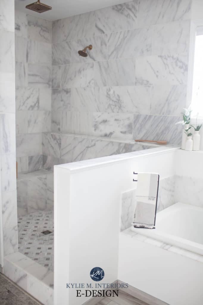
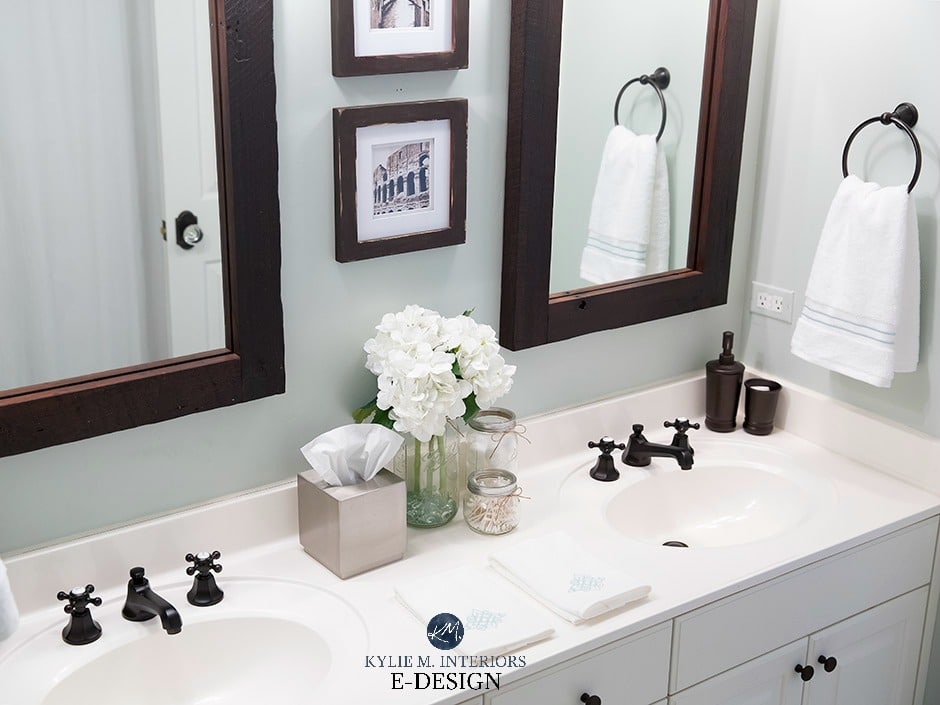
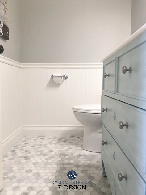
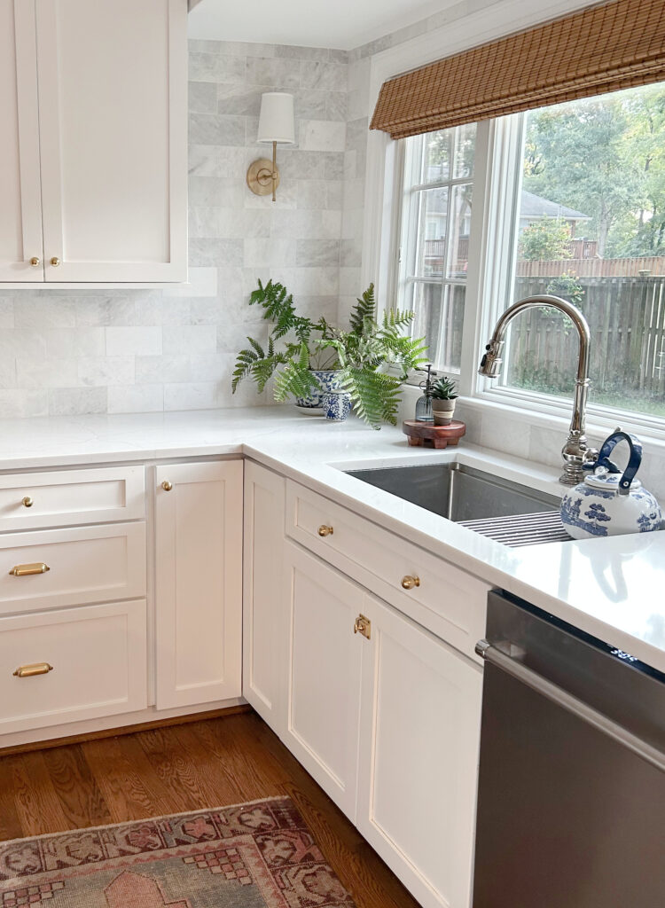
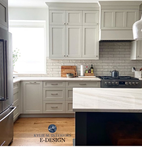
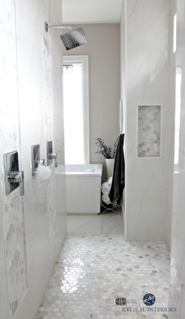
Looking at this small bathroom the hexagon marble tile backsplash is white and gray – but the gray is a violet-blue one…
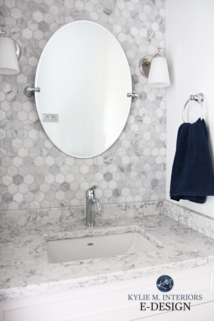
This hexagon marble tile backsplash (above) is shown with Sherwin Williams High Reflective White. However, if the homeowner wants a shade of gray, the tiles (and white quartz marble-look counter) easily accommodate it.
THE BEST SHADES OF LIGHT GRAY (BLUE-VIOLET) TO GO WITH MARBLE
- Benjamin Moore Graytint 1611 is a soft shade of light gray with a feather dusting of cool violet undertones (cool violet is violet-blue).
- Reflection is a light gray paint color with subtle, but purposefully colorful undertones, including violet and blue.
- Sherwin Williams Olympus White is similar to Reflection, but a bit more crisp and clear (has a bit less violet, so look at it carefully).
- Sherwin Williams Lazy Gray is like Olympus White, but with its LRV of 53, it has more depth.
- Benjamin Moore Pelican Gray is another gorgeous gray with violet-blue undertones. It’s most similar to Lazy Gray.
- Sherwin Williams Network Gray is a light-medium shade. While its undertones can be a bit unpredictable, it often has the perfect hint of blue.
Remember, that while colors can be SIMILAR, there will always be shifts in depths, temperatures, or undertones – sometimes all three! This is why it’s important to sample and COMPARE carefully (learn how to sample paint colors properly).
Sherwin Williams Network Gray Paint Color Review
Check out a CURATED LIST of some of my favorite shades of gray (blue-violet)
2. GREEN-GRAY PAINT COLORS (WITH BLUE)
While not all marble surfaces can accommodate an actual ‘color’, many are friendly with shades of green. Green can be warm (green-yellow), or cool (green-blue). The key to coordinating them with marble is that they should be green-blue with some gray to calm them down – making them a bit more earth-toned vs clean.
Sea Salt is a lovely soft green with a gray background to calm it down and is a popular paint color for ANY room, not just for those with marble. However, it’s a bit of a ninja and is well known for flashing into blue, to the point where you hardly see any green at all!
While there’s no marble in the above bathroom, from the overall style you can see how Sea Salt is a great paint color for this type of look.
I only use photos from my Online Paint Color Consulting clients or my local clients – I do the best I can to show you these beautiful colors in REAL HOMES!
THE BEST SHADES OF GREEN-BLUE-GRAY TO GO WITH MARBLE
- The previously mentioned Sherwin Williams Sea Salt is one of the most popular cool green hues.
- Benjamin Moore Palladian Blue is a long-time fan fave for its green-blue flexibility – however, it’s as about as colorful as I would look at when it comes to coordinating with marble.
- Sherwin Williams Comfort Gray is a gooooorgeous, light-medium depth green-gray with a bit of blue in its backdrop.
- Benjamin Moore Gray Cashmere is a soft, gentle, slightly fresh take on a green-blue-gray blend.
- Sherwin Williams Silver Strand is a beautiful green-blue-gray, where the gray plays a reasonably big part. `
- Sherwin Williams Rainwashed is along similar lines to Palladian Blue, and I definitely wouldn’t entertain more color/intensity than this.
3. STORMY LIGHT GRAYS WITH PURPLE UNDERTONES
Some marble counters and tiles don’t cater to purple-BLUE, but they still lean into purple. I refer to these shades as ‘stormy grays’, as they aren’t quite warm (purple-pink), but they aren’t notably cool either.
On the Rocks is one of my go-to gray paint colors when I look at the average marble surface. Sometimes it’s not quite purple-blue enough for one marble or violet-pink enough for another, but other times, it sure hits the spot (just like Tim, wink wink).
While you can’t see much of the countertop in this next photo, it gives you a good view of On the Rocks in action…
On the Rocks looks warmer than usual in this photo, just remember, it all comes down to the exposure of a room, time of day, and the photographer!
THE BEST STORMY LIGHT GRAYS TO GO WITH MARBLE
Remember, that while colors can be SIMILAR, there will always be shifts in depths, temperatures, or undertones – sometimes all three!
- Benjamin Moore Smoke Embers is a smoky, stormy gray with an earthy purple undertone that isn’t overly warm.
- Sherwin Williams On the Rocks is definitely one of the more popular approaches to gray-violet.
- Benjamin Moore Nimbus is popping up more and more in Design as it’s a soft, muted approach to warm gray with a purple undertone.
- Benjamin Moore Silver Satin is an off-white very slightly warm gray with that gentle violet hue.
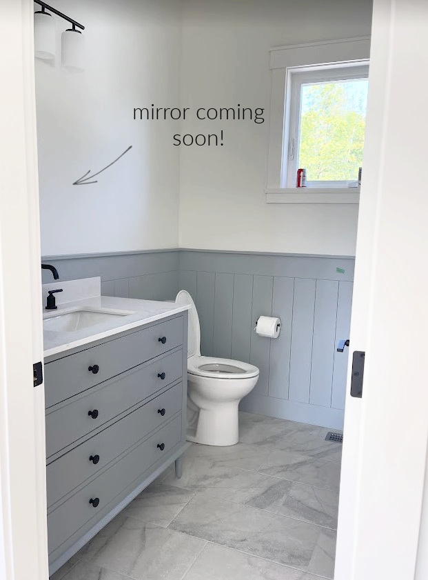
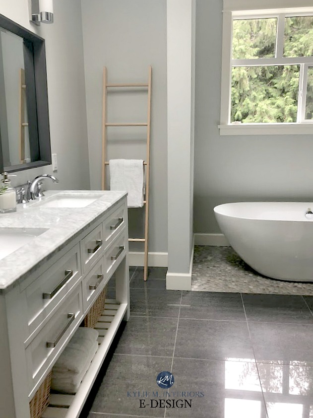
In this next bathroom, note the natural stone look of the wall tile, as well as the marble-look porcelain floor tile (with Benjamin Moore Nimbus)…
Get the Online Paint Color Expert that DESIGNERS hire!
4. STORMY GRAYS WITH BLUE-GREEN UNDERTONES
Whereas the previous bunch had a stormy violet undertone, these lean into the ever-popular shades of blue and green – often a blend! The key is to figure out which blend/proportion of color best suits your particular marble surface.
Stonington Gray is one color that’s underappreciated and underused. Even with gray going out of style, some like Stonington Gray will likely be around for the long haul.
The LRV of Stonington Gray is 59, so it has some decent meat on its bones. In a darker room, it will have a bit more visual weight and will only look bright and fresh (which is often the goal of those wanting gray walls) in a well-lit room.
GRAYS WITH BLUE-GREEN UNDERTONES TO GO WITH MARBLE
- Benjamin Moore Gray Owl is a fan fave. While it’s technically a warm gray, it sure as heck reads pretty stormy if not COOL. Its undertones also cater to green (scientifically), but quite often it will lean more toward blue.
- Sherwin Williams Crushed Ice is a fun one as its stormy undercurrent has you wondering just how it’s going to settle – slightly warm, slightly cool, green, blue – you’ll have to find out!
- Benjamin Moore Wickham Gray is another beauty with a stormy green-blue undertone and can be pretty with the right marble surface.
- Sherwin Williams Tinsmith is one of Sherwin’s best grays. It usually reads cool without being icy cold and harbors a blue undertone that can slightly wink at green.
- Sherwin Williams Big Chill is a classic in the world of ‘neutral gray paint colors’. Not that it’s neutral, but it’s stormy, ‘barely there’ blue undertone is pretty darn passive.
FULL Paint Color Review of Benjamin Moore Wickham Gray
FULL Paint Color Review of Sherwin Williams Big Chill
5. WHITE PAINT COLORS
There’s NOTHING wrong with going white as it can keep things bright and fresh! However, not all whites are created equal and you must hit the white that speaks best to your particular marble finish.
Shown above is Sherwin Williams High Reflective White with a wicked cool marble hexagon and beautiful quartz countertops. If you prefer a cooler shade, Extra White will lean a bit cooler on walls (a touch warmer on trim and cabinets) while still acting like white.
THE BEST WHITE PAINT COLORS THAT OFTEN GO WITH MARBLE
- Benjamin Moore Chantilly Lace is a brighter approach to white if the backdrop of your marble is bright, but not entirely stark.
- Sherwin Williams Extra White, if being used on cabinets or trim, is similar to Chantilly Lace. However, the formulation on walls changes and it’s a touch warmer.
- Sherwin Williams Pure White isn’t a ‘pure’ white, it’s a soft shade of white (LRV 84, true whites are up around 93). Pure White has a soft warmth, but its warmth is fractional compared to most, making it an interesting option for many marbles.
- You’d be surprised at how many marble tiles, backsplashes, and countertops can handle the subtle warmth of Benjamin Moore White Dove and sometimes even Simply White!
The 5 WHITEST White Paint Colors
Shown in this next photo, top to bottom: Sherwin Williams High Reflective White, Benjamin Moore Super White, Benjamin Moore Chantilly Lace, Benjamin Moore Decorator’s White…

Check out my FAVORITE shades of white to compare and sample with marble.
6. SLIGHTLY WARMER PAINT COLORS THAT GO WITH MARBLE
Now, not every paint color needs to have cool undercurrents or a white base, there are a few slightly warmer shades that have been known to humor a marble or two!
SHERWIN WILLIAMS AGREEABLE GRAY 7029
While not EVERY marble countertop or tile can handle a warmer approach, Agreeable Gray can be a great choice for marble or marble-look finishes that also have a wink of warmth in them.
FULL Paint Color Review of Sherwin Williams Agreeable Gray
BENJAMIN MOORE REVERE PEWTER HC-172
Revere Pewter is one of the most POPULAR gray paint colors on the market. And while it works with ‘some’, but not all marble finishes, it just might work for yours!
FULL Paint Color Review of Benjamin Moore Revere Pewter
Here’s a bunch of colors that are similar to Revere Pewter and Agreeable Gray that are worth comparing…
- Sherwin Williams Colonnade Gray
- Benjamin Moore Rodeo
- Sherwin Williams Amazing Gray
- Sherwin Williams Worldly Gray
BENJAMIN MOORE BALBOA MIST OC-27
Balboa Mist is a gentle shade of warm gray with a violet-pink undertone. Often, it’s not that Balboa Mist MATCHES a color in the marble, but it can offer a slightly warmer partnership if you want to lean away from the cooler end of things.
FULL Paint Color Review of Benjamin Moore Balboa Mist
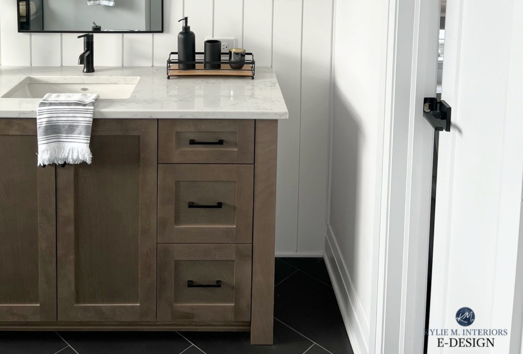
Balboa Mist (and its closest friends, listed below) are also known to suit a wide range of finishes that LOOK like marble but are actually quartz or porcelain.
- Benjamin Moore Classic Gray is an off-white warm gray (almost taupe) with violet-pink undertones.
- Sherwin Williams Egret White has a bit more depth and gray than Classic Gray but has similar intentions, for sure.
Speaking of warm colors…
WHAT BEIGE OR CREAM COLORS GO WITH MARBLE?
Generally speaking, beige, tan, and cream are touchy with many marble surfaces. It’s ideal if your marble has a bit of beige/gold or tan in it or a creamy warm in a few spots (I’ve seen it!).
If you do want to venture into the warmer world, I highly recommend checking out…
- A range of FLEXIBLE WARM OFF-WHITES (I have reviews for most of these on my blog). These shades aren’t overly committed to beige (orange) or cream (yellow tones).
- Some of the more trendy, modern shades of BEIGE & TAN. Avoid those that are overly orange.
- Or you might find a GREAT happy medium in the OFF-WHITE TAUPE world – there are some stunning shades in here that suit marble (again, I have reviews for most).
And for those who want a bit more drama…
7. MEDIUM-DARK SHADES OF GRAY
Darker shades of gray with carefully chosen undertones can be a STUNNING way to complement almost any marble.
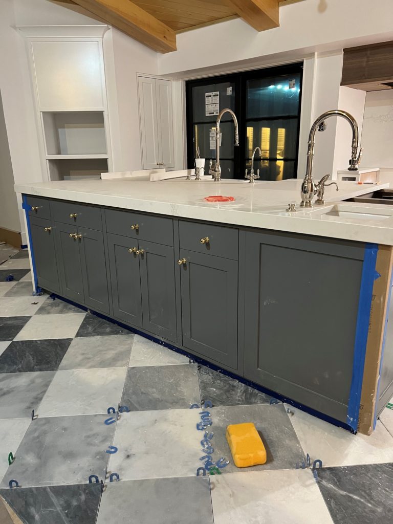
Trout Gray isn’t for the faint of heart, but when used in the right spot, as shown on this island below, it can make a marble tile floor look even more beautiful.
SIMILAR COLORS THAT LOOK GOOD WITH MARBLE
- Benjamin Moore Gray 2121-10
- Benjamin Moore Gray Shower
- Benjamin Moore Steel Wool
The 10 Best Dark Gray & Charcoal Paint Colors
You can also check out this curated list of some of my FAVORITE darker grays with blue-violet undertones.
8. THE DARKEST COLORS THAT CAN GO WITH MARBLE
While not every space can handle a SUPER dark color, there’s something to be said about bringing the drama llama into the room…
- Benjamin Moore’s Cheating Heart
- Sherwin Williams Cyberspace
9. THE MORE COLORFUL END OF THINGS
If you want a bit more colorful without tipping the scales, here are some badass beauties to check out…
Benjamin Moore Bachelor Blue with a marble tile backsplash (blue-violet)
- Benjamin Moore Bachelor Blue (see the best MEDIUM depth shades of blue).
- Sherwin Williams North Star – a blue-gray with a bit more blue than its grayer cousins.
There you have it! And while there are MANY more great colors out there, the above options should get you started!
READ MORE
The 12 Best White & Off-White Quartz (Marble-Look) Countertops
5 Ideas to Add Personality to a Subway Tile Backsplash
How To Get The Look of Marble WITHOUT The Price!
The 12 Best WHOLE HOME Gray & Greige Paint Colors
The 5 Best ALMOST FOOL-PROOF White Paint Colors
Not sure which color is best for you and your home?
Check out my Online Color Consulting – I’d be happy to help!
WRITTEN IN 2018, UPDATED IN 2024
Comments
Leave a Reply
More Posts

The 5 Best Creamy White or Off-White Paint Colors
THE ELUSIVE ‘CREAMY WHITE NEUTRAL’ When it comes to light, warm neutrals, it’s all in the undertones. And other than pink and green, yellow is the undertone many of my
Read More

The 8 Best Warm Neutral Paint Colors With NO Yellow Undertones!
The Top Light Depth, Warm Colors That Aren’t Cream! When choosing the best warm neutral paint color for your home, whether creamy white, beige, taupe, or greige, your choices are
Read More

The 12 Best Farmhouse Sinks of 2024
FIND YOUR DREAM SINK HERE… While traditional farmhouse design was all the rage in previous years, the embers have definitely cooled. As for MODERN farmhouse, it’s still kickin’ its cowgirl
Read More


Hi Kylie.
I love the paint colors mentioned. It looks like the bathroom vanities here have cool colors. We purchased a light wood-look bathroom vanity with white marble top with grey flecks. I love Seasalt but I’m wondering how the mix of a warm wood vanity with a cool marble top would do with any of these cool paint colors.
Difficult problem selecting colors for white porcelain marble look bath .When I put the color sample (sea salt) on one wall, it will appear green but another wall it will appear blue. Another sample (shoji white) has a yellow tone on one wall but a beige putty on another. How do you decide which sample to choose if they don’t look the same in the same room.
Author
Ahhhh, good question. It’s hard. It’s about finding a color that you like 90% of the time. Also, once it’s not being directly compared to the existing color on the wall, this can shift. You can ALSO play with your light bulbs to see if changing Kelvins changes how you feel!