
Posted on April 11, 2023 by KylieMawdsley
WHAT’S THE BEST PAINT COLOR THAT GOES WITH EVERYTHING?
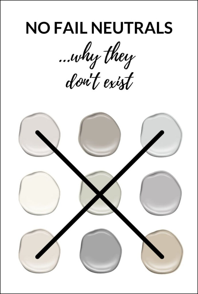
You’ll see a lot on Pinterest about ‘No Fail Neutrals’ or, ‘The Top 10 No-Fail Paint Colours…’ I’m here to burst your bubble and tell you, ‘There is no such thing as a no-fail neutral.’
Why?
This post may contain affiliate links. If you make a purchase through links on our site, we may earn a commission.
Oh, Lordy, where do I start?
Are there colors with a better chance of working in your home than others? ABSOLUTELY, and I’m going to share these with you. However, no ONE color will work in every home in any room.
I’ll be sharing a shortlist of my favorite, most VERSATILE neutral paint colors at the end of this blog post, but FIRST, let’s do a little learnin’!
PERSONAL PERCEPTION & PAINT COLORS
What a color is and what it LOOKS like to you can be two different things. I could tell you that Benjamin Moore Rodeo is a warm gray – you might think it’s too cool or too warm/greige. You could tell me that Sherwin Williams Peppercorn is the perfect neutral gray paint color, whereas I see it as WAY too colorful and not neutral at all!
It all comes down to perception. So if an influencer or Designer tells you that a color is the BEST no-fail neutral…I guarantee it isn’t ‘no fail’ at all. They might say it’s the ‘best no-fail greige‘ when you don’t see it as greige, but something else entirely.
Sure, a lot of my blog posts say, ‘the best this – the best that,’ and this is based on my experience (which is extensive). However, I won’t say that, come heck or high water, a particular color works every single time.
Because in the end, it all comes down to YOU. Picking paint colors can be stressful; looking for that PERFECT neutral can seem impossible. This is why you’ll learn a few ins and outs about why you may or may not be finding the color you love.
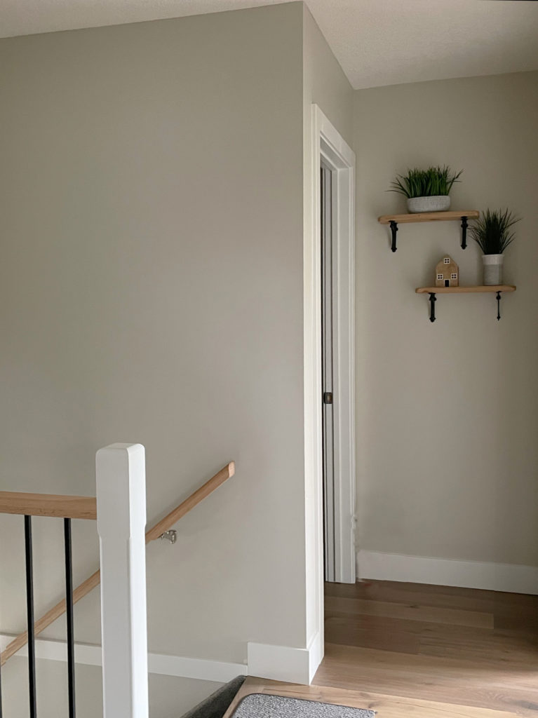
Benjamin Moore Rodeo
Let’s take a look at YOU. There are two types of ‘you.’
THE ‘EASY TO PLEASE’ YOU
You want a great paint colour, but not at all costs. (Men often fall into this category).
- You quickly narrow it down to 2-3 colors, pick one, and run with it – no paint samples, no muss, no fuss.
- You may notice that it looks slightly different from wall to wall, but you aren’t too worried about it – it’s just paint.
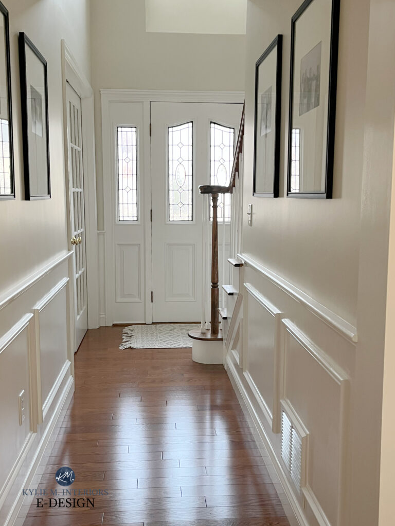
Benjamin Moore Ballet White
THE ‘BANG YOUR HEAD AGAINST THE WALL’ YOU
You absolutely AGONIZE over picking the right paint colour, and it can take weeks, if not months, to decide, and even THEN you second guess yourself. I definitely belong to this group. While I advise my Online Paint Color Consulting clients all day, I get massive anxiety when it comes to my home.
Why?
With your home, I don’t get emotional – I can look at your space and personal tastes logically. When it comes to my home, logic goes OUT THE WINDOW, and I think things to death. It comes down to the fact that I love too many colors and hate committing. Does this sound like you…?
- You pick up dozens of paint samples and have them taped to or painted on your walls
- You agonize over how each color changes on each wall – more green there, more purple there, and maybe a bit pink over there!
- There are empty wine bottles on your floor and dents in your wall from all of the headbanging
Yes, my lovely, this article is for you, because if you’re in the OTHER group, you’re probably not reading this blog post in the first place!
So, take a deep breath and realize that sometimes you are up against Mother Nature and a wild assortment of other things that can make it challenging to pick the PERFECT colour for EVERY corner of EVERY wall. That is reality.
THE ILLUSION OF THE ‘NO FAIL NEUTRAL’
The idea behind a ‘No-Fail Neutral’ is that they will work in any room, in any conditions – hence the ‘no fail.’ This means that these colors won’t fail no matter what your exposure, your carpet, your countertop, or your personal tastes. But many will…
Why?
METAMERISM & PAINT COLORS
Metamerism is the cold, hard fact that paint colors will change depending on their environment. Exposure, reflection, artificial lighting – these things WILL greatly affect how a colour may look in your home. And yes, there is MUCH MORE SCIENCE involved in all of this than ANY OF US really care to know about, so this is about keeping things a bit more ‘KD and box o’ wine,’ rather than ‘quiche and caviar.’
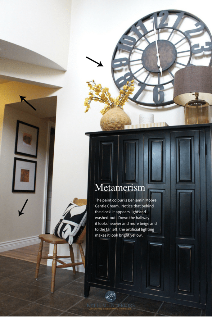
The more ‘colors’ a paint color has mixed into its recipe, the more susceptible it can be to metamerism. Paint colors that are made up of only 2-3 colors mixed together will be a bit more predictable than colors that blend 5+ colors (i.e., Benjamin Moore’s Affinity Collection).
Let’s look at some of the different parts of metamerism (OH THE JOY!!!)
The Ultimate Guide to Choosing Paint Colors with LRV
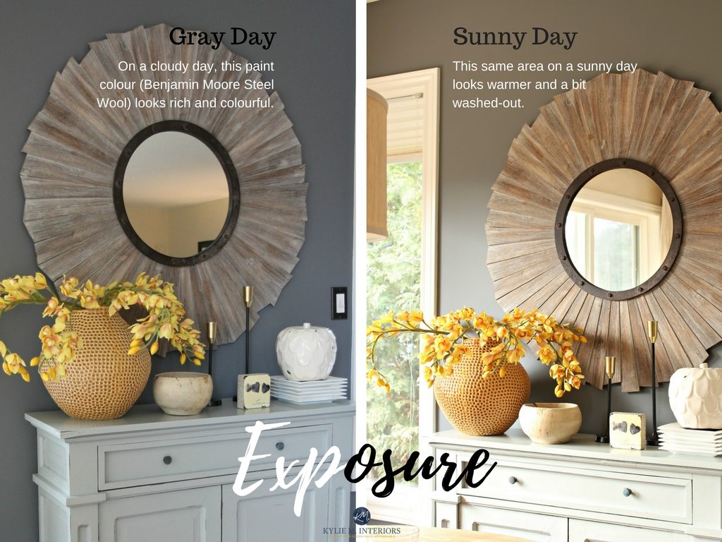
PAINT COLORS & NATURAL LIGHT/EXPOSURES
That beautiful off-white that looked subtle and warm in your south-facing room may look cold and grayish in your north-facing room.
Why?
Because your room’s exposure (or exposures) can greatly affect paint colors.
- North-facing light: Gray with a blueish cast
- South-facing light: Yellow
- East and West: Well, they are a hot mess as they change drastically from morning to afternoon, so we may as well not even go there
You can’t expect a paint colour to act the same on every wall in every room – it’s impossible.
North, East, South, West – Which Paint Color is the Best?
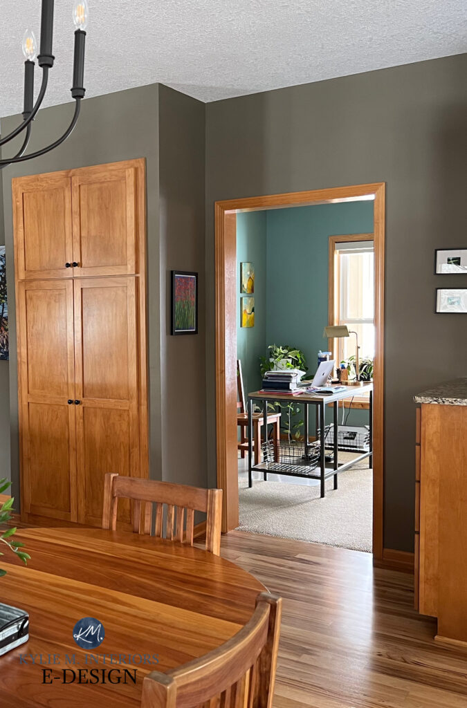
PAINT COLORS & REFLECTION
‘Every colour that I’ve looked at looks green in my room’ – I hear this ALL the time with my Online Consulting clients, and most often, these colors simply have NO green in them! One look at the photos they send shows me WHY every colour is taking on a green hue – reflection. Outside the windows, there are usually expanses of bright green grass, landscaping that is close to the window, or a large bank of trees.’
In this next photo, notice the green undertone on the space closest to the floor. Then, notice the strip of green putting/golf turf…
I had another client who didn’t understand why her samples looked pinkish in her room – there is no such thing as pink natural light (unless you get an epic sunset). One look at her photos showed me a deck stained in a lovely, rich red – the same lovely red reflecting onto her walls!
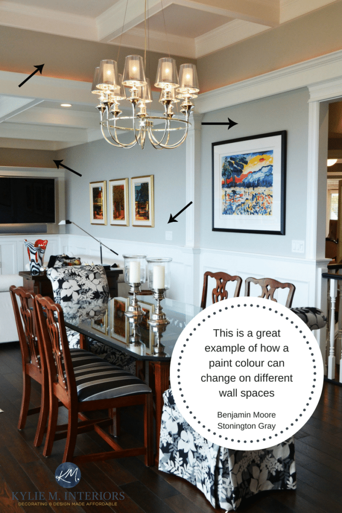
So, while the best intentions might pick the perfect beige that ‘seems’ to be as neutral as neutral can get, this same neutral can change more than a chameleon as you go from one end of a wall to the other.
BTW: There’s not much you can do about this, short of shutting your drapes…or your eyes.
Why can’t you do anything?
Let’s say you have a lot of green coming into your room via the exterior landscaping. A natural way to combat this would be to balance things out with red. What does red become when it’s lightened? Pink. And while pink has its place, it’s usually better on ham than on walls. Sure, the walls that pick up the green reflection might seem a bit more neutral, but on the other walls, and in the evening, you actually have to LIVE with this pinkish colour you’ve chosen (never mind it being the right color for your interior finishes, that’s a WHOLE different topic).
LET ME CHOOSE YOUR COLORS FOR YOU!
PAINT COLORS & ARTIFICIAL LIGHTING/LIGHT BULBS
The type of light bulbs you use can greatly affect how your paint color looks. And sure, this is something you have CONTROL over; however, sometimes the type of light bulb that lets a paint colour look its most authentic is the one you don’t feel comfortable living in.
- INCANDESCENT LIGHT BULTS & PAINT COLORS: Tends to be a warmer light, enhancing colors like red, yellow, and orange. Dulls cooler colors.
- FLUORESCENT LIGHTS & PAINT COLORS: A cool light that enhances blues and greens. Dulls warmer colors.
- CFLs & PAINT COLORS: You must watch these as it depends on the light bulb’s Kelvins. A lower rating = a warmer bulb. A higher rating = a cooler light, more like natural ‘daylight.’
- HALOGEN BULBS & PAINT COLORS: Can enhance colors slightly, resembling daylight to a degree.
- LEDs & PAINT COLORS: The light that will make most paint colors look their most authentic. From there, you play with the Kelvins and CRI.
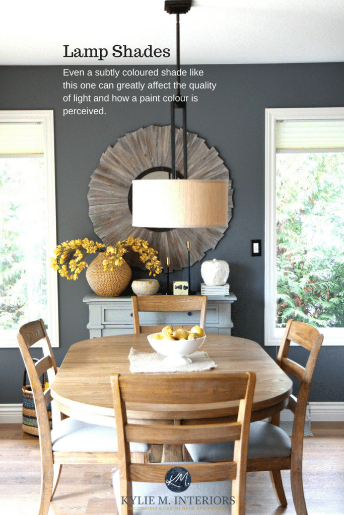
And then there’s your lamp shades…
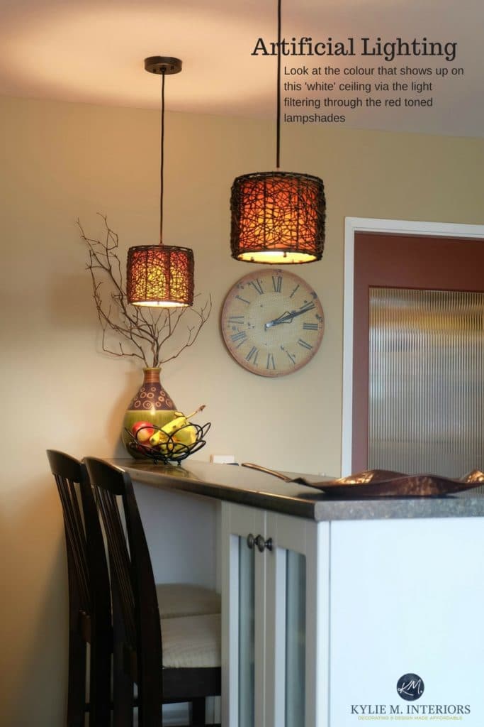
A big part of lighting is the color of the lamp or light shade (glass or fabric). White shades give off a cleaner light. White opaque glass shades tend to reflect the Kelvins of their bulbs the best, whereas white FABRIC lampshades almost always cast a warmer light. Amber shades or colored shades will reflect a tinted light onto the walls as the light filters through it – regardless of the bulb type (even though the bulb will still influence things).
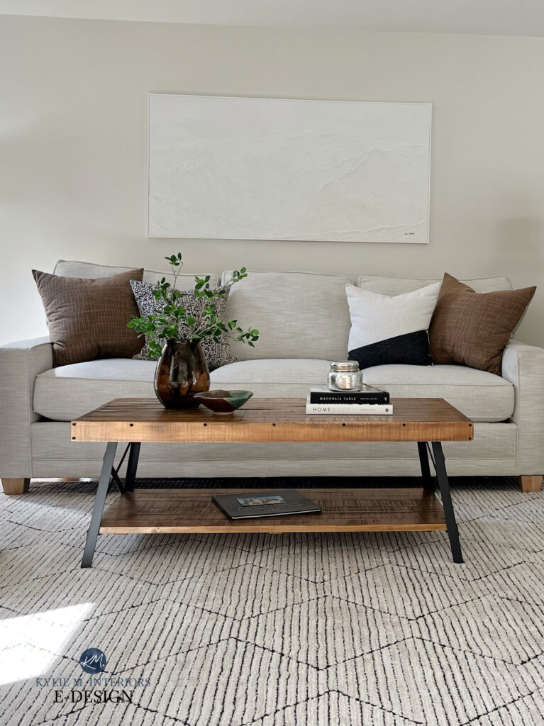
5 PAINT COLORS THAT ARE AS CLOSE AS POSSIBLE TO ‘NO-FAIL NEUTRALS’
These colors are shades that come up repeatedly in my E-design, colors that work in the average home, on the average wall, cabinets, trim, or exterior. Let’s see if they might work for you!
SHERWIN WILLIAMS EDGECOMB GRAY
Edgecomb Gray is definitely a popular warm neutral. Snuggled in tight between gray and beige, Edgecomb Gray is a transitional color, bridging the warm and cool worlds, with a depth RIGHT in my happy place.
Learn ALL ABOUT Edgecomb Gray in its FULL COLOR REVIEW
SHERWIN WILLIAMS EGRET WHITE
Egret White is on the edge of the off-white and light ranges, offering nice contrast with trim without too much visual weight. Some call it a warm gray; others see it as a taupe due to its subtle undertones. It’s great on walls, exteriors, and even kitchen cabinets!
Learn ALL ABOUT Egret White in its FULL COLOR REVIEW
BENJAMIN MOORE WHITE DOVE
Regarding flexible shades of white, White Dove is near the top of the list (along with Sherwin Williams Pure White). While White Dove is white, it’s a soft, warm shade of white that suits a WIDE range of interior finishes, including tiles, countertops, brick, stone, and more. White Dove is a GREAT place to start your color adventures, whether for your walls, cabinets, trims, or exterior.
![]()
Learn ALL ABOUT White Dove in its FULL COLOR REVIEW
SHERWIN WILLIAMS NATURAL LINEN
If you’re looking for a popular, versatile shade of beige, Natural Linen is rising in the ranks. Not as heavy as the beiges from the early 2000s, but not in the off-white world, Natural Linen suits a ton of beige tiles, countertops, and other interior finishes common from the early 2000s, as well as more modern beige surfaces.
Learn ALL ABOUT Natural Linen in its FULL COLOR REVIEW
BENJAMIN MOORE COLLINGWOOD
When it comes to gray paint colors, those with a subtle purple undertone tend to suit more interior finishes than those with blue or green undertones. For this reason, Collingwood can be a great fit for the average home.
Learn ALL ABOUT Collingwood in its FULL COLOR REVIEW
So, you can stop wondering why you can’t seem to find the perfect paint color, take a deep breath and find the paint colour that fits the bill most of the time. Sure, it might look a bit grayish here or a bit yellowish there, but as long as it has the bones you are looking for, then go for it!
And if all else fails, you know who to call (wink wink).
READ MORE
The 5 Best, Almost Fool-Proof Paint Colors For Your Home
The 3 Best, Most Timeless Neutral Paint Colors
The 8 Best WHOLE HOME Warm Neutral Paint Colors
6 Tips for Choosing a Paint Color When You’re an Overthinker
Check out my Online Paint Colour Consulting!

Chat soon,

ORIGINALLY WRITTEN IN 2017, UPDATED IN 2023
Comments
Leave a Reply
More Posts

The 12 Best Farmhouse Sinks of 2024
FIND YOUR DREAM SINK HERE… While traditional farmhouse design was all the rage in previous years, the embers have definitely cooled. As for MODERN farmhouse, it’s still kickin’ its cowgirl
Read More

Trendy & Popular Paint Colors for Your Kitchen Island (Mixed Bag!)
Islands, Vanities, Lower Cabinets? These Colors Have Em’ Covered…Literally It’s hard to beat paint when it comes to affordable kitchen and bathroom updates. However, whether you have wood cabinets or
Read More
The Best Paint Colors to Go With Golden Oak (Cabinets, Flooring, & Trim)
Modernize Your Outdated Golden Oak Home With COLOR! I’ve written a lot of blog posts on updating wood cabinets, covering a wide range of wood stains and grains. This one
Read More


I came across your blog while looking for “SW Wool Skein” and got hooked to your website. Thank you!!
Interesting article. Metamerism!! Now I can understand why my new river white counter tops and clear glass back splash look green. I have tall green trees all around family room/kitchen. it has North/East/South exposure. We redid our kitchen with white/grey cabinets. All white surface have green hue in them. Painted family room Behr Sage tint, which I think is very close to SW Sea salt and the color is lost in the room. I am thinking of going to beige route and painting it SW Wool Skein. have to get sample and see it.