
Posted on March 2, 2022 by KylieMawdsley
How to find the undertones in paint colours
I can’t even COUNT the times I’ve helped my E-Design clients fix rooms they JUST PAINTED. The beige they picked looks pink, the yellow they chose is day-glo, the gray that looked soooo great in their friend’s home looks flat and dull in theirs. And the funny thing is, I RARELY suggest complete colour changes, it’s almost always about tweaking what’s there (which is MUCH different from twerking, which sadly, I’m yet to perfect).
Why does this happen SO OFTEN? Well, there are two main reasons…
This post may contain affiliate links. If you make a purchase through links on our site, we may earn a commission.
1. THE WRONG UNDERTONE
2. FAILURE TO FIND THE RIGHT INSPIRATION OR PAY ATTENTION TO THE BOSSIEST PIECE IN THE ROOM
In other words, don’t blame the colour – blame the person who applied it. That’s right, when undertones go wrong, it’s usually because the homeowners focus more on what THEY want, rather than figuring out what their ROOM wants and NEEDS.
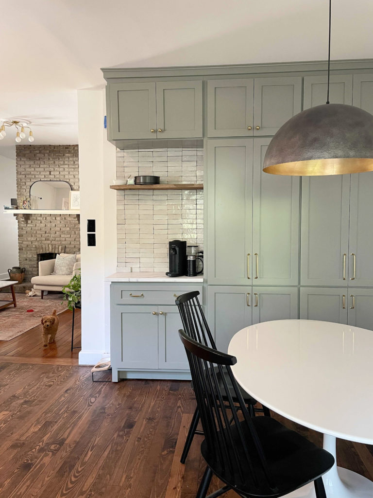
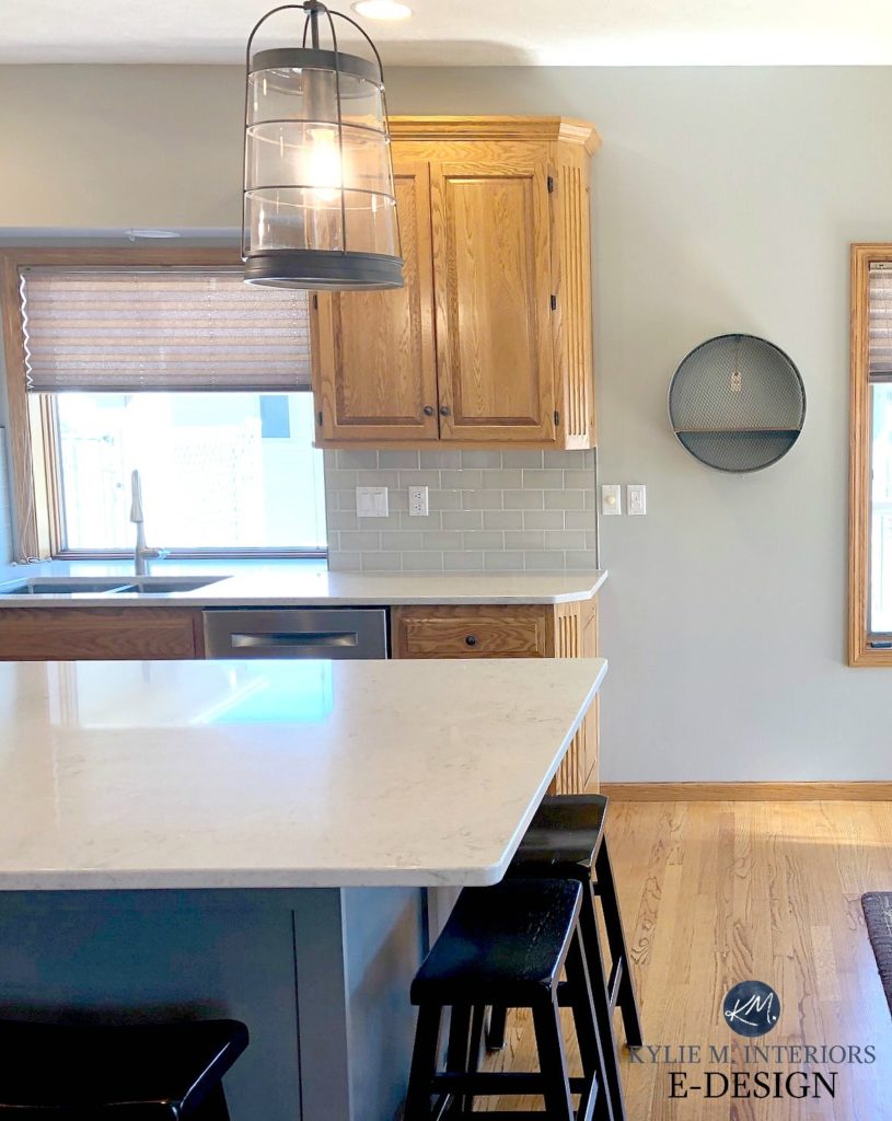
My client chose a BEAUTIFUL cabinet colour, Farrow & Ball Pigeon, which is a GRAY with a GREEN (green-blue) undertone
WHAT IS THE ‘UNDERTONE’ OF A PAINT COLOUR?
Undertone is that lil bugger of a colour hiding in your so-called ‘neutral’ paint colour that often doesn’t surface until after you’ve spent the ENTIRE WEEKEND painting your room.
EVERY PAINT COLOUR HAS UNDERTONES*
*Other than TRUE white, true black and primary colours.
For example, let’s say you chose a GRAY for your walls and it looks pretty darn gray, in fact, you’re pretty sure it’s the MOST NEUTRAL GRAY EVER SEEN! HOWEVER, you finish painting and for some reason, you see a bit of BLUE popping up – this is your gray’s UNDERTONE. Or maybe you picked the most PERFECT beige, but are surprised to see ORANGE or even a bit of PINK once you start slapping paint on your walls – this is your beige’s undertone(s). And even if the undertone is super subtle, even your room’s EXPOSURE can throw you a curveball when you least expect it.
Paint colours are just not that simple.
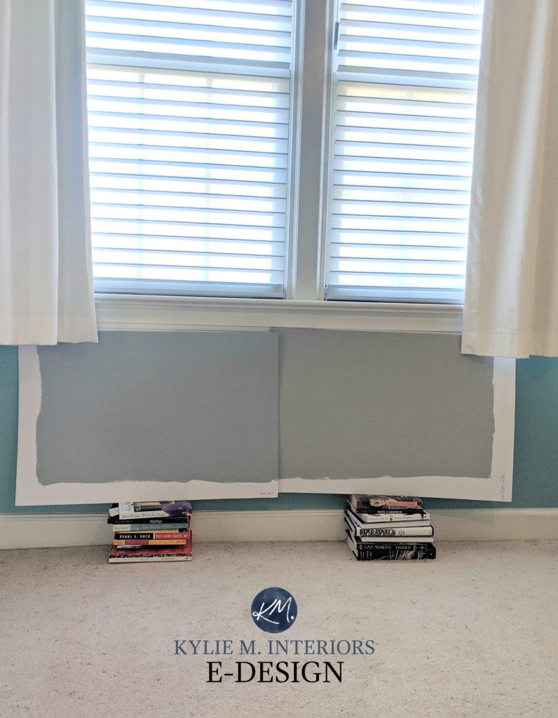
In this next photo, if you were to look at these two grays all on their lonesome, you might just see ‘gray’. HOWEVER, compare them with each other and it’s MUCH easier to see how one leans a bit more blue and one leans more green (LEFT: Sherwin Williams Mineral Deposit / RIGHT: Sherwin Williams Gray Matters).
Another example is the colour BLUE. Let’s say you chose a beautiful blue paint colour and it LOOKS pretty darn blue. But at certain times of day, you see a bit of green or violet – this is your blue’s UNDERTONE. That’s right, it’s not just NEUTRALS that have undertones.
Let’s take a peek at Sherwin Williams Rainwashed (below), what’s your general impression of it?
Now, let’s put Niebla Azul next to Rainwashed. Does your perception of Rainwashed change?
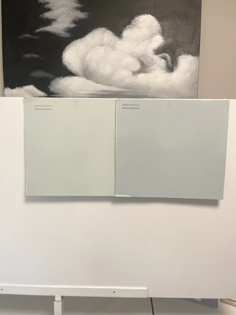
If you’re seeing what I’M seeing, at first glance, Rainwashed looked like a soft kind of grayed-out blue. However, once it’s compared to Niebla Azul which has more BLUE to it, Rainwashed looks a bit more green IN COMPARISON.
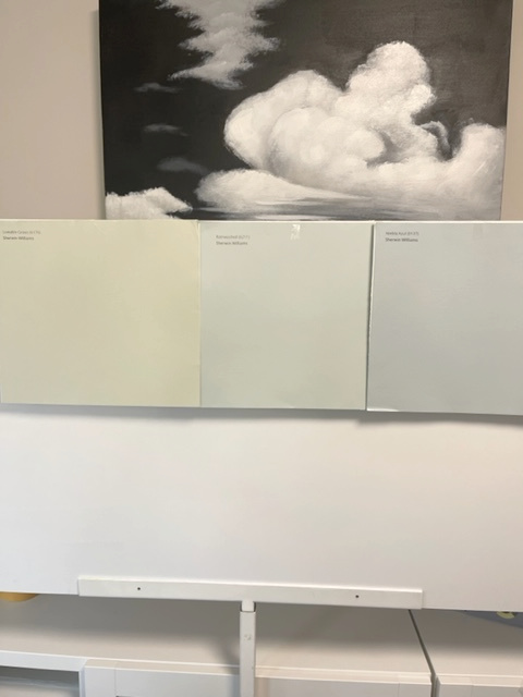
But then we add an ACTUAL green like Sherwin Williams Liveable Green to the mix (below) and see that Rainwashed really DOES have a nice blue-green blend to it…
Let’s do another example using WHITE. While there are some whites that are whiter than my lil Ginger butt cheeks (and no, if you click on that link it won’t take you to those photos – that’s a TOOOOOTALLY different website – wink wink), MOST whites have some undertone. In this next room, you’ll see Sherwin Williams Pure White on EVERY painted white surface…
Now, let’s see how Pure White looks when it’s directly compared to a CLEANER brighter white…
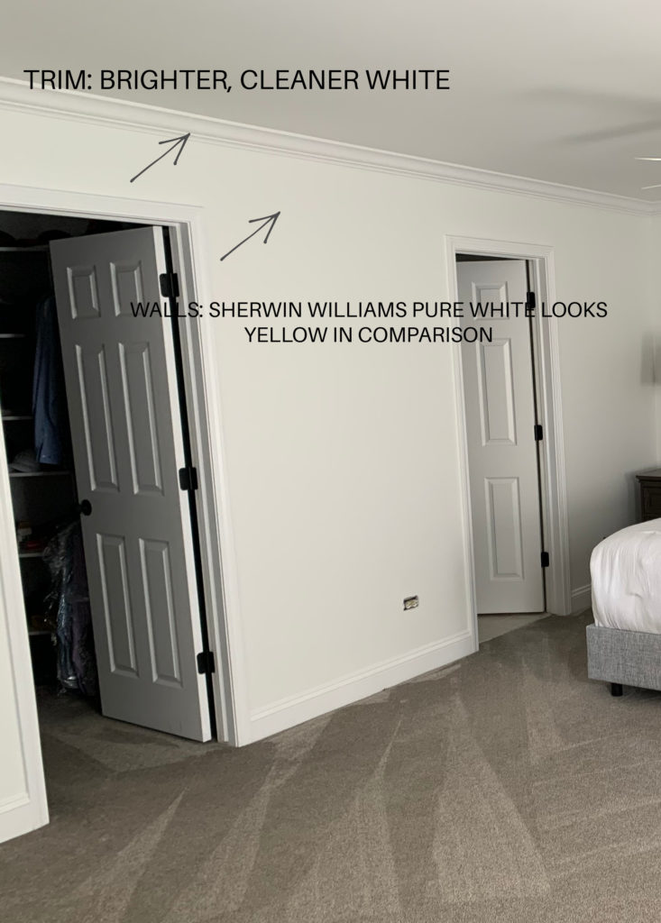
Pure White only LOOKS bright white in the first room because it’s not being directly compared to a BRIGHTER cleaner white.
COMPARE COMPARE COMPARE
In this next photo, we’re looking at Sherwin Williams’s Mindful Gray. How’s it looking to you?
Now take a look at this next photo to see how it COMPARES to other similar neutrals…
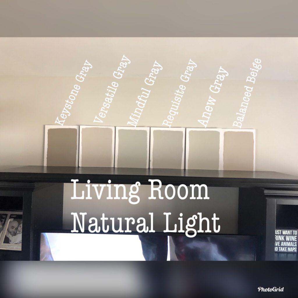
Which of the above samples looks the most GREEN? That’s right, the third in from the left – Mindful Gray. Is it SUBTLE? HELLLLS YES, but that doesn’t mean it won’t come up and bite you on the toosh when you least expect, which is why it’s SO IMPORTANT to compare (asking the experts helps too).
And remember, I have over 400 articles on this lovely little blog o’ mine. If you’re curious about a colour, find the SEARCH and see if I have it!
Why NO-FAIL NEUTRALS don’t exist
HOW TO FIND THE UNDERTONE IN PAINT COLOURS: TIPS & TRICKS
When it comes to finding the undertones in paint colours, there’s only ONE WORD you need to remember and hermetically seal in your brain…
COMPARE
A paint colour can look one way on its own, but compare it to ANOTHER colour and all of a sudden you’ll see shifts in temperature and undertones – things you might not have noticed at first or even second glance.
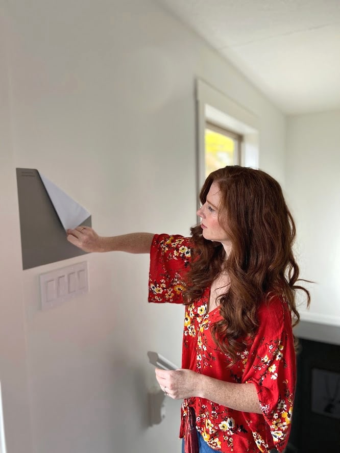
1. GO TO THE PAINT STORE OR SAMPLIZE & GRAB THE PAINT COLOUR YOU THINK YOU WANT
Most people have an IDEA of the colour they want before hopping online or going in-store. If not, I highly suggest following my PINTEREST or INSTAGRAM for inspiration!
2. PICK APPROX. SIX – EIGHT OTHER COLOURS THAT ARE SIMILAR TO THE COLOUR YOU ALREADY SELECTED
These colours might even seem like the SAME COLOUR, but actually have wee subtle shifts in them. Pick the ones that seem darn close as well as a few that look a shift different. Similar depths are BEST, but it never hurts to throw in a few that are slightly lighter or darker.
3. ORDER THESE SAMPLES FROM SAMPLIZE OR BRING HOME THE PAINT CHIPS FROM THE STORE
Never ever pick a paint colour based on how it looks at the store…evvvvvvver. THREE SLAPS WITH A WET MR. NOODLE! My fave samples are from SAMPLIZE.
SAMPLIZE
- does NEXT DAY delivery
- SAMPLIZE has considerably larger samples, making it easier to see the difference between paint colours
IN-STORE
- smaller paint chips are FREE
- smaller paint chips make it a bit more challenging to see the shifts between colours
SAMPLE POTS
- don’t do sample pots UNLESS you’re sampling a colour lighter or darker (ie. Benjamin Moore Revere Pewter made 25% lighter)
- sample pots aren’t environmentally friendly and they’re more expensive than SAMPLIZE
Click HERE to learn more about SAMPLIZE & save MONEY ON SAMPLES!
4. COMPARE YOUR SAMPLES
There is NOTHING that will help you see the undertones in a paint colour better than COMPARING it to other colours.
But when it comes to COMPARING paint colours, the process is a bit different from CHOOSING the actual paint colour you want to use.
- place your samples on a piece of white paper or poster board – you can tape this to your wall or lay it flat on a table (or both)
- make sure samples butt up to each other with no white space in between
- when looking at your samples, figure out what the DIFFERENCE is between each one – there will ALWAYS be a difference
- if you’re trying to choose a WHITE paint colour, find your brand’s WHITEST WHITE and compare it to that – this is vital as a TRUE WHITE will help you see your whites undertones
- if you’re trying to choose a DARK paint colour, find your brand’s BLACKEST black and compare it to that as this will give you a better feel for the ACTUAL depth of your dark colour
And remember, just because YOU want a particular colour, doesn’t mean your home agrees with you. If things aren’t flyin’, you may want to look at a new colour group or read this post here – How to Choose Paint Colours Based On Your Room’s Bossiest Finish
EVERY NEUTRAL OR COLOUR WILL HAVE UNDERTONES – FIND YOURS
Based on the colour group you’re looking at, figure out which undertones you might come across (because you WILL come across at least one).
And remember, it’s not just PAINT colours that have undertones, interior finishes do too – everything from tiles and carpets to fabrics and countertops!
There’s NO avoiding undertones, so you may as well figure out what you’ve got!
COLOUR GROUPS & THEIR UNDERTONES
- GRAY: blue, green or violet (read more HERE)
- GREIGE: green
- TAUPE: violet or violet-pink
- BEIGE: orange or pink
- TAN: yellow
- CREAM: yellow
- WHITE: usually yellow, but can pick up ANY ‘colour’ or hue (read more HERE)
Now, THIS is where it gets tricky (feel free to tap out here)…
The above colours are all MAIN or DOMINANT undertones. But as we saw earlier with Rainwashed, COLOURS can also have undertones. We’re going deep on this (that’s what she said)…
- BLUE: blue-green or blue-violet (read more HERE)
- GREEN: green-yellow or green-blue (read more HERE)
- VIOLET: violet-blue or violet-pink
- YELLOW: yellow-orange or yellow-green
- ORANGE: orange-yellow or orange-pink (red)
- RED: red-violet or red-orange
This means that your NEUTRAL PAINT COLOUR will have a undertone that’s a specific COLOUR. This could will then have its OWN undertone. As I mentioned earlier…
Paint colours are just not that simple.
So don’t feel bad if you’re having a tough time – this stuff isn’t straightforward, which is a) why you’re reading this blog post, and b) a lot of people end up hiring me to get things right.
But keep in mind, I have some AWESOME E-COURSES, designed for both professionals and DIY’ERS!
STEP 1
If you’re looking at NEUTRAL paint colours, find the MAIN undertone.
How do you do this?
COMPARE COMPARE COMPARE.
Compare paint samples and look for the DIFFERENCE between them – relate this difference to an actual COLOUR; figure out how they differ in COLOUR. The exception to this is if you’ve only changed the DEPTH, in which case you’ll have the same undertone.
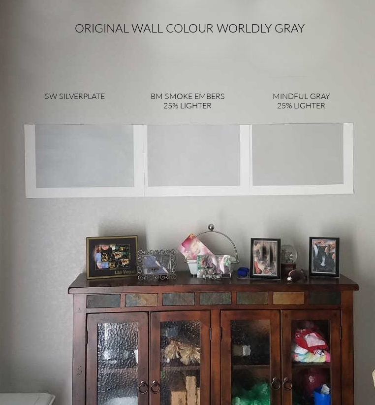
Do you see the wee shifts in undertones in the above samples? Sherwin Williams Silverplate looks a bit bluer in COMPARISON to Smoke Embers, which looks a bit more VIOLET. On the end, Mindful Gray has been lightened by 25% and definitely lost most of its green tendencies!
If you’re knee-deep in colour research, you might find it easier to have fan decks on hand. You can purchase them or some stores even lend them out with a small deposit!
STEP 2
Once you’ve figured out which MAIN UNDERTONE your neutral paint colour has, read the previous list and try to figure out which way this colour LEANS (if any, some come across pretty true).
How do you do this?
COMPARE COMPARE COMPARE
If you’re looking at an actual COLOUR or HUE, use comparison with other VERY similar colours to see which way the undertones ebb and flow. For example, if you’re looking at GREEN, is it a green-YELLOW or a green-BLUE? You’ll find out by comparing it with similar colours.
Compare as much as you need to in order to see how the undertones ebb and flow between colours.
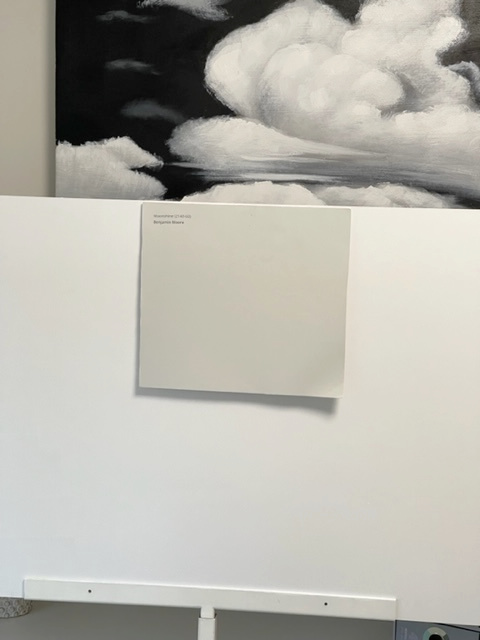
Take a look at Benjamin Moore Moonshine. Before you move along, decide which undertone you THINK it has. Remember, you HAVE to pick one – blue, green or violet…
Now we’ll compare Moonshine (right) with Benjamin Moore Stonington Gray (left)…
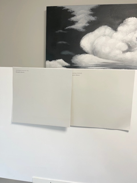
THIS is where you really have to flex your colour muscles. At first glance, it might be hard to see what undertone Moonshine has – but you have to choose. Via comparison with Stonington, we can see that Moonshine has a weeee subtle green undertone, and in comparison, Stonington Gray looks more BLUE!
Remember, many people have some degree of colour blindness, so if you JUST CAN’T FIGURE IT OUT – check out my blog or talk to your local paint supplier.
WHAT’S THE DIFFERENCE BETWEEN COMPARING & CHOOSING PAINT COLOURS?
When you’re comparing paint colours with the goal of CHOOSING a fave…
- Never place paint samples horizontal; they should always be 100% vertical on the wall (no leaning!). Light reflects MUCH DIFFERENTLY (more) off horizontal surfaces vs vertical ones.
- Always place samples next to trim. If you’re changing your trim colour, place them next to your NEW trim colour, not your old one.
- Place white paper alongside your samples so that you’re not COMPARING them as much to the OLD colour. Old paint colours can 100% skew your perception of the new options!
- If you’re trying to choose a WHITE paint colour, find your brand’s WHITEST WHITE and compare it to that – this is vital as a TRUE WHITE will help you see your whites undertones
- If you’re trying to choose a DARK paint colour, find your brand’s BLACKEST black and compare it to that as this will give you a better feel for the ACTUAL depth of your dark colour
- Move samples around the room to see how they shift in different lighting.
And of course, there are a billion other paint tips and ideas that I could share with you, but for the sake of staying focused on not having complete verbal diarrhoea, we’ll stop right here.
READ MORE
The Ultimate Guide to White Paint Colours
LRV: The Ultimate Guide to LRV & Choosing Paint Colours
3 Steps to Choosing The Best White For Your Home
How to Create a Timeless Home – 4 Part Series
NEED HELP?
CHECK OUT MY ONLINE PAINT COLOUR CONSULTING

Chat soon,

ORIGINALLY WRITTEN IN 2017 – COMPLETELY & TOTALLY REWRITTEN IN 2022
Comments
Leave a Reply
More Posts

The 5 Best Creamy White or Off-White Paint Colors
THE ELUSIVE ‘CREAMY WHITE NEUTRAL’ When it comes to light, warm neutrals, it’s all in the undertones. And other than pink and green, yellow is the undertone many of my
Read More

The 8 Best Warm Neutral Paint Colors With NO Yellow Undertones!
The Top Light Depth, Warm Colors That Aren’t Cream! When choosing the best warm neutral paint color for your home, whether creamy white, beige, taupe, or greige, your choices are
Read More

The 12 Best Farmhouse Sinks of 2024
FIND YOUR DREAM SINK HERE… While traditional farmhouse design was all the rage in previous years, the embers have definitely cooled. As for MODERN farmhouse, it’s still kickin’ its cowgirl
Read More


Love this discussion of undertones! I have learned so much from your color reviews Kylie!
I am looking to paint my kitchen /family room Moderate White to match my Giallo Napoleon and travertine kitchen finishes but looking to blend it with another living room color for my furnishings with Gossamer Veil. Would these work together? They would overlap in the foyer too.
Thanks for your wonderful blog!
Author
Hi Jackie, I like these two together. I’m hoping that the room with Moderate White doesn’t get super intense afternoon western sunshine as it will lean it that much more orange and makes me a WINK twitchy with Gossamer, but overall, I’m diggin’ it.
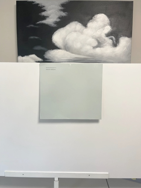
Hello…what’s the color of the pic with the bed in it and a white art piece above the bed? Love that color.
Author
Hi Mechele, that’s BM Winds Breath 🙂
Eesh! Ok, big gulp. What if the flooring, and countertops are neutral taupes/greys with a violet undertone and playing nicely with the white walls but the white appliances are casting an alarming blue undertone? To choose a neutral cabinet colour, who do I appease…the undertone of the appliances or the flooring & countertops?
Also, at the start of your article, you said sometimes adjustments simply require some small tweeking. Any small tweeks for this type of situation? Thanks so much!
Great article – thank you so much! I do have a quick question. Is the undertone influenced by the setting – i.e., surrounding colors, lighting, etc. Or, will a color have the same undertone no matter where it is placed? Thanks!
Author
Hi Tanya! ABSOLUTELY – great question! Undertones can become more or less obvious depending on their surroundings. For example, a violet undertone that looks a touch more passive surrounded by other violet undertones can look much STRONGER when partnered with an opposite undertone, ie. green!
Things can also shift based on exposure. For example, some blue undertones can look more blue-green in warm western sunshine or in warm light bulbs!
Kylie! I feel like you are talking about me…LOL. I had issues with the undertone in my guest bedroom that turned this cute sunny and cottagey feeling room into a dull, depressing spot. I just couldn’t figure out what went wrong. Through your package you recommended the correct revision (we went with the trim color darkened by 25%). It really was all about the undertone. NOW, this special room is like stepping into a dream. We love it! Thank you. And thanks for the education. Carolyn
Author
WAHOOOOOO, thank you, Carolyn, this is JUST what I love to hear!!!
Another fantastic post!! There is ALWAYS more to learn…and you spell it out!!
Author
Thank you, Maggie! (also my daughter’s name and it’s the PRETTIEST name ever :))
So, should all the main pieces in a room always have all the same (only one) undertone? When can you get away with a second undertone or can you?
I was given a tip by a color expert years ago that I use every time I pick colors. I take samples of my flooring, upholstery, countertop material, cabinet drawer front, wood furnishing, whatever will be in the rooms with the wall color and take them outside on a clear day in the early afternoon and look at everything together. The natural sunlight works like a truth serum and makes the neutrals state their undertones.
I did this last weekend in a really tough situation. The person needing help choosing a paint color is moving into a retirement community apartment. All the finishes except wall color are already decided. The cabinets were maple with an orange stain, the floors are a gray and brown mix wood look LVT (purple undertones) with a gray/brown/white multitone carpet and the countertops a light yellow Corian. Trim and doors are SW Extra White.
The display apartment had the walls painted in SW Natural Choice. I was not there, but the woman and her sister both said the walls looked green.
We picked out about a dozen wall colors and then paired the list down to 3 final choices.
Natural Linen, Moderate White and Accessible Beige. We kept a sample of the Natural Choice out as well and took everything outside. Natural Choice screamed Chartreuse in natural daylight surrounded by all the other colors. Accessible Beige also looked somewhat green and a bit dirty next to the orange and violet and yellow. Typically I find Natural Linen to be a bit too warm with most finishes, but in this situation it worked well with the warmth of the other color selections. I am still somewhat concerned that in the bedroom, where the only other color is the carpet it may be a bit warmer than I would want, but they are only allowed to choose one color for the entire space.
Just finished painting my west facing bathroom – that has tan fixtures. I chose BM White Down as you suggested in one of your blogs. I was so worried that the fixtures and tile would look pink, not at all. It is an amazing colour at any time of day. Thanks so much.
Author
YES, I love to hear this feedback, thank you! It also helps others who are in a similar situation :).
I remember ages ago that red lipsticks were either red-blue or red-orange and that the red-blue made your teeth look whiter – I think that’s right!! Thanks so much for rewriting this – great help!
I wish I had understood more about undertones and the proper way to choose a paint color…I just finished painting my dining room London Coach by Valspar. I had painted samples of the color on my beige walls and thought it was a soft dove gray that went well with my honey oak cabinets and trim. Now that the entire room is painted, the purple and brown undertones come through quite strongly, especially at night. I had planned to paint my adjoining kitchen and livingroom the same color, but now I’m very unsure. It’s a lovely color, but not what I expected. Is there a neutral (and perhaps lighter) gray you would recommend that would flow well with London Coach, but subtly steer away from the heavy purple and brown undertones? (I don’t mind a gentle purple undertone…I read that would work best with honey oak and help tone it down….though I’m not seeing that with London Coach…)
Once you know your undertones, then what? Does everything have to be the same undertone? Specifically in question- can you do white trim with a yellow undertone and a greige with green undertone (Simply White and Edgecomb Grey)? Or how about pairing a green-blue with an adjacent room that’s green slight yellow undertone (oval room blue and herbal wash)?
Author
Hey Jennifer, this is a great question and a LOADED one, too, as there are soooo many variables depending on the room, the goal, and the depths of the colors you’re using. As it relates to whites/trims and partnering them with the walls, there’s still so much. Generally, cool white trim colors prefer cool wall partners. However, cool walls can handle some warm trim colors as well. Really, it’s more of a ‘per color’ basis, than a general rule that can be applied.