
Posted on April 28, 2022 by KylieMawdsley
Ideas to Decorate a Bright, HIGH-ENERGY Room
While most people WISH they had a light and bright room, especially when their room is overly dark, bright rooms present quite a few challenges when it comes to decorating and choosing paint colours.
WHAT MAKES A ROOM HIGH-ENERGY OR BRIGHT?
While two things might be obvious, there’s another you may not have considered…
- natural light
- interior light
- reflective interior finishes
This post may contain affiliate links. If you make a purchase through links on our site, we may earn a commission.
That’s right! While natural light is the most common contributor; with interior lighting also playing its part, REFLECTIVE INTERIOR FINISHES play a massive role in how bright a room seems. Here’s a list of some of the items that raise the energy in a room…
- shiny countertops
- shiny cabinets
- glass cabinets or tabletops
- clear glass shades on lights
- shiny metal finishes such as appliances (especially stainless steel)
- decor with a high sheen either in colour or metal finish
- mirrors
- paint with extra sheen
- shiny leather furniture
- glossy wood or tile flooring
- wood furniture with a gloss finish
For a room to feel BALANCED, it needs items that ADD energy and light and items that ABSORB energy and light (like me in a room vs Tim in a room – hehe).
Every room should have a BALANCE of items that add energy & absorb energy

Even though I LOVE the blue, a more matte finish teapot would help slow things down
If you have a room with tons of natural light, you will want to balance that out.
Why?
Because a room that has TOO much energy bouncing around won’t feel restful.
Why?
Any light in the room (whether natural or artificial) will bounce from object to object without being absorbed.
What does slowing the energy down in a room DO? It makes it appear more calm and restful.
Funny enough, it’s easier to fix a dark room as the solutions can be slightly more obvious (starting with adequate lighting). Bright rooms are trickier because sometimes you don’t know something is wrong until you fix it. And once it’s fixed, not only will your room take a deep breath – so will you!
HOW TO ADD BALANCE TO A BRIGHT ROOM WITH DECOR & FURNISHINGS
A great place to start adding balance to your space is with home decor…
- canvas style artwork or wall hangings with low/no sheen (no glass)
- accessories that have a matte or non-shiny finish – texture is GREAT
- matte metal finishes (lighting/hardware)
- low-sheen fabrics on toss cushions and drapes
- non-shiny texture helps to absorb light
- wood surfaces with a matte finish, ESPECIALLY horizontal surfaces (ie. coffee table)
When it comes to accessorizing a BRIGHT room, it’s good to follow the 80/20 rule – 80% low-energy items and 20% high-energy items
While the above ratio might not be the perfect representation of BALANCE, that particular combo helps give a bright room balance, when combined with natural or artificial light.
HOW TO ADD BALANCE TO A BRIGHT ROOM WITH THE RIGHT PAINT COLOUR
When it comes to choosing paint colours for a bright room (in particular, those with a lot of natural light), it can be a tricky balance. With trends leaning towards the LIGHT end of things, there could be a difference between the type of paint colour you WANT versus the type that won’t wash out with all of that lovely natural light.
What does this mean?
I’ve found that MOST of my clients these days are pining for colours in the white, off-white or light end of things – colours with higher LRVs. However, it’s these exact colours that wash out on walls that get gratuitous hits of natural light; ESPECIALLY in rooms with vaulted ceilings.
Benjamin Moore Super White
What happens when paint colours get washed out?
- they lose their colour
- they lose their depth
- the contrast between trim and wall can be reduced
These aren’t always bad things if you love the colour regardless, but ARE bad if they create a look you don’t love.
Sometimes what you want doesn’t suit the room you want it for.
Where’s the happy medium?
You want a colour that’s on the lighter end of things, but you also don’t want it to look washed out in the natural light – I get it. It’s about knowing that NO MATTER WHICH COLOUR YOU CHOOSE, it will look lighter in a bright room – even the DARKEST of colours will lighten. So, when choosing colours for an overly bright room, I focus on one thing…
LRV
If you’re unfamiliar with LRV, the gist is that EVERY paint colour has an LRV number. This number tells you how light or dark a paint colour is on a scale of 0-100 with 0 being black, and 100 being white. And this is GAME-CHANGING stuff when it comes to choosing paint colours, so after you’re done here, I highly recommend you check THIS OUT.
Sherwin Williams On the Rocks
WHAT’S THE BEST PAINT COLOUR LRV FOR A BRIGHT ROOM?
If you’re NOT worried about your off-white or light depth paint colour washing out or want to EMBRACE your bright room with white walls – FILL YER LIL BOOTS. In fact, this is when adding balance with home decor, interior finishes and furnishings comes into play!
As for those of you not sure what to do, I’ve always held onto the magical LRV number of 62 (approx) as a great place to START when choosing a paint colour for almost ANY room. Why? That is a blog post unto itself. Regarding a bright room, in particular, 62 is a great place to start your colour adventure (give or take a few points – let’s say 60-66).
Why?
You ask a lot of questions – I like this about you.
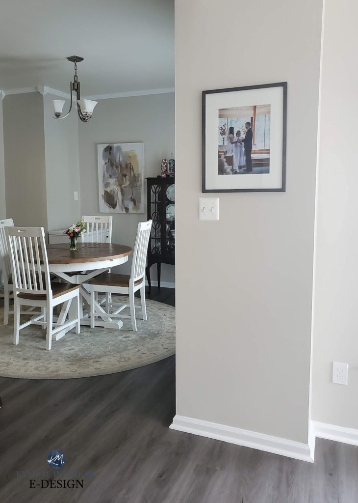
A paint colour with an LRV of 62 is a ‘light depth paint colour’. It’s not on the high end of that range nor the low end – it’s more or less in the middle and includes some of THE MOST POPULAR paint colours (ie. Benjamin Moore Collingwood). These colours are popular for a reason – they work in the AVERAGE room in the AVERAGE home.
While the above room itself isn’t overly bright, notice how Collingwood reacts when the natural light hits the wall directly.
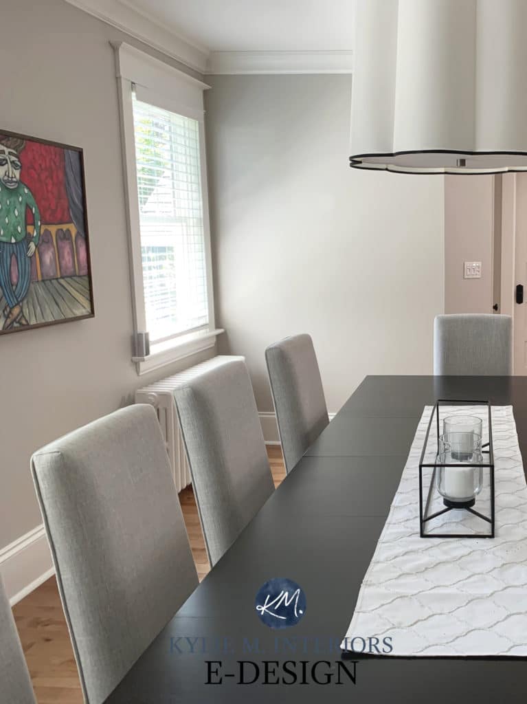
In this next photo, Sherwin Williams Modern Gray gets a hit of light on the right (and DOES wash out a bit) but gains its depth back in the dining area, which is more of an ‘average’ light. There’s that magical LRV of 62 in ACTION…
Will a colour in this range wash out? HECK YES, but not nearly as much as a colour with a higher LRV.
Is there a chance you’ll need to bump down to 50-55? Yes, it just depends on how much washout you’re prepared to handle.
The darker a paint colour is, the more light it will absorb. While this can slow down the energy in a room, it can also WEIGH it down if it’s not done right!
Because while MANY of you want a light and bright room via PAINT COLOUR, some want something a bit DARKER to bring more ambience and cosiness to their space – a look that’s achieved MUCH more easily with a darker paint colour (ie. LRV lower than 50).
You’ll be looking at my finished living room shortly, but before you do that, take a look at the BEFORE…
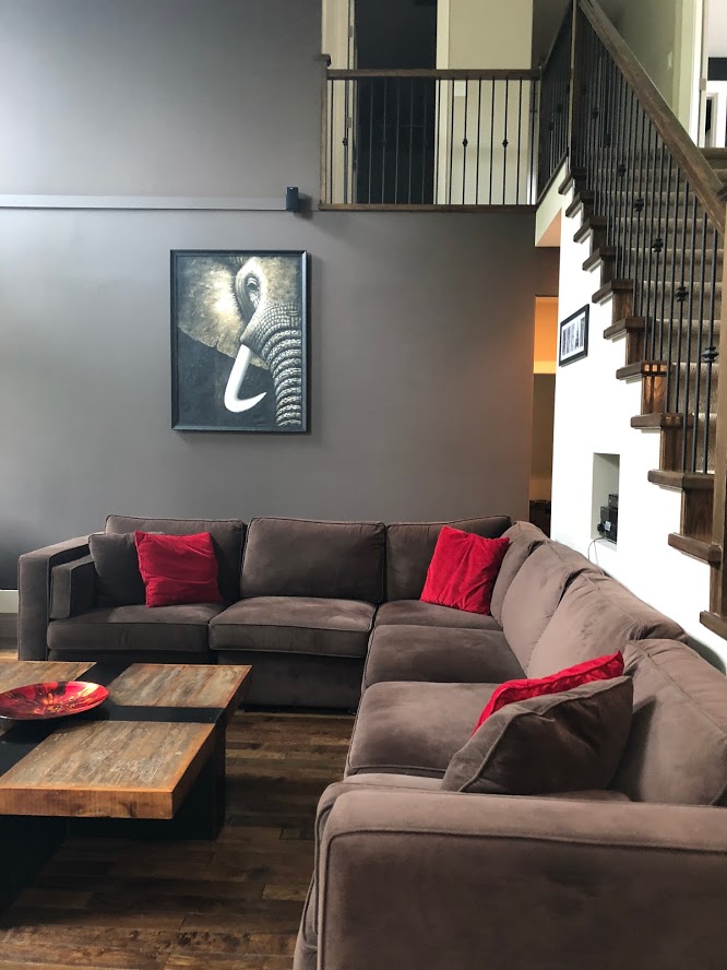
This is a great example of a dark paint colour slowing down the energy in a room by reflecting less light. However, the paint colour, combined with the sectional, flooring and lack of proper decor WEIGHED the room down and left it looking unbalanced and heavy.
What would help this dark and drab room without rewriting the whole thing?
- an area rug to break up the dark wood flooring
- lighter furniture that doesn’t blend with the floor
- a coffee table (glass or wood) with some sheen to it
- toss cushions in a mix of patterns/depths as CONTRAST also add energy to a space
But I still wouldn’t do artwork with GLASS on it or a mirror as it would bounce WAY too much light and look abrasive.
The moral of the story is this…
- If you don’t care if your off-white or light depth walls wash out or if your white walls look even whiter – PAINT AWAY, MY FUNNY FRIEND (we’re in the same club)!
- If you’re hoping for an off-white or light depth colour but worry it will wash out too much, an LRV of 62 is a great place to start. This can be a great way to get as CLOSE as possible to the depth of colour you WANTED without having to go OVERLY dark.
- If you want a DARKER colour on your walls, the darker you go, the more you’ll need to add BALANCE in your home decor so that your room has CONTRAST via a nice blend of light, medium and dark tones, as well as some sheen.
At the end of the day, the sun WILL go down, and you still need to love the depth of your paint colour!
Sherwin Williams Accessible Beige has a GREAT LRV
Next, we’ll break down a few BRIGHT rooms so you can see the above information in action!
CASE STUDY 1 – NORTH-FACING LIVING ROOM PAINTED AN OFF-WHITE
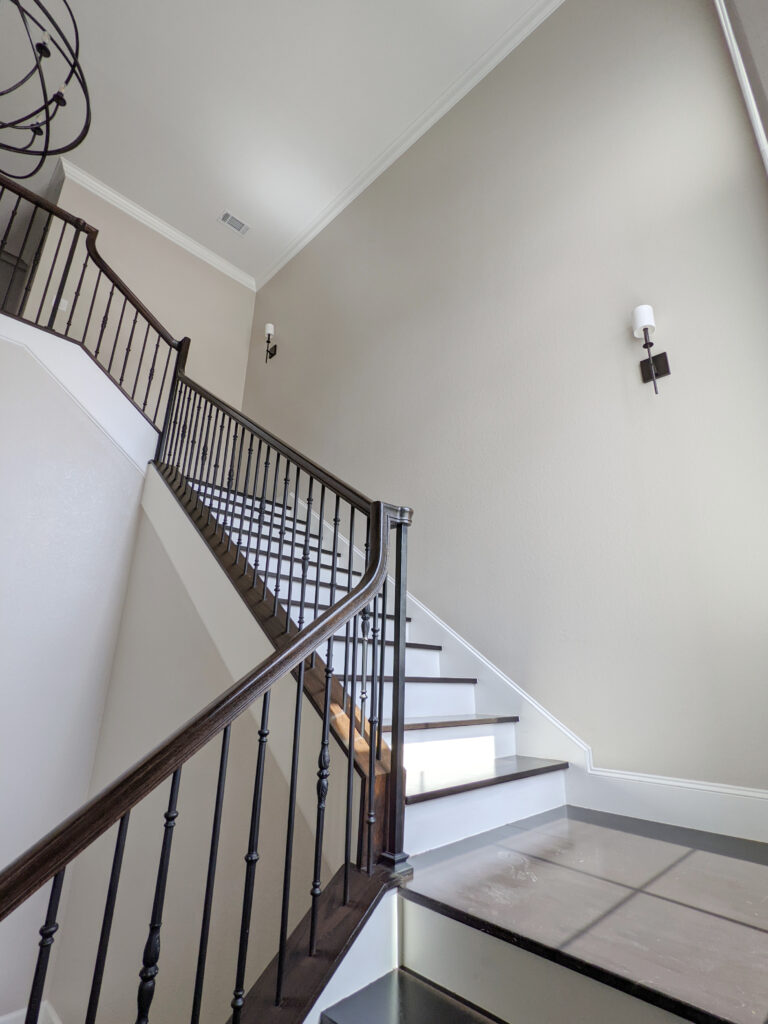
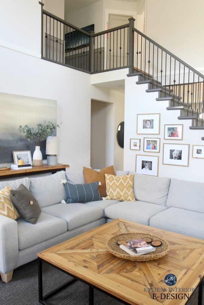
This living room (which you just saw the BEFORE of) is painted in Benjamin Moore Edgecomb Gray, but a very LIGHTENED version. In this case, I’m not worried about the paint colour washing out as I love it whether it’s true to form or a whisper of its former self…
And yes, ONE DAY I will have natural wood railings…one day
HOWEVER, being a bright(ish) room painted a colour with a HIGHER LRV, I put careful thought into the FINISHES.
Why?
The lighter a paint colour is, the more light and ENERGY it bounces around – I needed to add BALANCE.
- most of my fabrics absorb light and add texture; including the sectional, toss cushions and area rug – NO SHINY LEATHER!
- the wood on the coffee table and sofa table has a low gloss on it (light bounces MUCH more off horizontal surfaces, so this is an important detail) – NO GLASS
- the oversized art is a canvas, and while it has a bit of sheen to it, it’s textured and not overpowering – NO GLASS
- aside from the vase and the glass on the framed photos, the home decor is LOW SHEEN, and in most cases, textured as well (80/20)
- I would NEVER put a mirror in this room as it would add way too much light reflection/energy – the TV is bad enough (on the other side)
The Best Paint Colours for a North-Facing Room
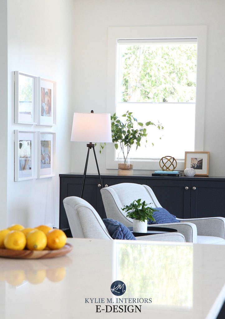
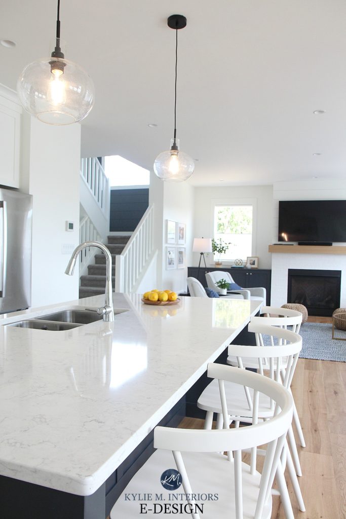
CASE STUDY 2 – SOUTH-FACING LIVING ROOM PAINTED WHITE
This next open-concept space is painted in Sherwin Williams Pure White, one of the more FOOL-PROOF whites on the market. HOWEVER, not only is this a bright room, we painted it white, which is THE MOST REFLECTIVE COLOUR.
But again, it’s all about BALANCE…
See the WHOLE HOME HERE
- countertop has a glossy sheen to it, as does the glass on the picture frames and the pendant lights
- you’ll also see sheen via the stainless steel appliances and TV which are easy to forget in the equation!
- EVERYTHING else is low sheen or matte – wood floor, area rug, furniture and the majority of the decor
What are some things that would throw this room off-whack?
- a glossy finish on the wood floor
- a mirror on the wall
- glossy cabinets – satin is as shiny as you should go
The Best Paint Colours for a South-Facing Room
CASE STUDY 3 – NORTH-EAST FACING LIVING ROOM PAINTED LIGHT GRAY
Funny enough, this is one of our old homes (for those who’ve been with me for a while, you KNOW how I feel about this home – insert wine, tears and twitching ‘HERE’).
This is another relatively bright space (but not OVERLY bright) that benefitted from some thoughtful balance…
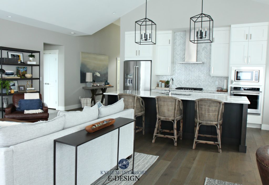
I chose Sherwin Williams Colonnade Gray for the walls which has an LRV of 53 (light-medium depth). In a bright space, notice how it looks LIGHTER than you might expect, especially above the cabinets! Remember, ANY paint colour will lose some depth in natural light; it’s just a matter of what’s LEFT OVER.
- the countertop and appliances are high sheens, as are the sofa table and cabinet hardware
- the leather chair on the far right also has a bit of sheen to it, adding a bit of energy to that corner
- if you were to look closely at the decor on the shelf to the left, you’d see an awesome 80/20 split of items that absorb light vs items that reflect light
- EVERYTHING ELSE absorbs light and/or adds TEXTURE to the space, helping to slow down the energy
I hope you enjoyed this blog post! And while not EVERY home has a bright, high-energy room, MOST homes have at least one LOW ENERGY room, so check out these tips and ideas for your low-energy space.
READ MORE
How to Create a Timeless & Trend-Proof Home
The 12 Best WHOLE HOME Gray & Greige Paint Colours
5 Ideas to Update Your 90s Home
Should You Paint Your Wood Cabinets – A QUESTIONNAIRE
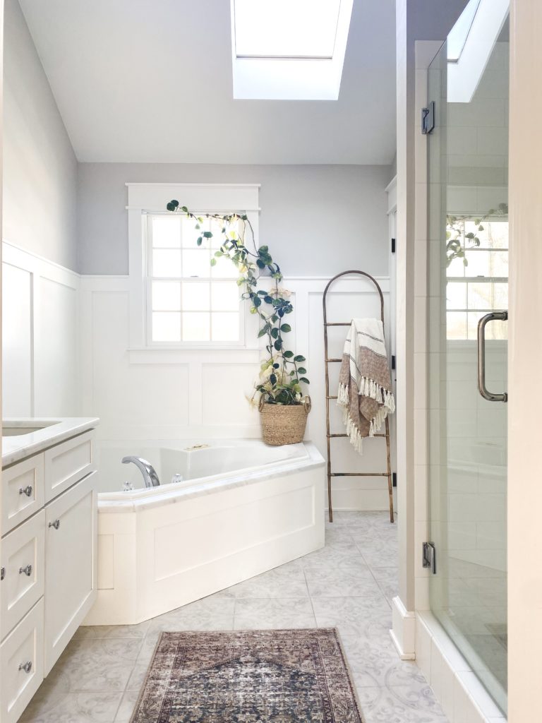
3 Ideas to Jazz Up A Small Bathroom
LOOKING FOR HELP?
Check out my Online Color Consulting Services

Chat soon,

WRITTEN IN 2016, AWESOMELY UPDATED FOR YOU IN 2022!
Comments
More Posts

The 5 Best Creamy White or Off-White Paint Colors
THE ELUSIVE ‘CREAMY WHITE NEUTRAL’ When it comes to light, warm neutrals, it’s all in the undertones. And other than pink and green, yellow is the undertone many of my
Read More

The 8 Best Warm Neutral Paint Colors With NO Yellow Undertones!
The Top Light Depth, Warm Colors That Aren’t Cream! When choosing the best warm neutral paint color for your home, whether creamy white, beige, taupe, or greige, your choices are
Read More

The 12 Best Farmhouse Sinks of 2024
FIND YOUR DREAM SINK HERE… While traditional farmhouse design was all the rage in previous years, the embers have definitely cooled. As for MODERN farmhouse, it’s still kickin’ its cowgirl
Read More

