
Posted on January 26, 2020 by KylieMawdsley
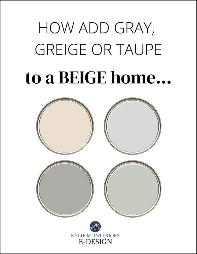
TIPS TO TRANSITION FROM BEIGE TO GRAY, GREIGE OR TAUPE
Is your beige feeling a lil’ blah? Are you bored with the warm Tuscan glory of your earth-tone-inspired home? Join the club, there are a lot of you.
And while trends are leaning warmer again (DEFINITELY), there are still those trying to cool down their warm colour palette, with the hopes of creating a more fresh, clean, vibrant home.
This post may contain affiliate links. If you make a purchase through links on our site, we may earn a commission.
Beige-inspired homes are often chock-full of beige walls, beige carpet and maybe even beige furniture. You may look around your room and think to yourself ‘I’m really drawn to gray (or greige-taupe), but how in the HECK do I change from beige to gray when my WHOLE FREAKIN’ HOME is beige?’
You keep on reading…
Remember, beige is a neutral and neutrals are about as flexible as a 10-year-old gymnast. So, while you may feel limited, you have a WORLD of colours available to you-you need to know which direction to go in and pay CLOSE attention to your undertones & colour DEPTH.
GRAY, GREIGE & TAUPE COLOUR THAT UPDATE BEIGE CARPET & TILES
If you subscribe to my free blog updates (drink the Kool-Aid – it’s gooood), you probably know that grays have undertones – I refer to them ALL the time (along with red wine, dogs and mildly inappropriate topics). Undertones are those sneaky ‘colours’ that wink at you once you’ve painted a wall with two coats and step back in all of your sweaty, exhausted glory to realize that your gray walls actually look blue or your beige walls look a bit pink.
The key to choosing the best gray is to figure out which undertones you are dealing with and which ones best suit your particular beige surface (carpet/tile/countertop/furniture).
REMEMBER, depending on the TYPE of beige you have, and HOW MUCH OF IT you have in your home; you might not be able to head in the gray/greige colour direction you were hoping for. In this case, you might end up with a warm paint colour on your walls and choose gray/greige for your furniture and accent pieces.
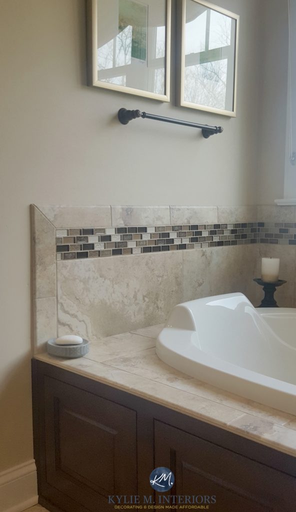
Some beige or tan finishes are more geared towards colours that are cooler than them, based on the BLEND of colours they have. For example, this next beige tile doesn’t have a noticeable taupe, greige or gray in it to warrant one of these colours on the walls – a cooler paint colour would come out of NOWHERE and wouldn’t relate…
However, this next beige granite countertop has some flecks of TAUPE in it, meaning that the right depth of taupe could make a lot of sense on the walls or cabinets…
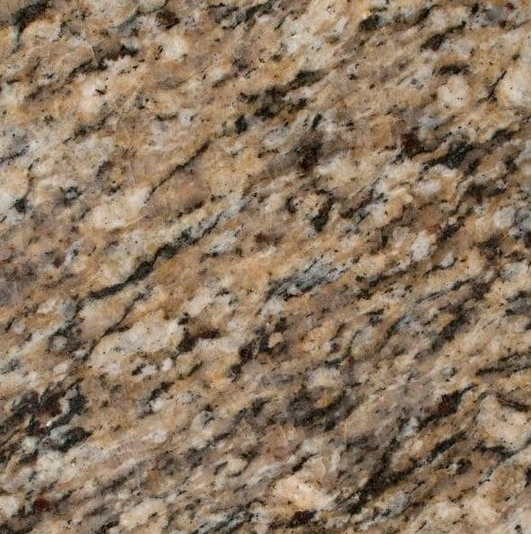
Why would taupe work with the above countertop? Because it already noticeably exists in the countertop – it would coordinate and visually connect and MAKE SENSE.
While it’s okay to stretch your room’s comfort zone, don’t stretch it OUT of its comfort zone or it won’t look good.
IF YOUR ROOM HAS BEIGE FINISHES & YOU WANT TO ADD SOME COOLER COLOURS
Whether you’re dealing with beige carpet, countertop, backsplash or tile (or several of these), there are two situations to consider…
1. If your room has only ONE beige finish and it doesn’t have any gray, greige or taupe in it, as long as you choose a paint colour that’s the same depth (or ideally) DARKER than your beige finish, you should be able to pull it off.
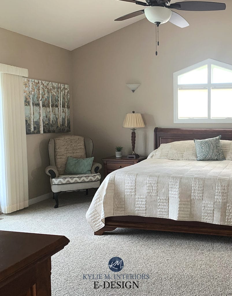
In this stairwell, the gray walls are okay with the beige carpet because there isn’t ANOTHER beige for the gray walls to compete with. In this situation, the gray acts more like a ‘subtle compliment’ to the carpet – although I wish it were a BIT darker.
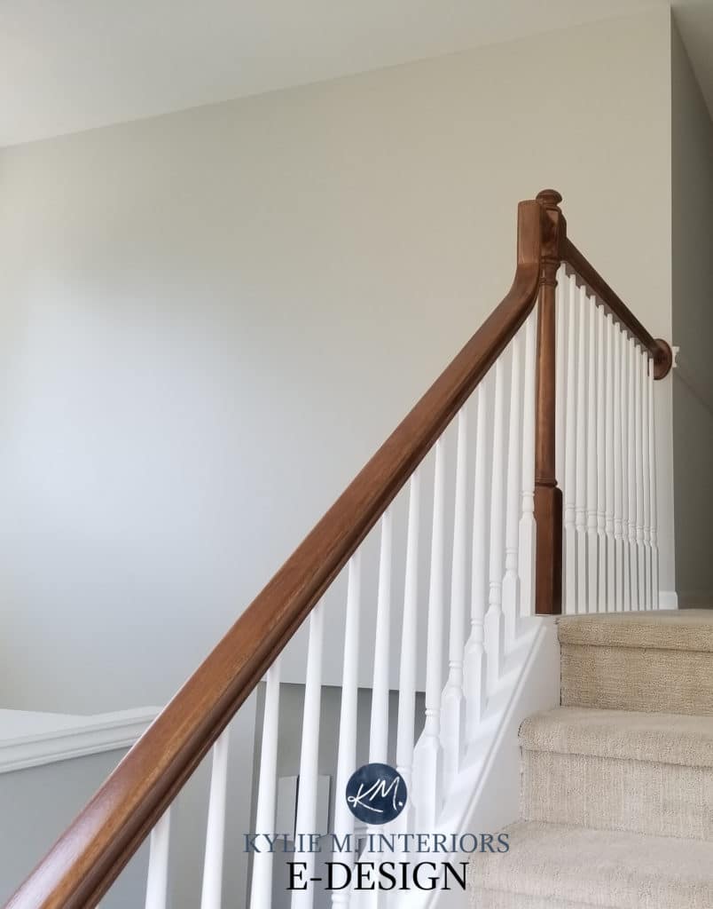
However, if you got down to the foyer in this home and it had travertine tile, the gray walls would make a lot less sense, as you’d have TWO FINISHES with beige hues to try and connect with.
2. If your room has MORE THAN ONE beige finish, it starts getting tricky to add gray, greige or taupe on the walls (it makes even less sense, like ‘where did it come from?‘. HOWEVER, your best chance, again, is that your chosen colour is a bit darker than the beige finishes surrounding it. Or, hope that one of these beige finishes also has some gray, greige, or taupe that’s noticeable – this is the BEST way to connect with your finishes visually.
Just remember, a colour that’s COOLER than your beige surface can make it look WARMER than usual due to the contrast between warm/cool. Many people want to tone down their beige carpet, countertop or tile and make it look ‘less beige’. But in doing so, the cooler colours they choose often make their beige look EVEN STRONGER.
Opposites attract and can ENHANCE each other.
Let’s talk about that a bit more…
COOL COLOURS & HOW THEY RELATE TO WARM BEIGE FINISHES
Cool colours or those with cool undertones will have blue, purple or green undertones (purple being the most common). These undertones aren’t always happy to be partnered with beige, especially if you have a beige (or tan) with stronger undertones (yellow/green/pink/orange).
BEIGE & ITS UNDERTONES
The warm undertones in beige are always centered around ORANGE and most often flex orange-pink, although there are some orange-yellows.
TAN & ITS UNDERTONES
As for tan, tan is a neutral with a YELLOW undertone that can lean slightly yellow-orange or yellow green. These undertones can be ENHANCED when you paint the walls a cool paint colour.
Keep in mind that the majority of hard finishes in a home (countertop, tile, carpet – yes, it’s considered hard) are BEIGE with an orange-pink undertone. Tan is more often found in soft finishes like sofas. 95% of the Colour Consulting I do regarding warm neutrals is about working with BEIGE, not tan.
Opposites attract, so your warm beige carpet or tile may look more orange, yellow or pink if you paint your walls a colour that’s COOLER than it, especially one with stronger undertones. The warmth of your carpet will ALSO enhance the cool tones in your paint colour. If this is okay with you, that’s a good start, but you’ll also want to pay attention to the DEPTH of your paint colour, which we’ll get into in a new blog post (coming shortly)
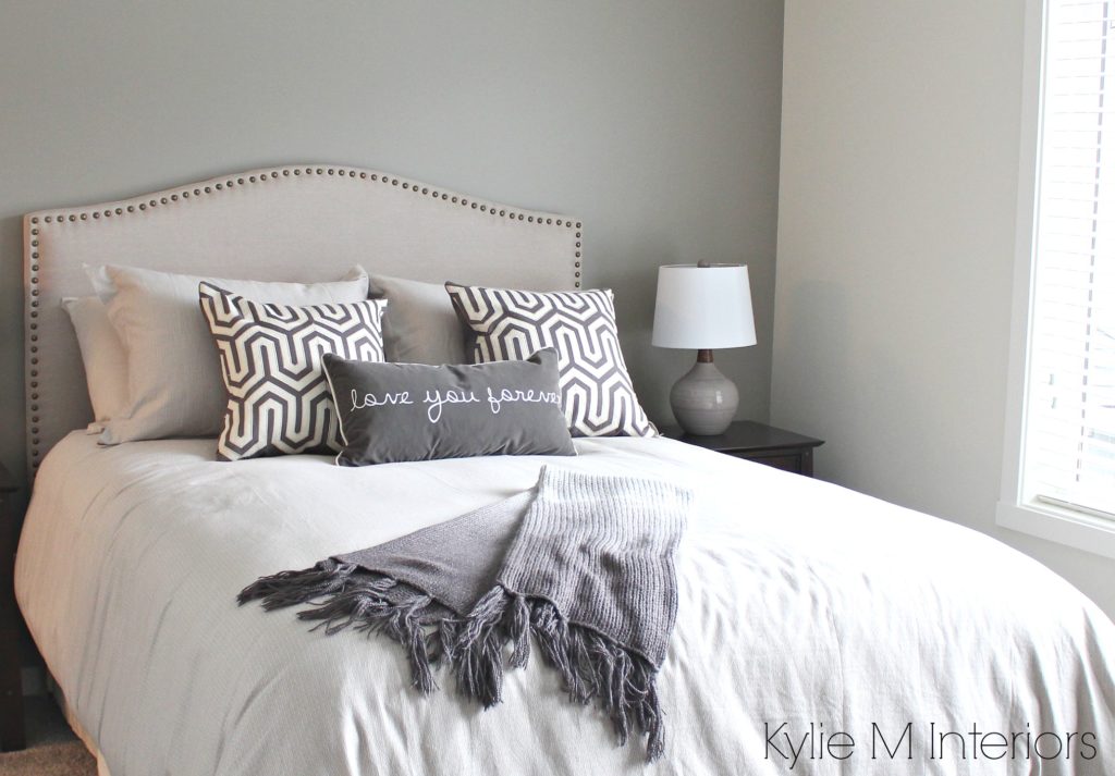
In this next photo, the carpet had SUPER subtle undertones, and the space had enough natural light to handle a gray paint colour (Benjamin Moore Gray Owl)…
THIS BLOG POST IS BEING MAJORLY UPDATED, ESPECIALLY FROM THIS POINT ON. PLEASE EXCUSE ANY REPETITION OR BLOOPERS!
Generally speaking…
- There are more beige tiles that will handle a gray with a warm purple undertone than a blue or green undertone
- Beige carpets tend to have more flexibility and you will find some that can humour a gray or greige with blue, green or purple undertones, but you still have to be careful as NOT ALL carpets can do this!
Read more: Comparing 2 Cool Grays – Gray Owl vs Stonington Gray
Read more: Colour Review – All About SW Big Chill
Warm Gray Paint Colours with Beige Carpet, Tile or Furniture
Warm gray paint colours have a weee willy wink of brown in them and can often come across slightly purple or green (and usually only blue when the exposure encourages it).
Via Kylie M Interiors Online Color Consulting
Warm grays (especially ones with a soft purple undertone) have a better chance of looking good with beige, simply because they BOTH have brown in them. The more brown you add to gray, the closer you get to greige, which is also a fab choice when updating a beige home.
HOWEVER, if you have beige products with a pink or orange-pink undertone, you risk ENHANCING those undertones if you pick a warm gray with a green undertone. The undertones in your beige products have to be VERY PASSIVE in order to handle a warm gray or they need to have the type of gray you want to use IN them.
Read more:The 10 Best Sherwin Williams Gray and Greige Paint Colours
Greige Paint Colours with Beige Carpet, Tile or Furniture
Greige paint colours are grays that are mixed with a good dose of beige and tend to have less undertone compared to warm grays and cool grays.

Read more: Paint Colour Review of Benjamin Moore Edgecomb Gray
Greige is a great colour to transition from gray to greige as it has both gray and beige in it – in decent doses. Is it as cool/gray as you were maybe hoping for? Probably not, but it can be a great ‘happy medium’ between where your HOME is and where YOU want to be (other than on a hot tropical island with Ryan Reynolds in a speedo).
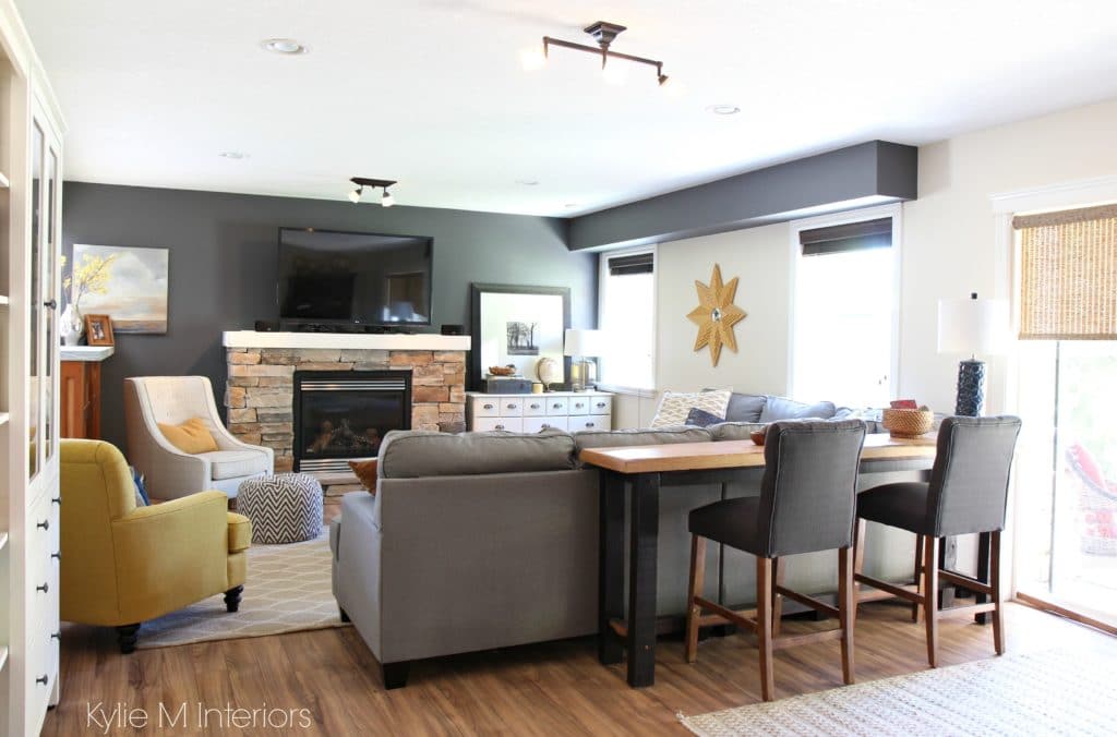
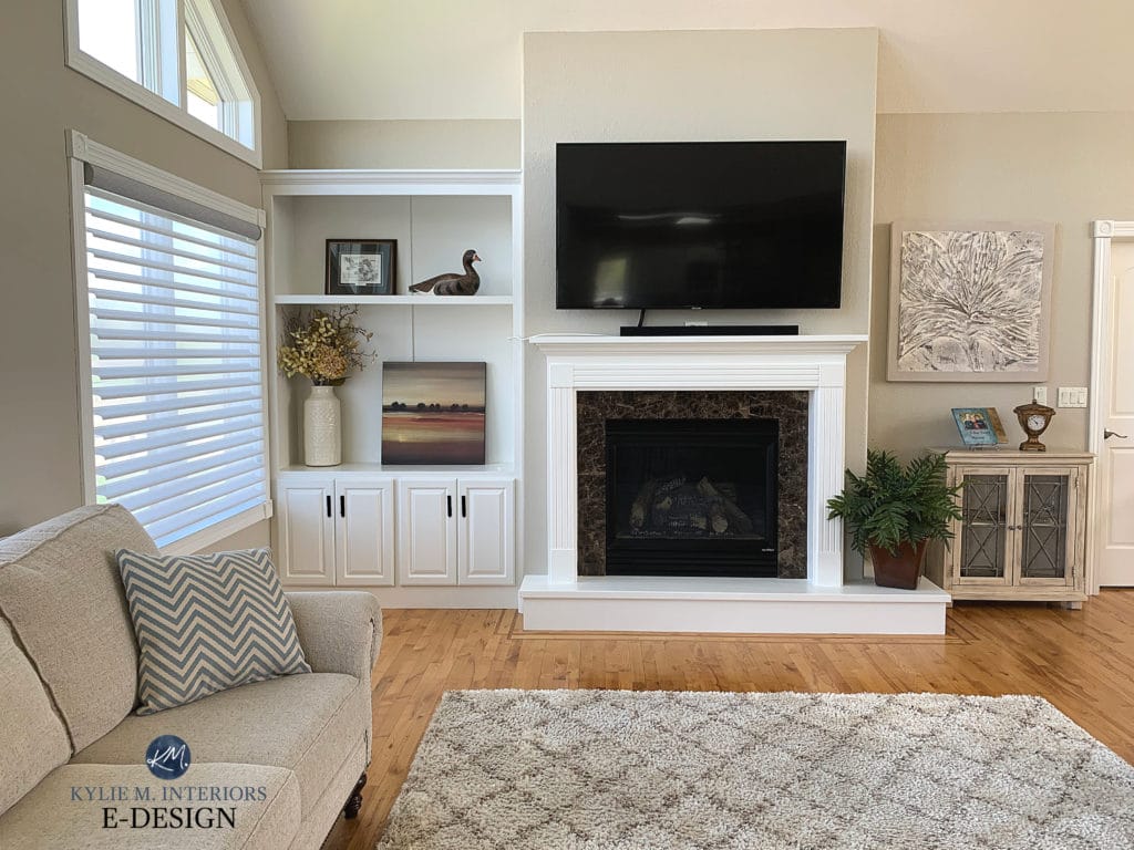
But remember, sometimes what YOU want for your home and what your HOME needs are two different things. As shown in this next photo, a warm, soft tan was the BEST choice for this room with the sofa, area rug, decor and fireplace surround. A gray of any sort or even greige wouldn’t have done it any justice.
Read more: Taupe and Greige – What’s the Big Difference?
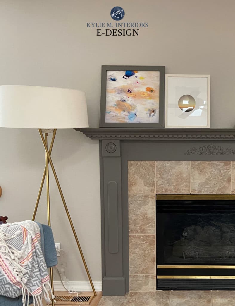
Again, in this next photo, there IS NO GRAY OR GREIGE that would look as good as or BETTER than this soft, flexible neutral…
Let’s take a quick break to talk about paint samples…
Undoubtedly, you’ll be heading out in the near future to grab paint samples – stop right there! I want you to check out SAMPLIZE. Samplize offers peel and stick paint samples that are more AFFORDABLE, EASIER and more ENVIRONMENTALLY FRIENDLY than traditional paint pots. Here are just a FEW reasons why I recommend Samplize to my clients…
- Samples arrive ON YOUR DOORSTEP in 1-3 business days, depending on location
- At $6.99, they’re more affordable than the samples pots/rollers/foam boards that are needing for traditional paint sampling
- If you keep the samples on their white paper, you can move them around the room
Visit the SAMPLIZE website HERE
The Best Paint Colour Depths to Update Beige
I’ve found that homes with beige in them often don’t suit the off-white range of the above colours. It’s like everything gets a bit too washed-out and non-committal. And while there is the odd exception, it seems that most rooms with beige in them best suit paint colours in the light to light-medium (or darker) range when it comes to transitioning from beige to gray or greige.
And as soon as we add some SERIOUS depth, I’m a bit more inclined to add more colour/undertone too if the beige can handle it…
When choosing a colour, you can get some good insights into how it may look via its LRV. If you don’t what LRV is, it’s Light Reflectance Value and to keep things simple, it basically tells you how light or dark a colour will look once it’s up on the wall. (Read ALL about it here – The Ultimate Guide to LRV).
In my Online Colour Consulting, I usually refer to colours that have an LRV of approx 65 or lower when I’m coordinating with beige. Once I get into the higher LRV’s (approx. 65+), things don’t seem to connect quite as well.
Now, I KNOW you are just begging me to mention some actual paint colours, but here’s the deal Ally McBeal. I created my blog posts to give you free access to information that is helpful and will get you off on the right foot. If you need help from there, I’m MORE than happy to give you suggestions via my Online Color Consulting which is affordable AND fun AND personalized to the specific needs of your home and your tastes. So, while I’d love to throw a riot of colours at you, a gal needs to bring home some BACON ya know?!
What to Avoid When Updating Beige…
As I said, beige is pretty damn flexible, however with the goal of getting grayer (short of watching 50 Shades of it), here are some things to consider…
- The more colour or undertone (blue/green/purple) your gray or greige paint colour has in it the more chance you have of ENHANCING the warm beige tones in your room. Get things as neutral as possible
- Grayish off-whites and cool whites rarely work, they just looks gross…says me – that is my super educated opinion
- Off-white cool grays or greiges RARELY work with beige. If you prefer cool grays, consider those with LRV’s of 65 and lower
Need help with your home?
Want to create your DREAM room?
Check out my E-Design and Online Colour Consulting Packages!
Chat soon,

READ MORE:
The Best Paint Colours to Update Beige Carpet or Tiles
The Best Sherwin Williams Greige Paint Colours
Benjamin Moore Top 10 Gray Paint Colours
Kylie M Interiors Interior Decorating and Design Blog E-Design, Virtual Consulting and Online Colour Consulting Services Based in Nanaimo, Vancouver Island and serving the whole darned world!
Comments
Leave a Reply
More Posts

The 5 Best Creamy White or Off-White Paint Colors
THE ELUSIVE ‘CREAMY WHITE NEUTRAL’ When it comes to light, warm neutrals, it’s all in the undertones. And other than pink and green, yellow is the undertone many of my
Read More

The 8 Best Warm Neutral Paint Colors With NO Yellow Undertones!
The Top Light Depth, Warm Colors That Aren’t Cream! When choosing the best warm neutral paint color for your home, whether creamy white, beige, taupe, or greige, your choices are
Read More

The 12 Best Farmhouse Sinks of 2024
FIND YOUR DREAM SINK HERE… While traditional farmhouse design was all the rage in previous years, the embers have definitely cooled. As for MODERN farmhouse, it’s still kickin’ its cowgirl
Read More


Hi Kylie. This is probably a strange question, but I haven’t been able to find the answer so I am hoping that you will know. I am growing my gray hair out, no more coloring for me. I am updating my wardrobe to reflect this change, no more warm colors for me. My question is, do I have to change my home’s interior colors also? I still love my beiges, olive greens, gold and travertine. What is your opinion?
Thank you,
Vicki
Author
Hi Vicki! Very interesting.
Okay, so I’m no wardrobe expert, but I’ve found that what suits us for clothing is not just about hair colour, but about skin tone, so I would probably pay attention to that first and THEN the hair colour (as gray can be VERY flexible, whereas skin tone isn’t always as flexible).
When it comes to ALL of this, it’s about what you feel BEST in, not just wardrobe wise, but home-wise – and these DON’T have to be the same! I find that the clothing I feel the best in are colours that I wouldn’t wear at all – things just feel differently to me going from walls to t-shirts.
You might find that your skin tone (relating to wardrobe) still likes those warmer colours. Or maybe you switch to cooler colours, but you do the ‘autumn’ version of cool colours, so that they aren’t COLD colours and are a bit softer (BM Smoked Oyster and Carolina Gull would be good examples of this) and these colours will work with your olive greens/gold/travertine as they are all in the ‘earth-toned family’. It’s when you take the ‘earthy tones’ out of the, that they become more cold and icy (ie: a more genuine blue/purple/green without any gray or brown in it). If you take the gray/brown out of those cool colors, there could be a disconnect between wardrobe/home.
The fact that you say you still love your beige/olive/gold means to me that you should KEEP them and just tweak your wardrobe so that they are in the same family!
I hope that gives you some food for thought!
~Kylie
Hi Kylie
I’m having a real difficult time selecting a paint color for my living room. I’m considering you consult but I hesitance is can you actually find a color for me from photos I send you of my space, couch fabric and area rug. I’m quite sensitive to color and do see those undertones that pop out and just did to find the right color to paint. Please advise
Thanks so much
Joyce
Author
Hi Joyce! I know, it’s hard to imagine that it works…but it does! The thing is, not only have I done thousands of e-designs, but I spent years in local homes, getting to know exposures/products/sizes. This means that when I look at your photos I have a pretty good idea of what I’m seeing, based on my hands-on experience. I’ll give you 3 options and explain them, so you can understand them. Plus there’s a follow-up email so we can tweak things if needed!
I hope that eases your mind a bit, I’d love to help!
~Kylie
In a new construction I’ve chosen White Viscon granite with white kitchen cabinets. I’m concerned about a paint color that will work in my huge open space that will include dining and living. All furnishings for these areas are warm Tuscany/autumn colors. I have Surya Caesar rugs 1053 and 1029. Do you think Sherwin Williams Anew Gray will work? What if I choose a darker color for the island and great room built-ins to tie it all together? What color would you recommend for that? Drywall people finish this week…please help!
Author
Hi Jill, when it comes to personal questions like yours I would only be guessing! I do refer these to my E-design so that i can take a look at your space/lighting/furnishings and come up with colour options that actually make sense! It’s affordable, fun and I DO have a quick consult option so you can get it in 2-3 business days! https://www.kylieminteriors.ca/online-decorating-design-services/
Hope to chat soon,
~Kylie
We just painted all of the interior walls in my brand new home Balboa Mist. The house is west facing and the walls look lavendar! I’ve been in tears for days about it. What colors of furniture, etc. should we decorate with to make the walls look more gray and less purple?
Author
Hi Jyll! Yes, Balboa can pick up more, dare I say – feminine undertones. The first step is don’t pair it with green, which can enhance the purple look of it or warm tones (yellow/orange/red). Sometimes the key with a colour like Balboa MIst (which might make you cringe) is to choose some grays that are as neutral as possible, but ALSO pair in some grays with a very vague purple undertone. If you ignore something and it’s the ONLY THING that has it, it can stand-out. Whereas if you slightly nod toward it, you can dilute it’s impact a bit. I’m sorry you’re so sad! Is there any place you could do a feature wall or a room or 2 you could paint a bit different to shift things a bit???
Hi Kylie,
I love all your posts. Always helps my life easy when making a decision. Just a little lost this time with whole house painting decision. We have an open floor plans with warm beige (w green undertones) walls, dark hardwood floors and dark stained cabinets and dark beige carport in rooms.
I want to change cabinets to white ( maybe SW origami white?) and want to change Walls to gray. (Options are SW Light french Gray, mindful and repose). Which would you suggest may go well. I’m confused if Warner mindful or cooler of the repose or French might work better. In this big 800 sq ft open living area.
I appreciate your help and can send a picture if needed.
Need to make decision in 2 days so I’m lost. Thank you in advance.
Author
Hi Alicia! When it comes to questions like yours I do need to refer to my E-design, otherwise I’m totally just guessing. There are exposures to consider, countertops, tiles – all that jazz and if I offer something it’s just a guess. I do have the Quick Consult option, if you were to grab the consult with that Quick Consult option ASAP, I would be happy to bump you up and get you some answers! https://www.kylieminteriors.ca/product-category/interior-paint-palettes/
~Kylie
I’m considering painting my whole downstairs either SW popular Gary 6071 or Agreeable Gray 7029. I want more of a light, warm Greige instead of gray. Would one of these work? Should the ceilings be painted the same color, a deleted color of the wall color, or white. Our 2 story den is now painted in the sameness color as the walls, and looks good. Thanks for any help you can give.
Author
Hi Linda! I do try to give as much info as I can on my blog, and if that doesn’t help, it might be time for a closer look with my E-design. With personal questions like yours, where I need to see the exposure/flooring/furnishings/etc… I’m hesitant to throw an idea out as I’d TOTALLY be guessing, which won’t do you any good if it won’t work!
You can check out my packages here if that interests you…https://www.kylieminteriors.ca/product-category/interior-paint-palettes/
~Kylie
Hi
My house is beige throughout. I repainted my maple cabinets chef white, the island dark grey, and the counters are a mostly black speckled gray and tan, then nothing looked right. I then painted the kitchen walls wine and it extends in to the living room as an accent wall. I painted the area where the kitchen table is Sherman Williams functional Gray and it looks lavender! I painted the rest of the living room Sherman Williams Agreeable Gray and it looks very baby blue! I would like new carpets and to paint the rest of the house also but am not sue what color to go with and how to make this gray work? I’m willing to paint a different gray but it seems like Agreeable Gray should have been the best choice? HELP!
Author
Oh Suzanne, sounds like you’re having quite the time of it! Now without looking at photos it’s hard for me to say and I could easily send you on another wild goose chase. When it comes to personal questions, it can be best to go through my E-design, which is affordable and fun! This way I can look at photos and spend some proper time with it! https://www.kylieminteriors.ca/online-decorating-design-services/
~Kylie
Kylie,
I just remodeled the master bathroom but budget limited my ability to replace the travertine (the bathroom is quite large). I have beuatiful greige/tuape painted vanities but when I chose the paint–oops! It’s too blue around the tube area which has the most travertine.
Near the vanities and new counter tops the paint seems to blend but where the travertine is on the wall and more abundant–yuck! I used Repose from Sherwin Williams and that was clearly a poor choice. I’m slightly disappointed since I have a designer with the remodeling firm; however, color is a specialty and we didn’t really look at it in the tub area only near the vanities.
If I sign up for consult should I select ensuite bathroom or just bathroom? What is the difference from a consultation perspective.
Thanks in Advance.
Author
Hi Michele, sorry for the delayed reply! You can choose EITHER option and you will get the same results – I’d be happy to help!
Hi Kyle,
My husband and I have enjoyed all your videos. We bought a new townhouse and want to paint it all one color. We are looking for a Greige. Kitchen cabinets are toasted antique. The counter tops, bathrooms and floors are a combination of browns and grays. Any suggestions for a beige with gray under tones that is not too dark.
We have looked at Accesible Beige, Agreeable Gray, Feather Down, Edgecomb Grey, Tapetry Beige, Elmira White, and Manchester Tan. Totally confused. Do not want yellow or pink undertones. Would really appreciate any suggestions.
HELP …… Thanks. BTW are furniture is gray and taupe.
Kathy
Author
Hi Kathy! From the sounds of it, Edgecomb Gray could be an interesting choice, as could Accessible Beige. Colours can shift as you go from room to room with different finishes and EXPOSURES, so you will see some flexing, but those are two of my faves!
Hi Kylie.
Do you consider SW Aesthetic White a gross grayish off white? I am thinking of using it in a rustic lake villa which faces North and South, but does not get a lot of natural light. Warm orangeish oak woodwork, fireplace wall, and cabinets. Thinking of blue/green/gray accent pillows, otherwise fairly neutral. Lake view on North Side.
I have sampled it on the wall, but….LOVE your knowledge and inspiration!
Author
Welllll, it depends on who you’re talking to as to whether it’s gross or not ;). I PERSONALY LOVE Aesthetic White, as it’s an off-white beige that leans into gray, which could help a bit with that cooler northern light without being like ‘legit beige’. I LOVE it :).